Happy Thursday! This issue of the Animation Obsessive newsletter is all about Moremi, an animated film produced in South Africa.
Moremi is part of the Kizazi Moto: Generation Fire anthology that came out last year. Disney brought together a ton of African animation talent to tell stories in different styles. Think Love, Death & Robots, or the animated Star Wars anthology.
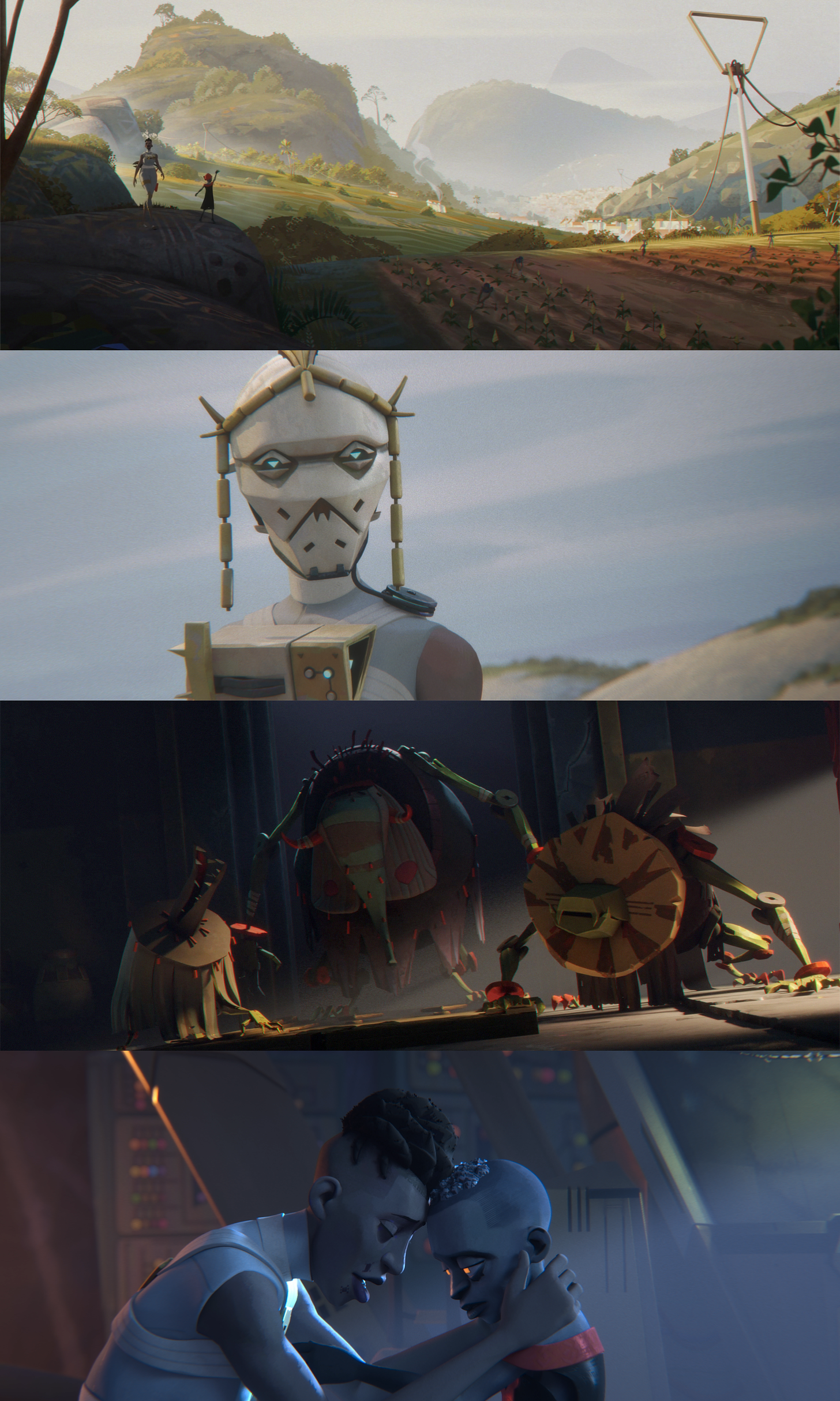
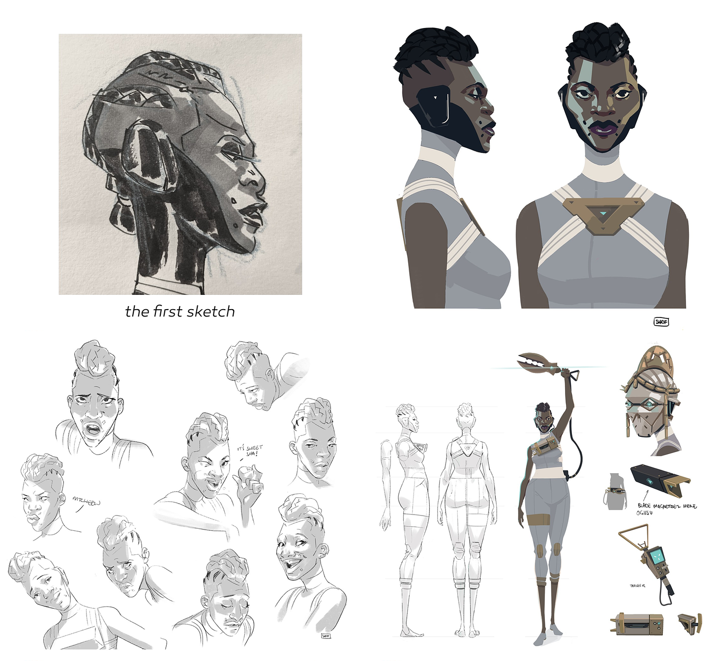
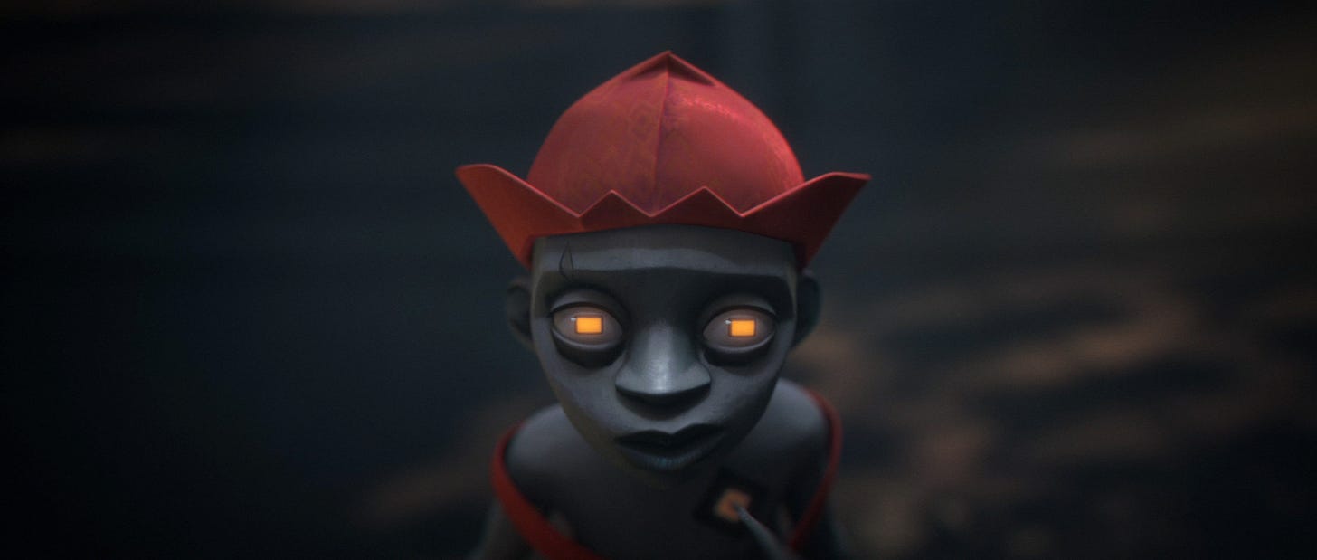
The result is a worthwhile series that we enjoyed. And Moremi stands out in it. The film is a sci-fi flip of the Moremi Ajasoro tales from Nigeria, and there’s a painterly style to its 3D animation, plus a bold approach to graphic design. Even just the look of the spirit beasts that hunt Luo, the ghostly protagonist, is remarkable.
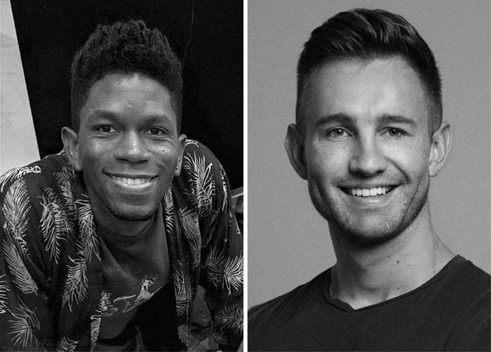
This coming Saturday, Moremi will compete at the Annie Awards in the categories for TV character animation, effects and direction. It’s the most-nominated Kizazi Moto entry. In light of that, we interviewed director Shofela Coker and art director Wian van Bergen about how the film came to be.
You might know Coker for his “breathing paintings” in the 2017 documentary Liyana. We wrote an issue about those a few years ago — they’re gorgeous. Moremi pushes forward many of Liyana’s visual ideas, that blend of 2D and 3D art into a single image. But the scale this time is much more ambitious. For Moremi, Coker teamed up with Lucan Studio and Triggerfish in Cape Town, and Peter Ramsey (Spider-Verse) guided the project as executive producer.
We learned about that and more in the replies from Coker and van Bergen. You’ll find them below, edited for clarity, length, flow and formatting.
Animation Obsessive: What was it like getting picked up for the Kizazi Moto anthology — was it just a phone call out of the blue one day?
Shofela Coker: It was an email, then several rounds of pitches and development that lasted months. The call was for over 300 African creatives to pitch a short Africanfuturist story. We were shortlisted to 80, to 33, then 15 — and finally 10 projects were selected. At initial contact, I had no idea Disney or Peter Ramsey were involved.
Despite how incredibly exciting the opportunity was, I said no at first because, as much as I wanted to work with Triggerfish on something, I had just quit my full-time job a couple of months earlier to focus on New Masters — a graphic novel I co-authored with my brother, Shobo. I reconsidered because the chance to work with like-minded African creatives who I really value appealed to me so much.
What inspired the story of Moremi? Aside from being part of a sci-fi anthology, were there any guidelines or requests for the project?
The kernel of the story came from a desire to explore a longing for home — I hadn’t been to Nigeria (where I’m from) in over a decade at the time. The original Moremi myth is one of my favorites, and it provided inspiration and a wonderful platform to explore the theme of home for me. It’s a myth of great cultural significance, inherent complexity and rich questions about Nigerian identity.
What was the experience like directing a team this large for the first time?
I was very open with the team about my inexperience and leaned on a sense of collective leadership during the project. I believe that animation at this scale needs to be owned by everyone who brings their energy and skill to it. I also had fantastic support from friends in the industry, training from a great masterclass series organized by the American Film Institute and the support network of the directors on the anthology itself.
My experience working on the film Liyana also set a standard for the type of ethics and the sense of collaboration I aspire to in all my projects.
As an accomplished painter and 3D modeler yourself, did that factor into how you were able to communicate your vision for the film to the team?
Thanks. Moremi is meant to be a very audiovisual narrative, conveyed and felt mostly without dialogue. Its 2D and 3D elements needed to have a strong relationship because the printmaking and sculptural aesthetics and philosophies of Southwestern Nigeria, which I love and which we referenced, do that naturally.
It was important for me to communicate well with our art director, and our production design team, about the personal and cultural aesthetic cornerstones of the film. So, yes, technically my background did let me provide materials such as concept sculpts, and help the production design team with designs and layouts. But we were lucky that our specialists always improved them and often came up with ideas that elevated the film all on their own.
Peter Ramsey has talked about serving as a creative consultant on the anthology, giving notes throughout the process. How was it working with him? What was his advice or feedback that stuck with you the most?
I’m not sure I’ll realize how fortunate we were to have Peter’s time as a mentor till much later. His notes and support were always careful to push us toward quality, impact and clarity, rather than a dilution of ideas to cater to storytelling formulas.
In fact, Peter encouraged us wherever possible to seek methods that would allow the specificity of the film’s vision to work both on screen and in the production process. Talking to him about pulling inspiration into animation from outside media (and other sources) was particularly helpful.
It was clear that he genuinely cared as much as we did about expressing the ethos of the series from day one. Mostly, Peter is a man with the most gregarious and unassuming wisdom. I think we all loved that approachability most about him.
Was there ever a point in the project where an idea just wasn’t working, and you had to find a new direction?
There was a moment in the production when I got quite ill for a couple of weeks during previz, and the team solved a particularly tricky storytelling device in the final third of the film without my direct input. I was quite proud of that moment.
What was it like seeing the final cut for the first time?
I worked on the series’ poster, so I got to see all of the films in the anthology a bit early. That was when I got to fully appreciate the final cut of our film — in context.
Our film was not just in fantastic company, but in wonderful dialogue with such unique voices. I had seen pieces of pre-prod from the other films, but watching the anthology got me excited, similar to when I discovered Franco-Belgian or Japanese animation as a young Nigerian. I wished Kizazi Moto was there for the younger version of me. As an adult my world still felt expanded, even though I’ve followed all of the directors’ personal work for a while. It felt like there was a whole new language of animation that we’re only just seeing a rich glimpse of.
How have things been in the months since?
We premiered Moremi (along with Enkai and Surf Sangoma) at Annecy 2023, which was quite special for me, as I’ve always admired the festival from afar. We then took the series to Johannesburg for a wonderful premiere that celebrated the series in the country where it was produced.
Later, AFS collaborated with the US Embassy in Nigeria and AFRIFF to premiere it theatrically in Abuja and Lagos. The reception for it in Nigeria was particularly meaningful to me. I had so many conversations with young people and animation professionals about the possibilities of animation in Nigeria and Africa. I also got to give a few animation workshops and visited a few of the major studios there.
Most of all, I’ve enjoyed the hope that the series has sparked with the people I’ve engaged with.
Animation Obsessive: Shofela Coker’s work tends to have a very standout visual aesthetic. What was the process for maintaining his unique vision and building on it?
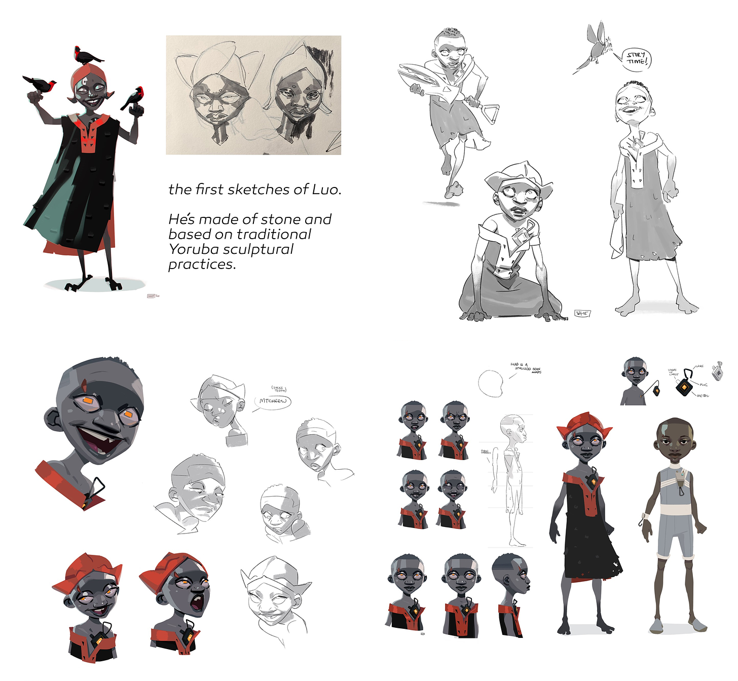
Wian van Bergen (art director, Lucan Studio co-founder): Collaborating with Shofela Coker was enriching. He’s not just talented as a visual artist but also brings a wealth of experience in art direction to the table. Before production, I conducted research based on his director’s treatment to align myself with his goals.
Some of Shof’s strengths are his clear communication and openness to new ideas, which fostered collaboration and exploration on Moremi. Our weekly check-ins doubled as chances to exchange art inspiration and brainstorm new ideas. The film’s visual aesthetics evolved and refined as this partnership continued.
Did the project have any “art pillars” — benchmark rules that drove the art direction decisions?
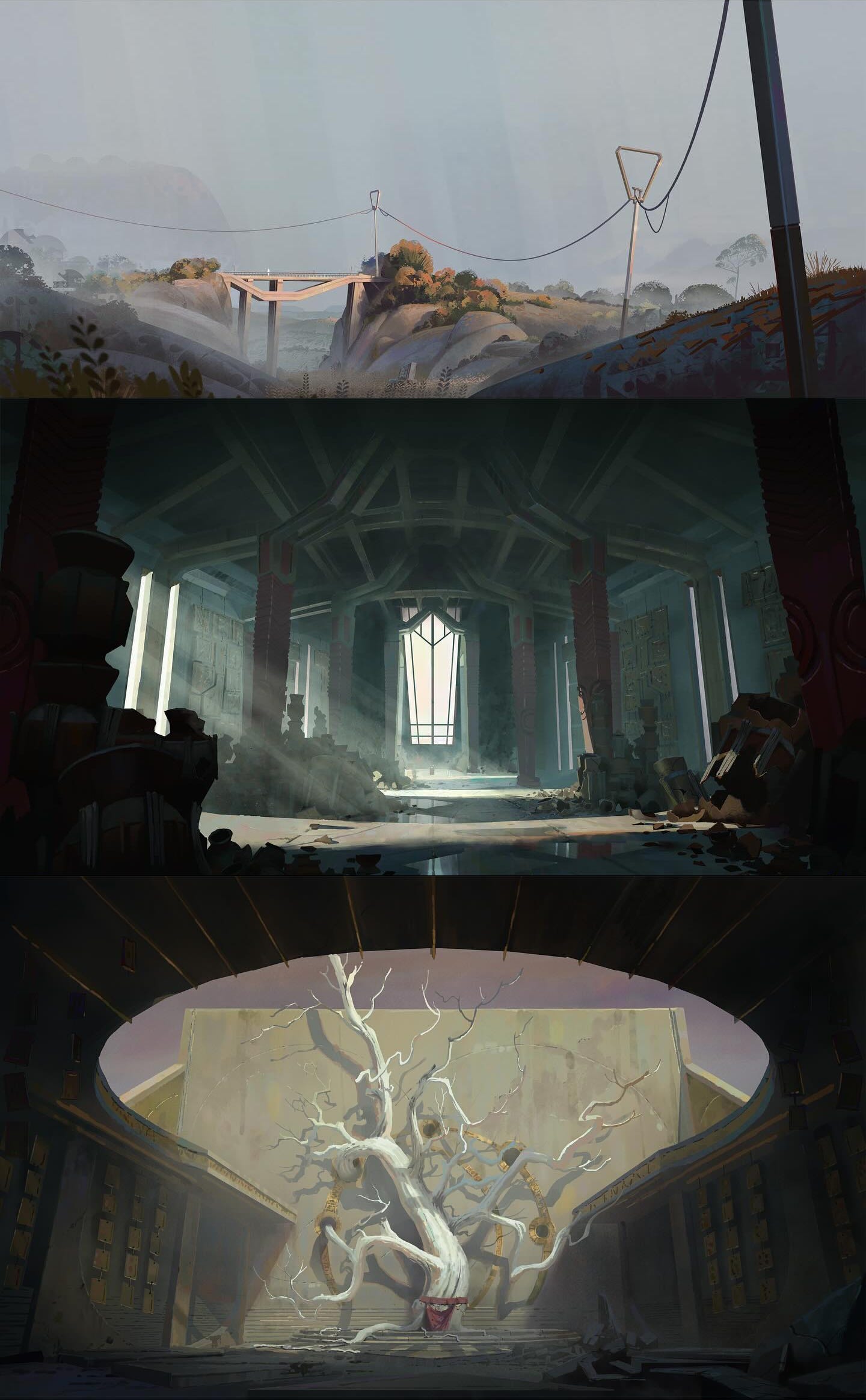
Early on, I put together a style bible to outline the look and feel we aimed for. I really delved into the techniques of traditional painters to capture a similar tangible beauty.
We focused on aspects like lost and found edges, shifts in color temperature, the art of mark-making, creating atmosphere, defining clear shapes and grouping values effectively. Nigerian motifs weave throughout the film, not simply as decorations but as meaningful symbols. We incorporated Yoruba printmaking patterns, particularly in the background, to enhance the narrative.
Lighting was crucial throughout the film. Each composition was designed to guide the viewer’s eye and enhance key story moments. We wanted to ensure that the cinematography felt rooted in reality, and so we adhered to specific camera lenses and leveraged lens aberrations, depth of field and subtle grain for a cinematic quality.
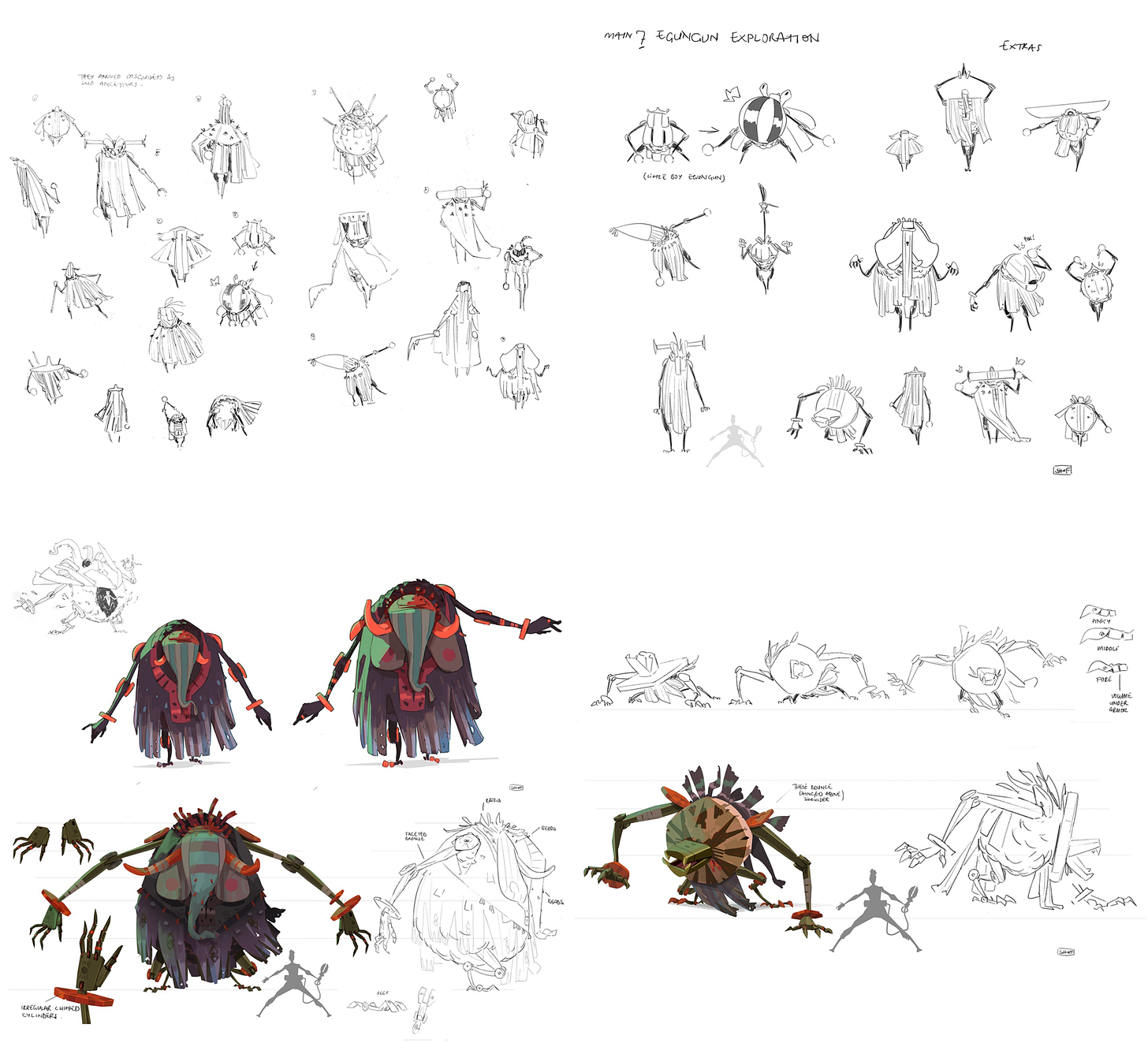
The creatures in the film have a sort of unplaceable half-animal, half-machine design. What was the intention and inspiration behind them?
The Spirit Giants are imposing figures, dressed in dark raffia and wearing masks. They drew inspiration from the masquerade costume Egungun figures of Yoruba culture, believed to embody the spirits of ancestors during festivals and ceremonies. Each of the main Spirit Giants in the film embodies an animal design — Lion, Elephant, Crocodile, and my personal favorite, Mosquito.
Their designs originated from Shof’s concepts and were further refined by the art team. Shof has spoken about his childhood experiences with these masked figures in Nigeria; it’s evident that these encounters left a profound impact on him, serving as the inspiration behind the designs.
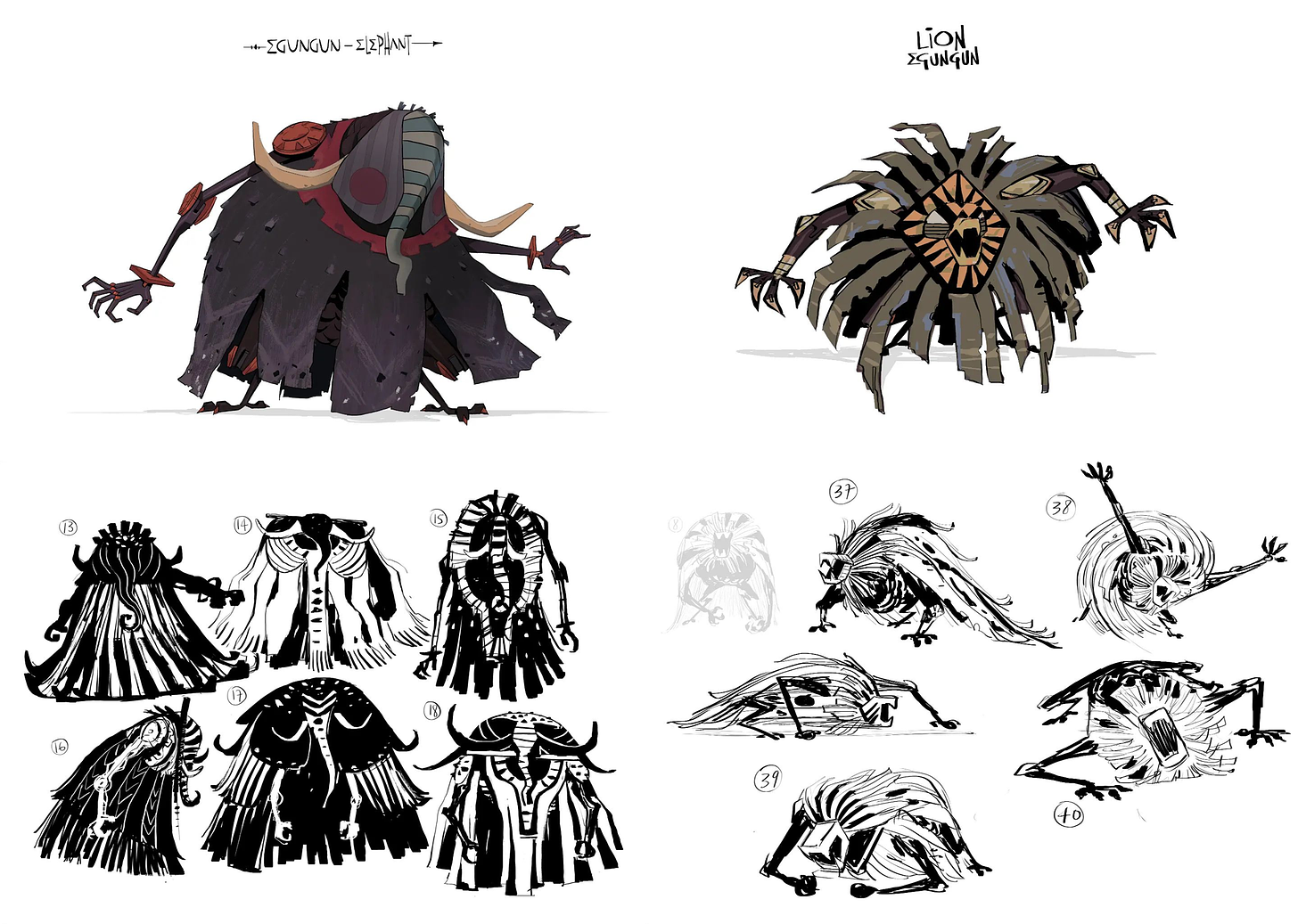
The characters in Moremi have a sort of matte, almost stone-like surface to them, with a lot of depth coming from tone and texture variation. It creates a sense that these are like real, physical objects. Why this look, and how was it achieved?
A challenge we faced in making the film was seamlessly blending our 3D characters with the 2D painted backgrounds. Our aim was for the characters to appear as though they’d been crafted by the same hand that had painted the backgrounds.
Typically, 3D renders come off as too flawless, without the charming imperfections of hand-painted art that we were after. To overcome this, we developed a custom compositing workflow. This involved breaking down each component of the render — such as color, individual lighting, shadows and reflections — and manipulating them separately, before reassembling them and merging them with the background.
That approach let us work with the precision of a painter, tweaking every element and texture to our liking. We even went so far as to introduce subtle printmaking patterns in the areas where light transitions into shadow. It might be a small touch, but it adds a painterly richness to the overall look.
And that subtle, painterly quality is offset by splashes of neon 2D FX. What was the thinking behind that?
Our story blends sci-fi and magical realism, and we were determined to make the special effects stand out. Each FX element was conceptualized in 2D, in line with our principle of integrating printmaking patterns and graphic shape design. We then used software like Houdini to imbue them with life and movement. Finally, these elements were brought together in the compositing stage to give them that magical appearance.
I’m incredibly proud of what the Lucan Studio team has accomplished with the FX, as it was one of the most challenging and time-consuming parts of perfecting a shot. Moremi has been nominated for Best FX at the 2024 Annies, so here’s hoping for the best!
That’s a wrap for today! Thanks for reading.
And a special thanks to Coker and van Bergen for taking time out of their busy schedules to answer our questions this week. We wish them and the team luck at the Annies. Voting closed on February 12 — now, we can only wait and see.
One last thing before we go. We shared this video on Twitter, and we plan to mention it again on Sunday — but check out this “special effects” breakdown for Akira that Stefan Riekeles posted. It reveals the secret of those famous reflective puddles: the sky was sliding behind them. An amazing look at film trickery before digital compositing.
See you again soon!


Amazing interview, guys! I'm all in for African representation in animation.