
The Shape and Color of 'Lilo & Stitch'
Plus: news.
Welcome! It’s time for another Sunday issue of the Animation Obsessive newsletter. Here’s the agenda:
1) Inside the art direction of Lilo & Stitch (2002).
2) Newsbits of the week.
Now, let’s get going!
1 – Taking risks
This thing was a “miracle” project. That’s how Chris Sanders, its co-director, describes it now. Lilo & Stitch was a movie that got away with it all.1
The ‘90s were boom years for Disney. Lion King and Hunchback were huge — in scope and success. The company’s films were growing more expensive, too: Hercules, Mulan. They were getting unmanageable, and too big to fail.
“[T]he bigger they got, the more unwieldy,” Sanders told Vulture last year. “You have bigger budgets, but that meant that you had to be, in a weird way, more careful.”
The company felt it. At a 1997 retreat with Eisner, producers and execs and artists agreed that, maybe, it was time for something more contained. A lower-tech, lower-stakes project that left more room for risk — a “smaller, gutsier film,” as co-director Dean DeBlois put it.
In Sanders’ words:
Each [film] had seen an increase in complexity and an improved level of finish, but in the process we wondered if they had lost some of the imperfections that gave them character.
And what about spontaneity and risk? Were we engineering them away? While we were proud of the films of our era, we all expressed a secret desire to make a Sleepy Hollow or a Dumbo — small, strange movies with more heart than budget.2
Thomas Schumacher, a key executive, came away from this retreat with a plan. Disney would do “a movie for less money and empower one artist, or a couple of artists, to make that movie,” he said.3
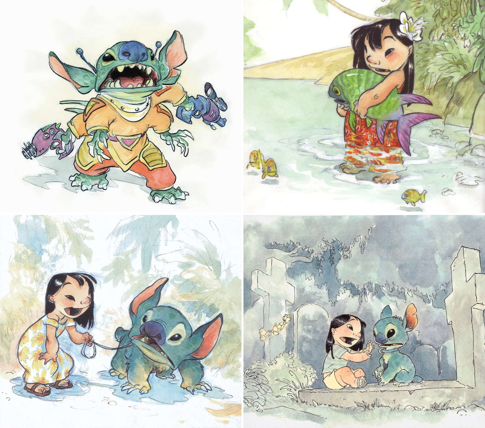
He asked Sanders to pitch something, and Lilo & Stitch took shape from there. Sanders’ pitch booklet, filled with his own illustrations, charmed the top brass. “The decision is that, yes, we want to make this movie,” Schumacher told him, “but on one condition: it has to look like you drew it.”
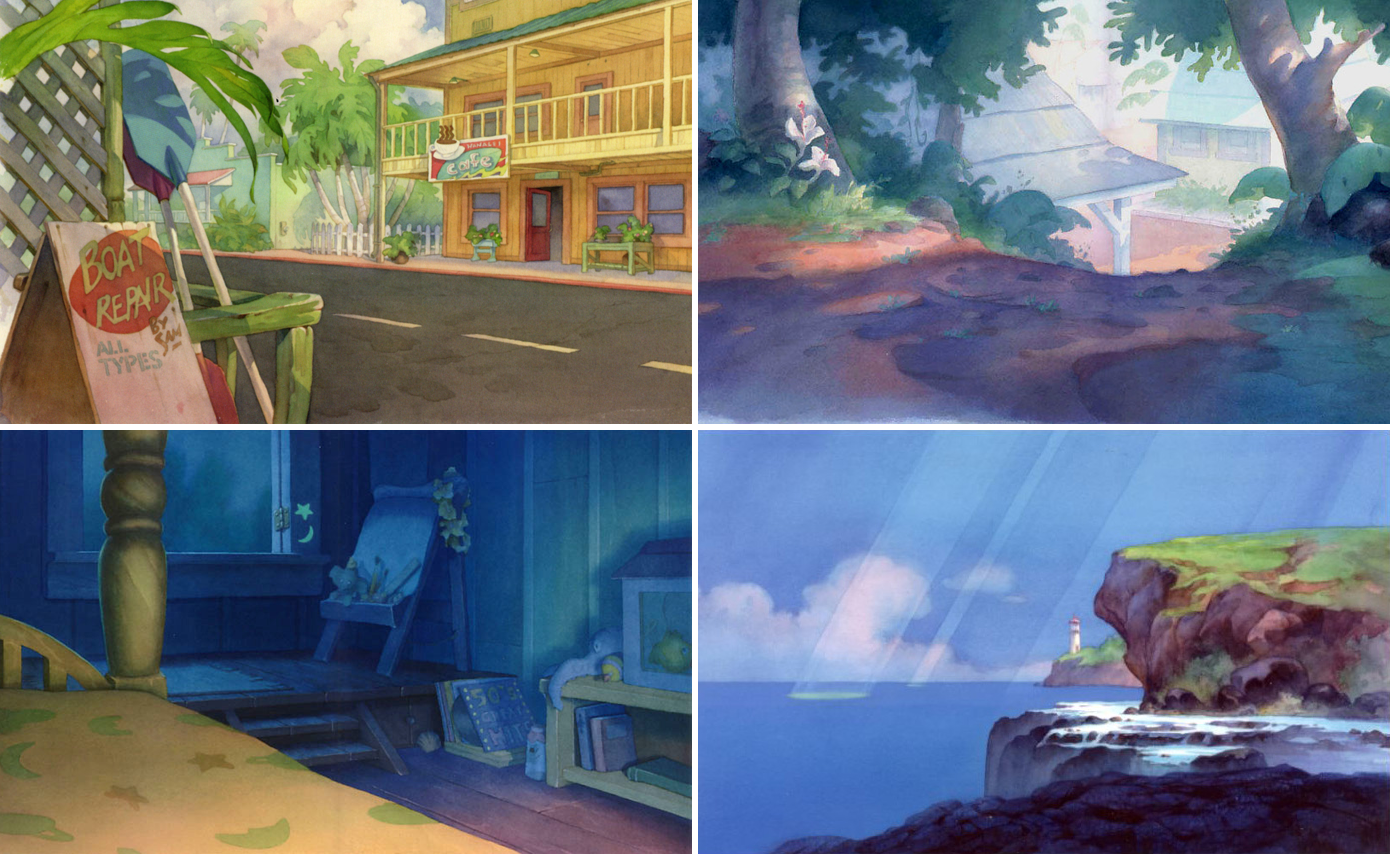
Lilo & Stitch was unusual for Disney, even in that era. The Hawaiian setting, the Elvis music, the sisters at the heart of the story — everything has an odd uniqueness. A personal quality. You see it in the visual style, too, which is Sanders’ own.
This uniqueness was driven by the project’s smallness — starting with the reduced budget and schedule, and especially with the limited team at the top. “There’s a compromise when you involve lots of people,” said Dean DeBlois, “because ultimately 30 people can only agree on something that falls in the realm of cliche.”4
Disney’s process was to put lots of voices in the room, including lots of executive voices. Lilo & Stitch was different. Eisner famously didn’t see it until the team was almost done — Schumacher hid it from him, hoping to protect the “really fragile stuff” that was special about it.
“From the beginning, the idea of keeping it small was a banner we hung over every aspect of this film,” wrote DeBlois. That extended to the “select few” artists in charge of its look, and to the simplicity of its style. Effects and shadows were dialed back; detail was reduced. The team “deliberately avoided splitting elements into underlays and overlays wherever possible,” DeBlois noted.
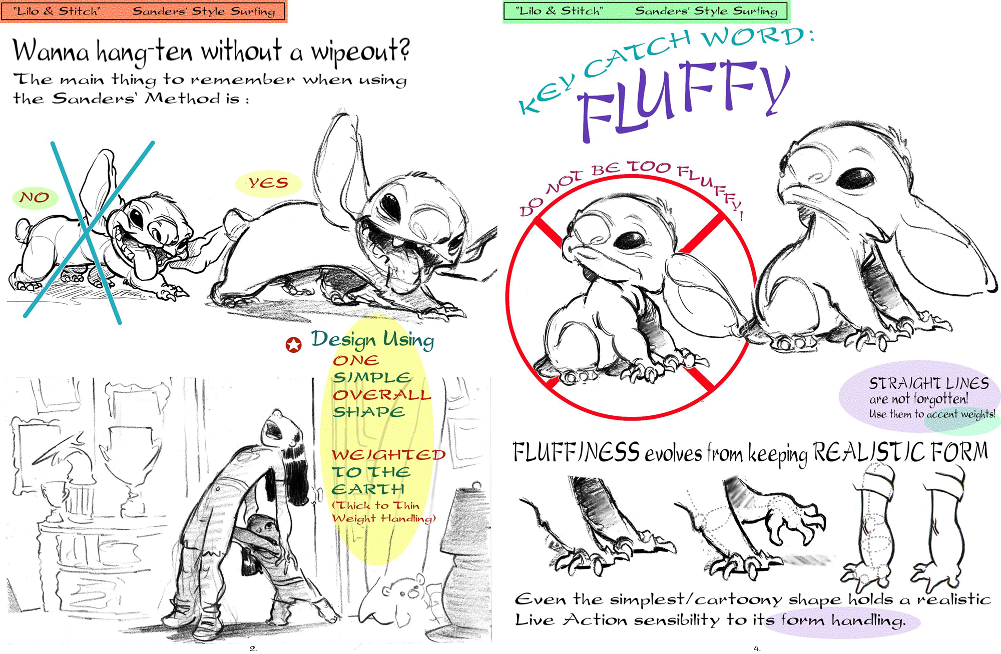
Instead, they looked to old-fashioned storybooks, to early Disney and to Sanders’ pitch drawings. He’s someone who uses “one simple overall shape” for each pose, according to artist Sue Nichols. Animator Byron Howard saw in Sanders’ art “no hard edges, no straight lines.” It’s all curves.5
Thanks to Nichols and her style guide (readable online), the team figured out how to emulate Sanders’ work. She broke it down — in ways he’d never considered. One thing was his tendency to root his characters. Shapes taper upward: they’re heaviest in the feet and legs. These are designs “weighted to the earth,” as Nichols put it.
Another was the “fluffy” quality of Sanders’ drawings. Art director Ric Sluiter went into detail about that last one:
We chose soft, rounded shapes, suggestive of little loaves of home-baked bread. Elements were slightly inflated, or what we called chubbed up (a metaphor which I found enabled the artists to comprehend the style easily). Personally, I have a real affinity for this style. Its opposite is the contrasty, harshly lit, hard-edged style, or broken glass, as I call it.
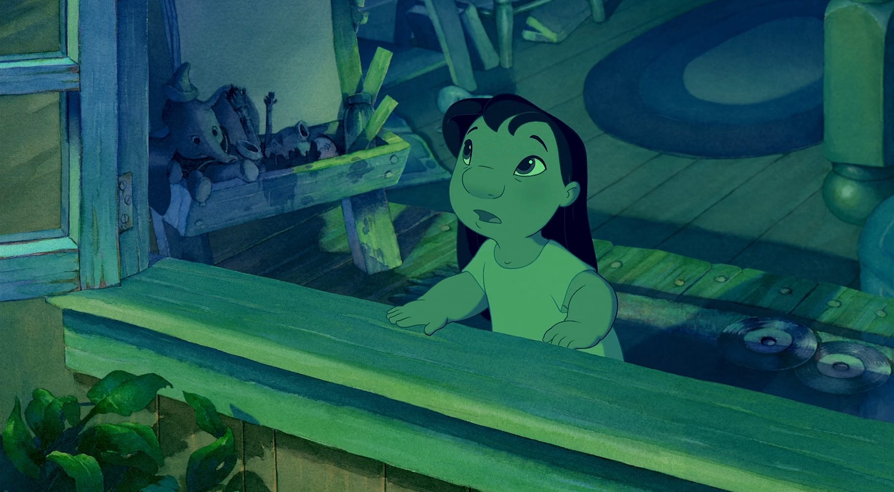
The film’s shapes all work by those rules. We see simple, whole forms that get thicker as they get closer to the ground — and they’re always enlarged, like overinflated balloons. “Everything’s blown up and puffy and more fun,” noted the film’s visual effects supervisor.
Lilo & Stitch’s visual language is different from straight realism, and from the CG animation of that era. DeBlois said that they wanted the “pure charm of an illustration up on screen” — art that reveals “the painter’s hand.”6
Every line and brushstroke was subtly bent to the expressive needs of the story. DeBlois again:
Lilo & Stitch presents a universe as seen through a child’s eyes. It’s simplified, purified and romanticized. We set out to create a safe, protected little world in which Lilo’s surroundings seem to cradle and watch over her. The soft, rounded character designs and organic watercolors relax the imagery and ease the atmosphere … Lilo’s world is custom designed to suit her point of view. Even Stitch … is deliberately proportioned to complement Lilo’s size and to fit within her tiny universe.
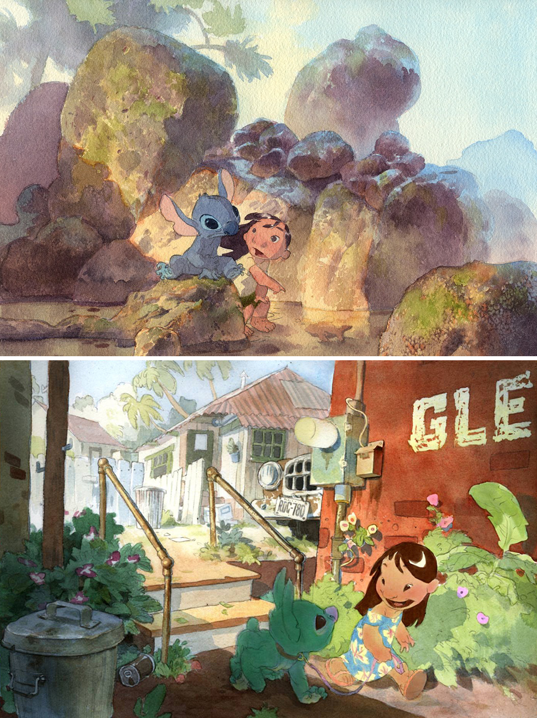
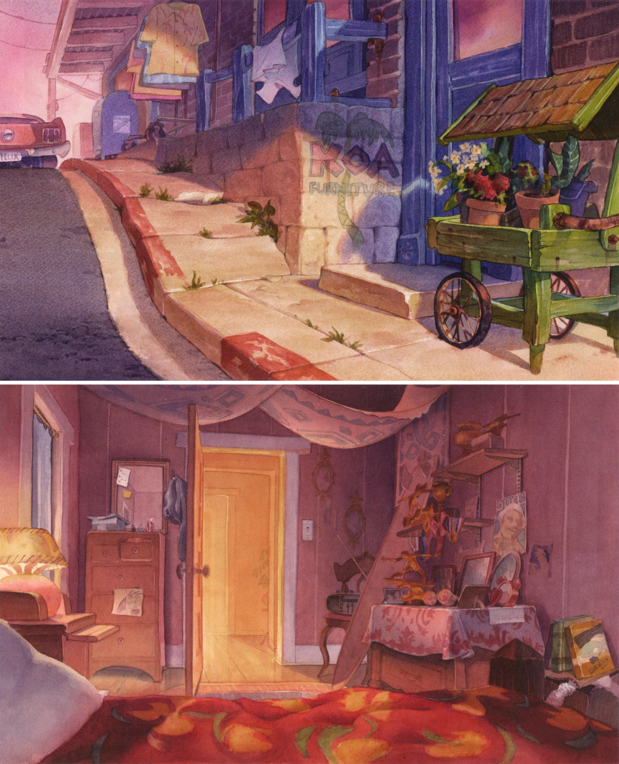
The vibe of this made-up world relied a lot on those “organic watercolors” DeBlois mentioned. Watercolor backgrounds were common in the early Disney years, on films like Pinocchio — but the company had abandoned them decades and decades before Lilo & Stitch. Bringing them back was a steep challenge.
Yet they lend warmth, and (again) that storybook feel the team wanted. So, as hard as it was, the painters relearned watercolors. Which meant figuring out the quirks of the medium — and how to render this film’s specific subject matter.
Key painters from the team visited Kauai to study the environments and their colors. One was background supervisor Bob Stanton, who found blue “everywhere and in everything.” It ended up in the film, as did the evening-pink sea foam that the team observed on the trip.
Like Ric Sluiter explained:
Our research trip to Kauai … taught us that the colors in Hawaii are really turned up a notch, with the air being so clear and the islands getting pressure-washed almost daily. We wanted our color palette to be bright, fun and tasteful so we kept our choices secondary rather than primary. We didn’t use any white paint, which tends to kill a color, and instead we allowed the white of the paper to act as a light illuminating the pigment from behind, which is effectively how stained glass works. This kept the colors very rich and clean.
Those clean colors were applied to simpler background designs, favored by the watercolor medium. Paul Felix, the production designer, wrote that he “left off worrying about texturing, or elaborate lighting, or adding an overabundance of stuff.” His focus was on “mood and basic shapes.”
Meanwhile, the background team polished its techniques. Artist David Wang noticed that he could “use lots of water and mix it with a color in a small dish, not on a palette board,” so that “the heavy grains in the paint [would] sink to the bottom.” Another trick came from Maurice Noble (1911–2001), a Snow White vet. Asked how certain rocks in Peter Pan had been textured, he revealed that it was “very coarse-grain sea salt.”7
Lilo & Stitch’s charm comes down to more than color and shape. The writing is funny, tight and poignant, the motion is rich with character — and so on. It’s one of Disney’s best films, and not just of the last 25 years.
That said, what made this film great is visible right there in its colors and shapes. In the palette, the watercolor backgrounds and the idiosyncrasies of Sanders’ personal style, you see signs of risk. Of freshness and vision. Of executives who trusted artists with a scary, exciting idea — and of artists who pulled it off.
Lilo & Stitch is tied to Disney tradition, definitely, and it was meant to be. But the artists were given a chance to turn the lessons of the past into something really new. This film doesn’t look like any other Disney project — and its shape and color, so carefully composed, are exciting even now. The same goes for the rest of it: you feel the heart in this movie.
People still love it. So does its team. Speaking about Lilo a few years ago, Chris Sanders told Fumettologica:
If you had done this crazy jump on a bike when you were 15 years old and you took a video of it and now that you’re 30 you look at the same video and think, “Oh my God, I can’t believe I did that” — I think that’s more like it.
2 – Newsbits
Film Fund Luxembourg invested in new animated projects. The director of Flee landed €1.5 million for his next movie: Dansker, based on a Danish comic series.
In America, Deaf Crocodile announced the first six volumes of Treasures of Soviet Animation. It will include restorations of The Little Humpbacked Horse (1947), The Snow Queen (1957) and the works of Yuri Norstein.
A new ad from Australia went for an “illustrative 3D look … that, when paused, could resemble a 2D illustration.” The results are impressive.
China’s megahit Nezha 2 is now one of the five highest-grossing movies. (Also, it’s set to screen in “37 European territories,” Variety reports — starting this month.)
Suresh Eriyat, who leads Studio Eeksaurus in India, wrote about his visit to Ghibli this month — and his encounter with Hayao Miyazaki. His story is complete with illustrations.
DreamWorks’ Dog Man did well in theaters this year. Yet the British studio behind its animation, Jellyfish, is going under.
In Japan, Junk World has a trailer and a release date: June 13. It’s the follow-up to Junk Head, one of the weirdest stop-motion films of modern times.
There’s trouble with South Africa’s rebate program for filmmakers — trouble that affects animation, too. The government “owes untold millions of dollars in unpaid claims,” per Variety.
The Light of Aisha is a feature due in April. Director Shadi Adib lives in Germany, but much of the team is Spanish — including animation director Raul Garcia, a Disney veteran. See its trailer here.
Lastly, we wrote about Norman McLaren in wartime.
Until next time!
From Chris Sanders’ great interview with Fumettologica, used quite a bit.
Sanders wrote these words in Lilo & Stitch: Collected Stories from the Film’s Creators. This book is our main source today.
See The Story Room: The Making of Lilo and Stitch, another important source.
From an interview with AWN.
Nichols’ quote comes from her style guide for Lilo & Stitch, while Howard’s is from The Look of Lilo & Stitch, included on the DVD.
See The Advocate (July 9, 2002).
From Vulture’s oral history of Lilo & Stitch, cited several times.
Thank you so much for this, all these details reinforce why Lilo and Stitch is such an enduring favorite for so many people
As a a kid I loved it. As an adult I loved it. After living in Hawaii for a few years and having to move away again, I love it in different ways and cry even harder when I watch it. The music, the dance, the colors, the focus on family and the narrative about separation takes on such a different level for me. The song Nani sings to Lilo the night before their planned separation was written by Queen Liliuokalani during her imprisonment when the U.S. was forcibly taking over the islands. I would hope Disney knew that when they selected the song. Is it an acknowledgement of the pain and wrong doing perpetuated on the people of Hawaii? Or just a sad song picked for the reason Disney is known to sometime take: maximum-heartstring- pull for anyone familiar with the song’s origins.