Welcome! We’re back with another exciting edition of the Animation Obsessive newsletter. This is the agenda today:
1 — on the making of Blossom, Bubbles and Buttercup.
2 — the animation news this week.
3 — a wonderful film by Norman McLaren.
New around here? We publish Sunday and Thursday. You can sign up for free to receive our Sunday issues in your inbox every week:
Now, on we go!
1. McCracken’s iconic characters
On Monday, it came out that Craig McCracken is rebooting his classic cartoons The Powerpuff Girls and Foster’s Home for Imaginary Friends. He tweeted that he’s thrilled to be back on them, and has plans to “develop new characters and stories for two of [his] favorite creations.”
Startling as it may be, the original Powerpuff Girls series is almost 24 years old. In 1998, when it first made McCracken’s name, who thought that the show would still be this relevant? Not him. “I thought I would get a college hit where 20-year-olds would watch it in their dorms when they’re stoned,” McCracken once said. “That was it.”
Even after Powerpuff’s surprise success, McCracken felt it couldn’t last. “The fact that Powerpuff is hot right now means it’s going to be a joke someday. People will hate it because it was popular,” he told the magazine Bust in 2002. And yet here we are.
The original Powerpuff owes its enduring fame to a lot of things. Take its scripts and stylish backgrounds — or its voice cast and inventive, memorable stories. That said, one specific thing brought the show into existence. And that thing gave Powerpuff the instant recognizability that helped it to soar:
The iconic designs of Blossom, Bubbles and Buttercup.

Back in 1991, Craig McCracken was a promising student at CalArts. Like his school friends Genndy Tartakovsky and Paul Rudish, he was in love with UPA. A new generation of animation students looked to the past to find the future. McCracken recalled:
I always knew there was this graphic style that I liked — I had seen it somewhere. [...] But growing up in Southern California, you know, there was no access to UPA cartoons... you might’ve seen it somewhere, in some ether world, and your subconscious remembers seeing it, but it wasn’t till I got to CalArts that I really found it and realized that’s the stuff — that fifties graphic style that I knew I always liked; I just didn’t have any reference to it.
It was the start of the “UPA revival” era. Young artists like McCracken combined UPA’s influence with the likes of Hanna-Barbera, Underdog, Jay Ward and anime — and created something new. In this context, the Powerpuff Girls were born.
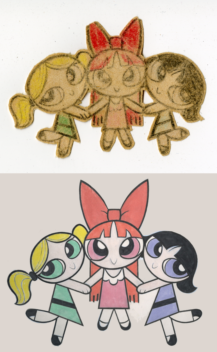
Their origin story is kind of famous. McCracken was working on his sophomore film — something about a superhero, drawn in his mid-century modern style. But he needed a lead character. “And it was around June [1991] and my mom said, ‘Hey, your brother’s birthday’s coming up. Why don’t you do a card for him?’ ” McCracken remembered. “So, I just started doodling these little things.”1
As he sketched ideas for the card, he made a drawing of three girls holding hands. They had giant eyes, inspired by the paintings of Margaret Keane. “There wasn’t any conscious thing, I was just, ‘Oh, those Keane paintings are funny,’ and I was just sitting around just drawing girls with big eyes,” he said in 1995.
For the look of each girl, his main focus was contrast. They were drawn “as a unit” — so, giving them blond, red and black hair separated them out. He based Buttercup’s haircut on one used by Jennifer Fried, a CalArts friend.
In terms of style, McCracken was heavily influenced by Paul Rudish at the time. “He always had this ability to draw really cute things without them being too sappy. So I went through this phase where I was trying to emulate what he did,” McCracken told Bust. The girls didn’t look like Rudish’s art — but McCracken was “really thinking of him” as he drew. Add in a dash of Hello Kitty influence, and something clicked.
“I just liked them as a design. I liked how simple they were; I liked how graphic they were,” McCracken said. And it occurred to him that they could be the leads in his superhero film for CalArts. Such cute designs acting tough was an immediate hook.
Which was the beginning of the Whoopass Girls.

McCracken’s initial sketch was remarkably close to the final designs in the Powerpuff Girls series. Still, between those two iterations was a slow process of refinement — starting with McCracken’s student film about the Whoopass Girls (their original name, before the complaints).
There were false starts along the way. One of the earliest was McCracken’s attempt to give them fingers. As the book Makin’ Toons recounts:
The girls first sprang to life as a small thumbnail drawing — so small that McCracken couldn’t give them too many distinctly articulated features — and when he tried to enlarge the image to refine it, he realized that some things shouldn’t be tampered with. “That’s why they don’t have fingers or anything,” he explains. “Because I drew them so tiny... and when I tried to add fingers, I was like, okay, I’m not gonna screw with it. I stumbled accidentally onto something that works; I’m just gonna leave it.”
The versions of Blossom, Bubbles and Buttercup he used in his second-year film, Whoopass Stew – A Sticky Situation, got closer to the ones we recognize — from the colors to the eye shapes. But there’s something awkward about them. In certain key ways, they almost drifted from the charm and balance of that first rough sketch.
Compared to the Powerpuffs, McCracken later called the Whoopass Girls “a little more freakish and stretched out and not as cute.” It was something he ironed out as he became a better artist. “I did fine then,” he said, “but when I look back at them, they look sickly to me.”
Then there was the 1995 pilot for The Powerpuff Girls, a collaboration between McCracken, Rudish and Tartakovsky. By this point, McCracken had smoothed the girls’ designs out a lot. They’re still elongated, but they resemble themselves.
The problem was that the pilot tested poorly among kids. “They literally said this is the worst cartoon ever made and whoever made it should be fired,” McCracken recalled in a recent interview.
“Craig panicked that afternoon and he came back that evening... redesigned the whole show in a night,” Rudish said. McCracken threw out the girls’ designs entirely — he even added fingers. Thankfully, it went nowhere. Cartoon Network decided to give his original vision for the series another shot.
From there, things progressed, little by little. There was a second pilot. McCracken spent years on Tartakovsky’s series Dexter’s Laboratory, polishing his skills.
“And then [executives] Mike Lazzo and Linda Simensky came to me and said, ‘Hey, we’re gonna pick up Powerpuff Girls,’ ” McCracken said. “ ‘We want to greenlight the show. We love this Dexter’s crew; we want to keep this unit together […] and we want to put you in the driver’s seat.’ ”
This led to McCracken’s all-time favorite iteration of the girls — the “1998 designs.”
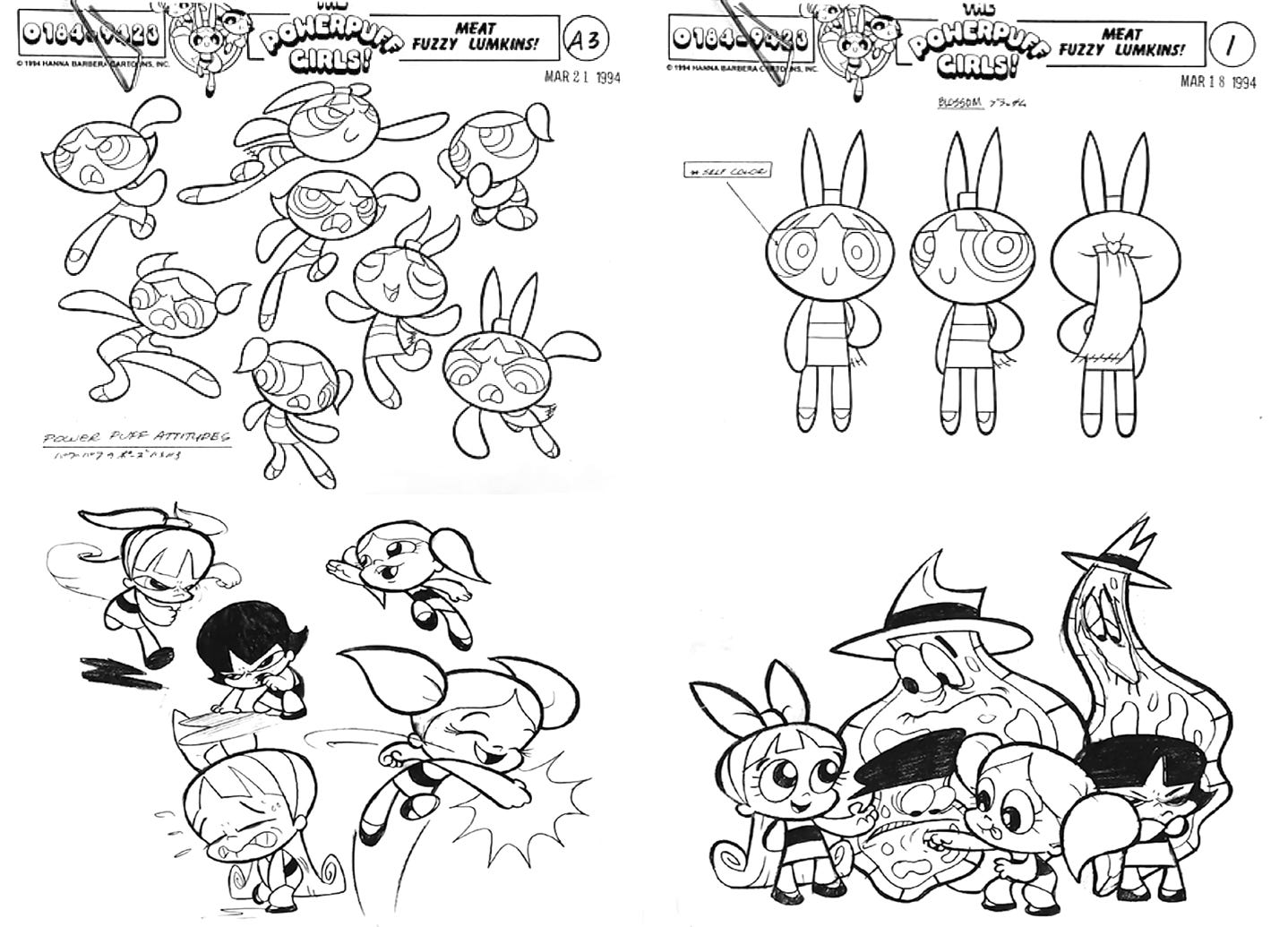
As the new Powerpuff Girls series went into the works, the girls were perfected. McCracken partnered with designer Craig Kellman on the model sheets for the primary cast, but recalled handling the designs of the Powerpuffs himself.
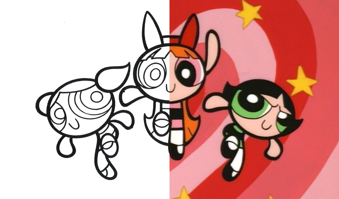
The sheer amount of thought that went into the 1998 models and style guides is breathtaking. We learn that a Powerpuff Girl’s hand is shaped “like a butterknife.” That her facial features “wrap around [the] contour” of her head like a ball with paint on it. Everything good about the original sketch is here, only better, clearer and more fleshed out.
This hard work made for extremely tight and eye-catching designs. Each aspect of the Powerpuffs was weighed, measured and hand-picked. It added up to characters that feel solid and present — almost like they’re real. And yet there’s nothing realistic about them. It’s a mystery.
McCracken said that it’s “just the essence of a character.” He said that he “tried to define all the characters as iconic images.” Through years of work, he honed that accidental sketch of Blossom, Bubbles and Buttercup down into an unforgettable achievement in design.
If there’s one word that fully describes it all, it’s the one he used. This stuff is iconic.
2. Global animation news
An update on animation festivals
Despite all that’s happening in the world, animation festivals march on. They continue to do the job that they do best — celebrating artistry that might otherwise go unseen.
Recently, we learned more about the most unusual animation festival of 2022, the upcoming Linoleum. It’s based in Kyiv, and set to stream in a few months (September 7–11). There are 36 films in competition this year, including recent favorites of ours like Fall of the Ibis King, Letter to a Pig and Sierra. Even more appear in the non-competition screenings.
On the subject of Letter to a Pig and Sierra — they just picked up a top prize and a special mention (respectively) at the Anibar festival in Kosovo. They were joined by the surreal feature Bye-Bye Elida, a film about the lives and “inexplicable rituals” of creatures that look like escapees from a Studio 4°C anthology. We’re intrigued.
Elsewhere, we find the inaugural Hiroshima Animation Season coming up in August. (A gorgeous trailer, with a mascot designed by Koji Yamamura, dropped earlier this month.) It’s giving special “Golden Carpstar” awards to animators and organizations in Asia and the Pacific Rim. Among the winners is Feinaki Beijing Animation Week. The anthology To the Bright Side, by Feinaki-connected animators, will screen.
Best of the rest
Per a Zippy Frames report, the streamer 35mm has made 474 classic works of Polish animation available in restored form. It’s legal and free. Find it here.
American director Chris Sanders did a long, deep interview on Lilo & Stitch. He explained how the team hid the film from Michael Eisner, and why one Disney artist called it “the closest thing to a Miyazaki film that the studio ever made.”
British animator Daniel Aguirre Hansell has found a lost 1967 cartoon by Richard Williams (The Thief and the Cobbler).
There’s a new trailer for the Japanese stop-motion series Rilakkuma’s Theme Park Adventure, by the always-great studio Dwarf. It’s coming August 25.
The head of Nelvana in Canada predicts the end of the current animation boom. Streamers are growing more budget-conscious: “business right now is strong, but I think it will start to slow down again and get back to a normal place.”
The Japanese manga Shuna’s Journey (1983), created by Hayao Miyazaki, has been translated by writer Alex Dudok de Wit. It’s coming in November — here’s a preview.
In Canada, the Vancouver Institute of Media Arts has opened another round of scholarships for Ukrainian refugees — including ones for animation and VFX.
In Japan, this week brought the third anniversary of the Kyoto Animation arson attack. The studio held a memorial.
The Russian government has mandated that films receiving state subsidies must give “priority placement” to Russian streaming platforms, rather than theaters.
Lastly, we wrote about the making and impact of Koji Yamamura’s film Mt. Head — one of the 21st century’s most significant pieces of independent animation to date.
Thanks for checking out today’s issue! We hope you’re liking it so far.
As usual, the last section is for paying subscribers (members). We’re highlighting a classic film by Norman McLaren, Canada’s most renowned animator. It’s a real masterwork of stop-motion cutout animation and clean design — and very accessible.
Members, read on. We’ll see everyone else next week!
Keep reading with a 7-day free trial
Subscribe to Animation Obsessive to keep reading this post and get 7 days of free access to the full post archives.


