Welcome! It’s our first Sunday issue of October here at Animation Obsessive, and this is the agenda for today:
1) On the Chinese cartoon Three Monks (1980).
2) Animation newsbits.
Now, here we go!
1 – Hidden depths
Cartooning is a specific skill. Not every animator has it — or needs it. You don’t see it in the painted films of Alexander Petrov, our subject last week. Still, great cartooning is a riveting art of its own.
A great cartoon simplifies things for the viewer. When someone gets sad or scared or angry, the emotions are big. When someone runs, they really run. The character designs focus on the essentials, too. You can read the seven dwarfs from Snow White at a glance. Grumpy is grumpiness personified.
Cartooning can get even simpler than Grumpy, though. It’s possible to make a cartoon so direct and so hyper-focused that it’s a form of minimalism. Only a few details remain. When an artist nails those details, the result can sometimes feel perfect — like nothing about it could be any other way.
Three Monks (1980) is one of those cartoons.
It comes from China, from the country’s “second golden age” of animation. Its director A Da was, like many animators, a target during the Cultural Revolution of the ‘60s and ‘70s. He and his family were forced to live in a tiny room, and he went through reeducation, including years of hard labor.1 But a regime change ended the persecution — for all of China’s animators. They were burning to get back to work.
Three Monks captures the energy of that moment. It’s one of the best and most famous animated films ever made in China — and it’s ultra-simple. Conciseness is at the core of it. Like A Da explained:
The film does not have one line of dialogue, everything inessential has been removed from the plot, the structure is “subtracted” to make it compact, the characters use only the simplest primary colors and the background is almost blank ... I believe only the most refined things can leave a deep impression on people … [it’s a matter of] avoiding wasted brushstrokes as much as possible.2
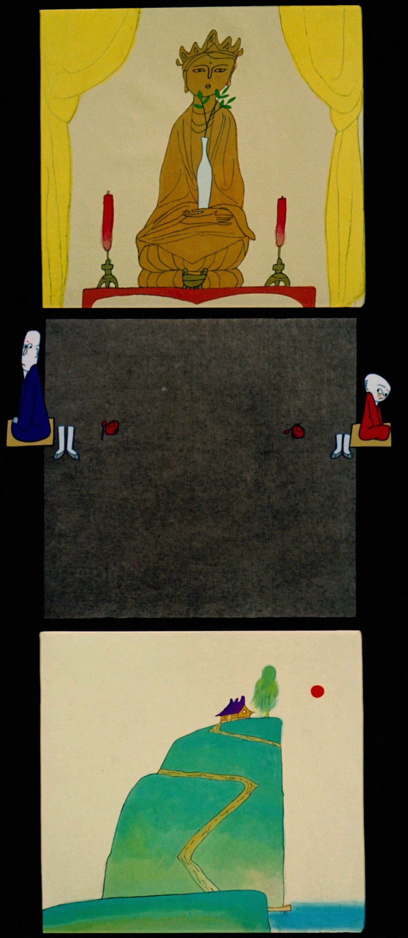
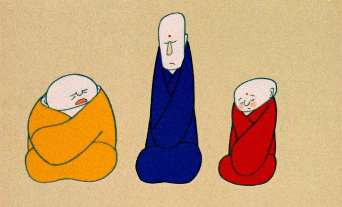
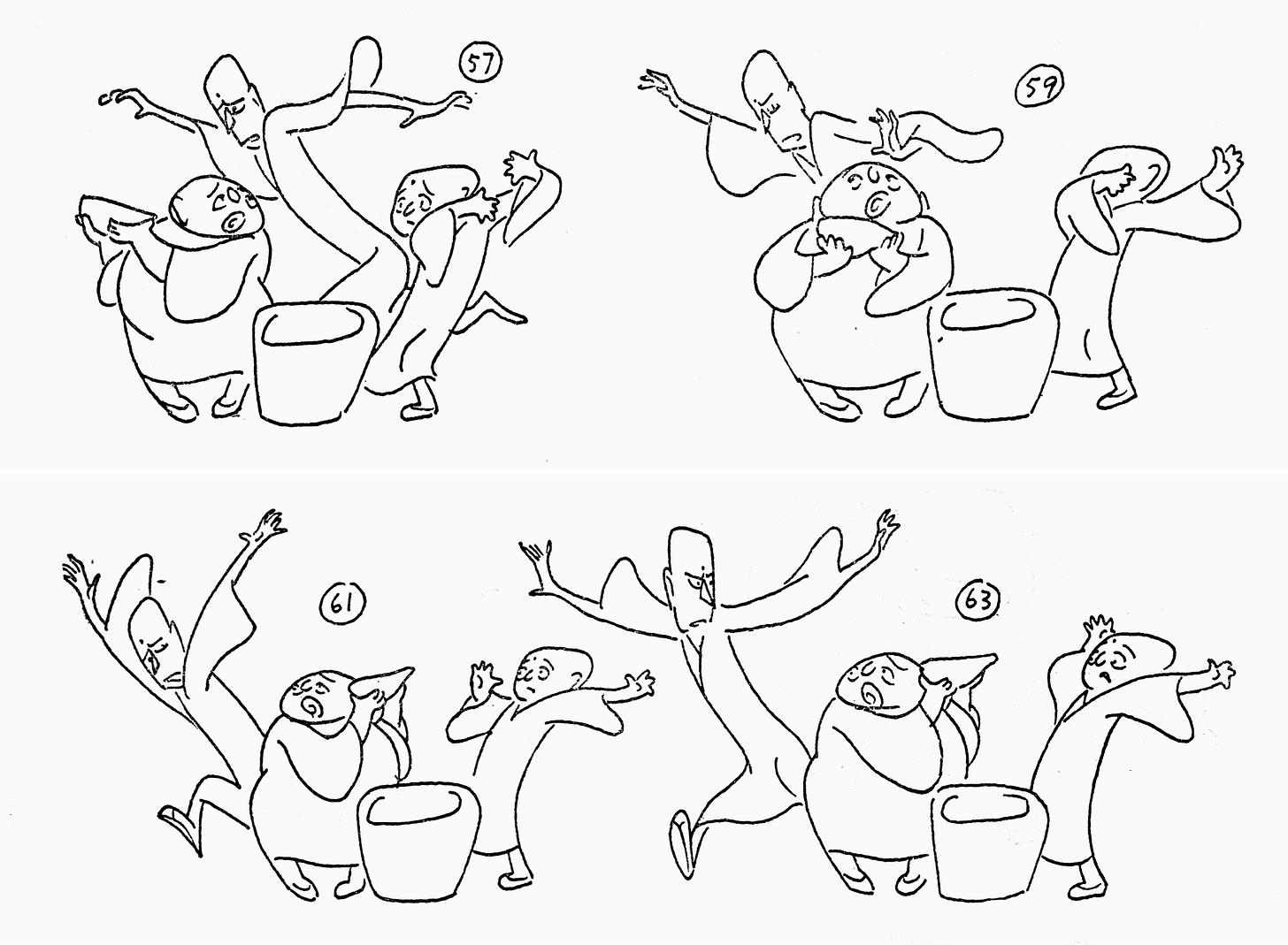
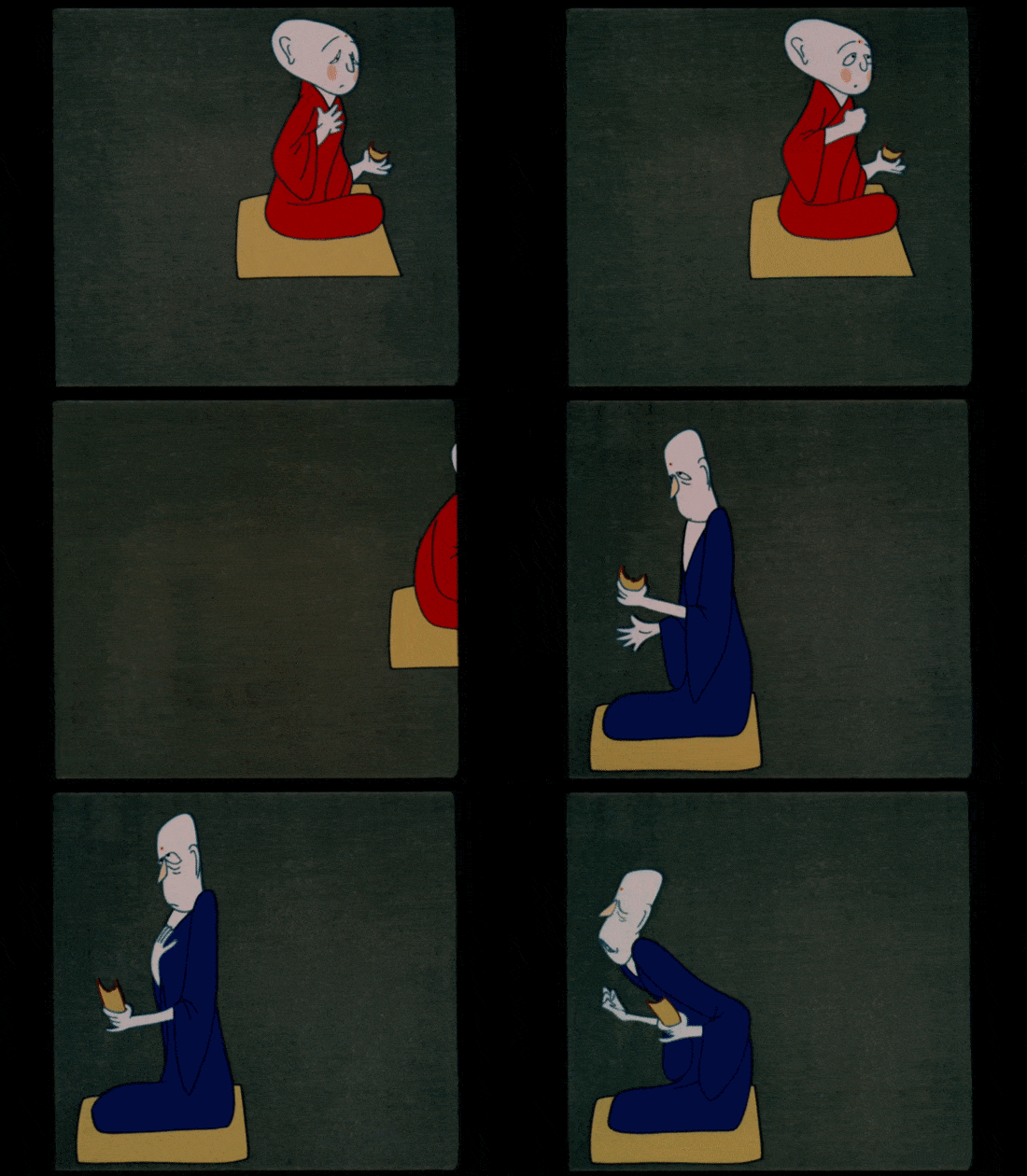
Three Monks is 18 minutes of pure charm — and pure cartooning. The characters are a trio of Buddhist monks, introduced one by one as the film progresses. They live in a hilltop temple, chanting sutras. That’s one of their main two activities. The other: walking to the bottom of the hill to bring back drinking water. Which becomes a problem, worsening as each monk arrives.
This is a film that doesn’t need much of an introduction to be enjoyed. It’s wonderful already. “The three monks, like Disney’s seven dwarfs, are perfectly individualized, each with his own way of walking, eating and solving life’s problems,” noted writer David Ehrlich.3
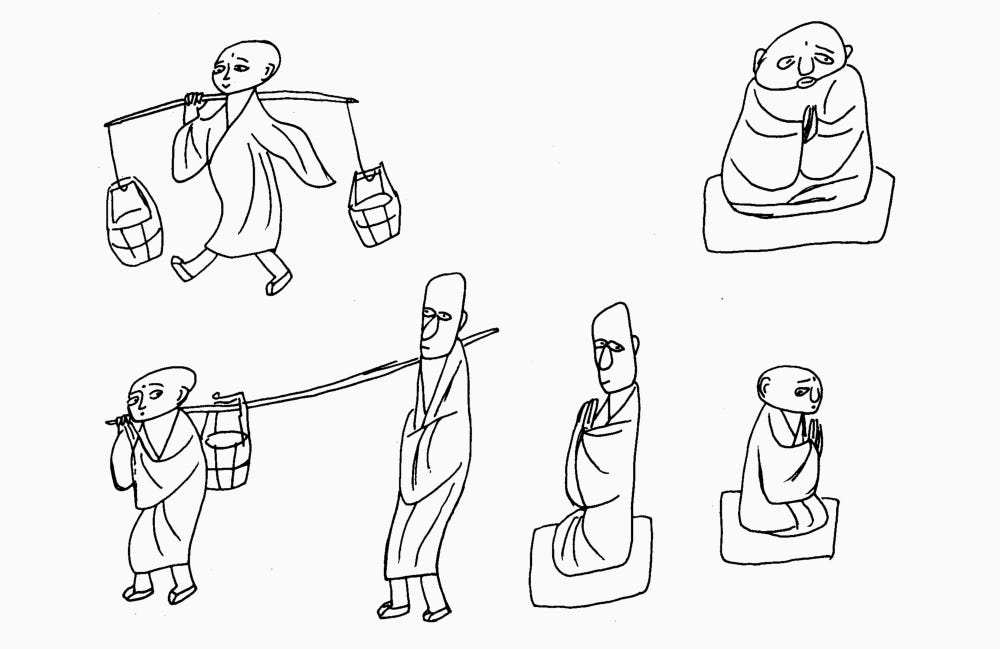
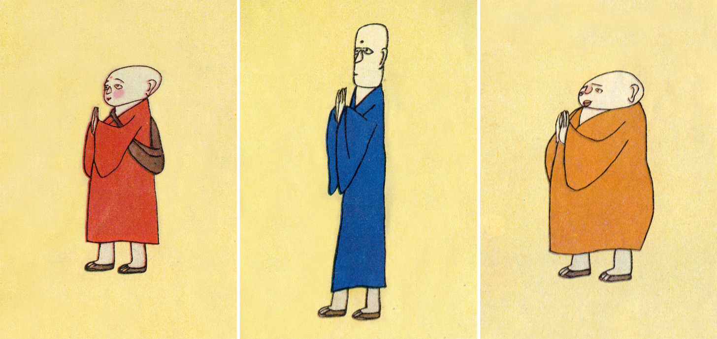
There’s the young, impressionable monk — short, and a bit of a prankster. He’s joined by an older, taller monk, who’s serious and rail thin. Then the big monk arrives, the most lovable and honest of the three. They express their personalities with every move they make, all synced inventively to folk music.
Slowly, the monks’ relationship breaks down to the point that none of them want to get water. Disaster strikes then, and they have to come together to save the temple.
At the center of this story is a proverb, widely known in China at the time. According to one translation, “One monk will shoulder two buckets of water. Two monks will share the load. Add a third and no one will want to fetch water.”
There’s a related saying in English — like A Da explained, “Too many cooks spoil the broth.”4 The gist is that more people produce worse results. Each additional monk makes them all more inefficient.
Three Monks subverts the proverb, though. It offers a message of hope. The trouble isn’t people, it argues, but a lack of unity between them. This was a call to the future that could be, and a warning against the divisions of the recent past. A Da said in 1984:
China has had many problems since the Cultural Revolution, and [this] film seemed like a good way of communicating the idea that we need to work together to reconstruct our country.5
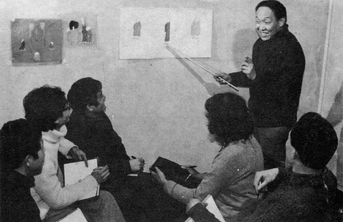
A Da came up with Three Monks in 1979, after catching a “cross-talk” performance (a bit like a standup comedy show). It seems to have attacked China’s bureaucrats — and the proverb of the monks was part of it. He realized that this proverb could be a film.6
So, the gears went into motion. A Da was a director at Shanghai Animation Film Studio, a state-funded animation workshop that employed hundreds. Its leader Te Wei liked his idea — as did Bao Lei, the children’s author who wrote the initial script.
The proverb is very simple: three unadorned sentences that suggest something larger. Bao Lei explored their subtext, telling a story about the monks’ daily routines of self-sufficiency, which he likened to Robinson Crusoe’s. A respected cartoonist, Han Yu, offered feedback on the script and designed the characters. He’s known for his rustic, naive line, which he brought to the cast.
Then A Da rewrote the script, with Bao’s blessing. He kept boiling it down. All the monks’ routines were removed save for chanting and gathering water. These two came to symbolize much more.7
That was the philosophy of the film in general. A Da felt that the proverb was so popular because it was “three almost duplicate sentences, humorous, full of implicit meaning, easily understood, concise and profound.” He wanted to make a film that followed the same path. Three Monks would use simple, repeated actions to arrive at humor, and to convey a message. The simplicity would contain complexity.
Take the film’s backgrounds, often bare. Here, the team brought up a concept from traditional Chinese painting: “using white as black.” In other words, using the blank white space of the page as part of the artwork. An artist’s black brushstrokes are only one aspect of an ink painting. The white spaces may not all be filled, but they also aren’t really empty. They show implied images — not rendered in black, but no less present. So it is with Three Monks, which suggests dirt roads, hillsides, floors, walls and skies with blank space.
A lot about the project was outlined verbally like this. A Da carefully chose 10 words to guide the team: Chinese, allegory, popular, modern, cartoon (manhua), witty, concise, comedy, movement and music. The film’s main animator, Ma Kexuan, came up with a few key phrases of his own:
Seek variation within simplicity, reveal layers within repetition, contain wit within plainness, find dexterity within clumsiness.
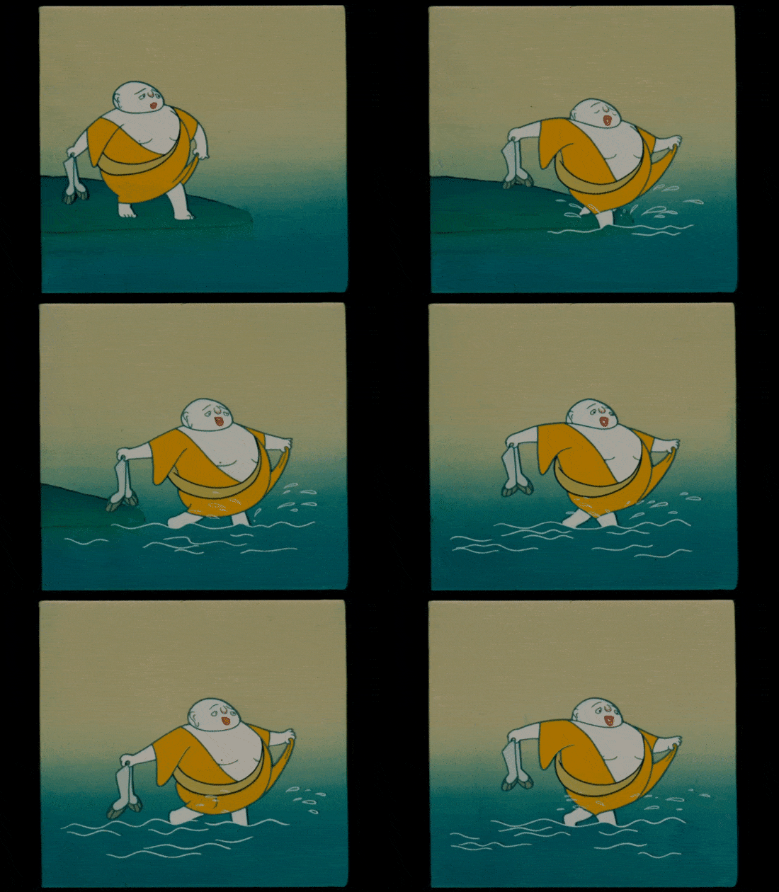
So much of Three Monks happens through repetition. Each monk performs the same actions, sometimes in cycles. But they do so in their own ways: when they sit in a circle and eat dry food without water, for example, they all choke differently. The big monk walks many times, but the context changes. He goes through a stream in a loop of wide, joyful steps — contrasting with his miserable trek in the sun just before.8
Like Ma Kexuan wrote, there are hazards with a film like this one. Repeated actions can be “monotonous.” As he argued, “In order to avoid monotony, we must search for diversity in simple unity.”
Another risk was the rustic quality of the art. In Ma’s words:
... the character designs of the three monks are exaggerated and terse, and, at a cursory glance, the squiggly lines seem to be drawn carelessly, freely and casually. … With “unpolished polish,” [Han Yu] creates a kind of “quick and free-flowing” simple beauty. If you don’t understand this, you will think that you can be careless when dealing with the images, that you can exaggerate without restraint, and it will be very easy to be slapdash and coarse.
Actions in Three Monks are simple, but they’re subtly varied. They’re repetitive, but not identical. They’re drawn in a rustic style, without spectacle or extreme exaggeration (one artist noted A Da’s request for animation that was “not over-the-top”), but they’re brilliant and imaginative.
With no words in the script, music is left to drive the action. After the storyboard was complete, but before the animation began, composer Jin Fuzai got involved. Everything would be timed to his score.
That score, too, follows the same principles. The characters’ themes are largely the same — but the feel of the melody shifts. Once again, there’s variety hidden in sameness. As Jin later explained:
… the Three Monks are three particular characters. How would the music express this? First, the musical style had to be characteristically Chinese, so we used only folk instruments, not even a hint of Western instrumentation. Second, the music on the whole needed to be light and humorous, not what we usually understand as Buddhist music, which is meditative and serious … Given these needs, first I laid out the monk theme … and used a different instrument for each monk. Why? I wanted to use pitch and tone to portray the similar images of the characters … Everyone can see that the small monk is smaller than the others … so I used the high pitch and tone of the banhu. The tall monk’s sound brings some tallness, so the sound is just a little bit deeper and the tone of a zhuihu emerges … The fat monk’s personality is straightforward and sincere, so the same monk melody is described with a guanzi. Playing a guanzi in folk music evokes a straightforward and sincere feeling.9
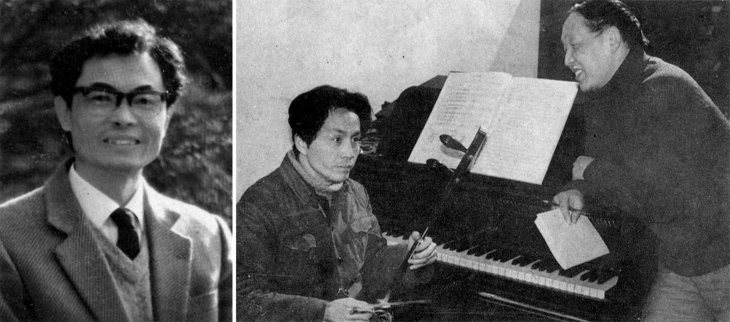
It should be said that a huge amount of analytical thought went into the music. The book From Three Sentences to an Animated Film, about the creation of Three Monks, dedicates around 40 pages to the theory and sheet music behind the score. It works so well for a reason.
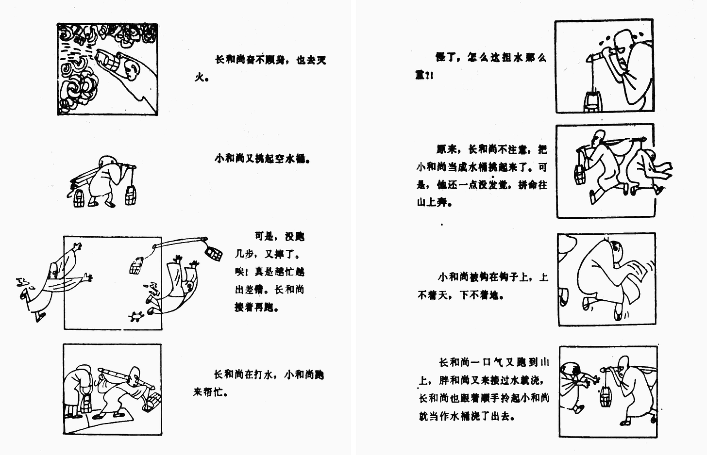
That’s the case for the film overall. It wasn’t just the director, Jin Fuzai or any single artist. Toward the start, A Da held brainstorming sessions with the whole team: everyone put forward ideas. That led to the scenes where the monks help animals, for example, to show their kindness. The same went for the dry food scene, and the scene where the smallest monk almost gets thrown into the fire.
Something as basic and straightforward as Three Monks shouldn’t, on the surface, be as incredible as it is. Watching a character walk in a cycle across the screen, or carry water in buckets against a blank backdrop, isn’t normally this much fun. It doesn’t normally mean this much. Thought and care made it irresistible.
This is a cartoon whose aspect ratio was reduced to a square — so that character animation could dominate, without making the rest of the screen feel empty. It’s a cartoon whose gags were polished to remove anything that broke the tone, even if they got laughs. A cartoon whose team discussed the differences between Western linear perspective and the “scattered perspective” of traditional Chinese painting, which they used. A cartoon that’s almost pure intention.
Three Monks was A Da’s favorite project he’d done. It became a favorite of many, both within and without China. You don’t need to know about the acclaim and awards to get it, though. It’s simple enough to understand on your first watch, and rich enough to watch a second time, and a third. And again and again and again.10
2 – Newsbits
We lost animator Marina Voskanyants (90), a Soyuzmultfilm great. Scholar Sergei Kapkov paid tribute to her career, which stretched back to ‘60s films like Big Troubles and The Bremen Town Musicians.
In America, Marvel and DC finally lost their notorious “Super Hero” trademarks, held jointly for many decades.
A new episode of The Amazing Digital Circus, produced in Australia, is out on YouTube and Netflix.
In Croatian news, vintage Zagreb Film cartoons continue to show up on the studio’s YouTube channel. Two more, A Doll and Perpetuum & Mobile, Ltd. (both 1961), appeared this week.
There’s a new interview with Swiss animator Georges Schwizgebel, who turned 80 last month. His ties to Chinese animation and A Da came up, as did his 1982 victory in Berlin, when he won a prize beside Three Monks.
At least three news sites were temporarily banned in Tanzania after sharing a short animation that questions the president, amid a crackdown on political dissent. You can see that animation via Facebook.
Anim-Babblers took an extremely in-depth look at the art and evolution of layouts in Japanese animation.
In Hungary, the Hungarian Folk Tales series is set to return next year with its first new season in more than a decade. Marcell Jankovics was reportedly involved in the latest episodes before his death in 2021.
Japanese animator Kazuya Kanehisa (Hai Yorokonde) has done a short for the NHK’s long-running Minna no Uta program. See a snippet here.
Kaku Arakawa, the director of many Hayao Miyazaki documentaries, spoke with Taiwanese journalists about becoming friends with Miyazaki, filming the difficulties of aging and more.
In America, to celebrate the 20th anniversary of Howl’s Moving Castle, Variety talked to its character designer and co-animation director.
Lastly, writer Andrew Osmond worked with us on a story about Watership Down (1978), and the fight behind the scenes that nearly sank it.
Until next time!
A Da discussed his Cultural Revolution experiences in Valley News (September 29, 1984).
From A Da’s essay in From Three Sentences to an Animated Film (从三句话到一部动画片). This book is our main source for today’s issue. It includes essays by most of Three Monks’ team, alongside articles written about the film.
From Ehrlich’s essay in Animation in Asia and the Pacific.
A Da made this point in the Rutland Daily Herald (October 5, 1984).
From the Los Angeles Times (November 27, 1984).
It was a cross-talk performance by Hou Baolin, a star. The title was The Monk (和尚), and Hou seems to have adapted it shortly after into an essay called The Monk and the Bureaucrat (“和尚”与“官僚”).
Critic Chen Jianyu called these actions “symbolic” in his famous review of Three Monks, included in From Three Sentences. Ma Kexuan described them similarly.
Ma Kexuan made these points in From Three Sentences.
From Jin Fuzai’s essay in Chinese Animation and Socialism.
Three Monks was the subject of one of our very first issues in 2021, but today’s issue is all new — drawn from sources we’ve accessed since then. This is one of our favorite films, and we’re happy to cover it again in much greater detail.


Enjoyed reading this. On my way to watch the film. I love the ideas of creating statements to govern their making of the film. As an artist working on my own short film. I'm sure to copy that idea.
What a delight. Some of the music during the storm scene, and the lashing motion of the tree, reminded me a bit of the disney cartoon “the old mill.”