Setting the Stage for 'Mulan'
A look into production design, plus animation news.
Happy Sunday! We’re back with a new issue of the Animation Obsessive newsletter. Here’s the lineup:
1) Inside Hans Bacher’s style guides for Mulan (1998).
2) Animation newsbits.
Before we start — on Tumblr this month, Neil Gaiman shared our Unofficial Art of Coraline PDF from last year and called the project “wonderful.” Really exciting to see. As always, the PDF remains free to read.
With that, here we go!
1 – A Disney version
A lot of thought goes into animated Disney movies. That’s easy to forget. Most of them seem to just exist, fully formed, by the time the public sees them. You can take something like Lilo & Stitch as a given. After all, how could it be different?
The truth is that a million little decisions built that film, just as they built Disney’s other hits (and its misses). Every detail had to be chosen at some point, from the story to the shape language, the colors to the camerawork.
That was the case for Mulan (1998), too — possibly the best film of the Disney renaissance. As a viewer, it looks like a seamless whole. But the team had to assemble it brick by brick.
A major member of that team was Hans Bacher, the production designer. He’s a legend now — in large part thanks to Mulan. On this project, Bacher defined the look of the world, the color, the staging of the shots and how the screen conveyed information.
He became the production designer in late 1994, as the search for a style was underway. According to Bacher, the team wanted to emulate traditional Chinese paintings.
“It still was supposed to be a Disney movie, but the studio wanted to come up with a story-typical style for the new projects,” he wrote. “It had been successfully done with Hercules, Aladdin and Lion King where art-historic and geographic elements had been combined and ‘Disneyfied.’ ”
What was the Disney version of traditional Chinese art, though? Bacher helped to answer that question. As his co-worker Chen-Yi Chang (character design lead) recalled:
I knew Hans Bacher before he came on the project, and I liked his stuff a lot. ... Hans was convinced you can do a film without too much detail that still looks “real.” It’s the same in a lot of Chinese art, especially the landscape paintings, in which everything is kept very simple. A lot of mountains are high in the mist, so details are omitted and your imagination fills them in.1
Bacher has summarized it as “poetic simplicity.” He unlocked its secrets as he worked: this film “changed my understanding of design completely,” he noted. To create the look of Mulan, he drew from Chinese painting and comics while analyzing Disney classics like Bambi — which rely on “pure empty stages for the action to follow.”2
There was a lot to learn, and he wasn’t the only one who needed to learn it. “It was a real struggle for most of the artists to come around to the strong graphic look Hans was pushing to establish,” said Ric Sluiter, the art director. Bacher had to lead the way and teach the team — particularly the layout artists working under his supervision.
He had to create a style guide.
Pieces of Bacher’s style guide for Mulan have circulated for decades, in varying forms. There were a few different versions of it. Even after the first one went into wide use by the team, he kept writing notes and developing his theories.
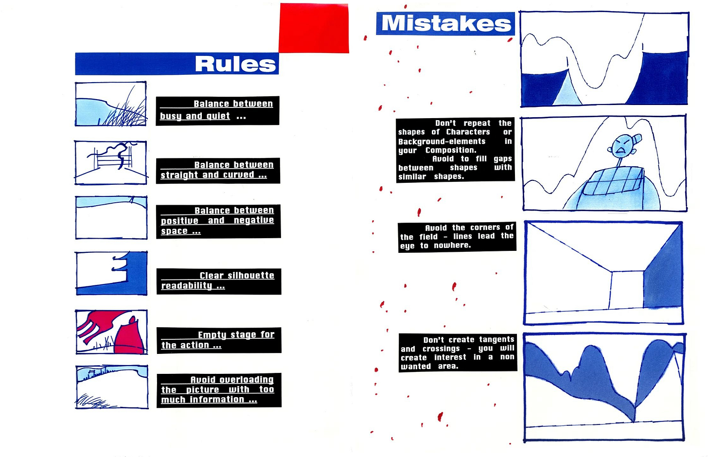
Certain ideas were fleshed out over time — but the bones were always there. On a page created early in the process, we find six core rules for setting up shots in Mulan. Although Bacher made slight changes to the list later, these rules still informed the final artwork in the film:
Balance between busy and quiet.
Balance between straight and curved.
Balance between positive and negative space.
Clear silhouette readability.
Empty stage for the action.
Avoid overloading the picture with too much information.
Bacher filled his style guide with small sketches to illustrate his points. And those points get specific. “Don’t repeat the shapes of characters or background elements in your composition,” he wrote on one page. On another: “avoid parallel lines, use different spacing, no straight lines.”
It’s a goldmine of insight into Mulan’s style, even filmmaking in general. Bacher takes time to break down shots from Cinderella — and to discuss the staging of Orson Welles, Eisenstein and other early masters of live-action film. The list goes on.
Although Bacher kept revising it, his style guide seems to fall into two general eras. First, the 1995 version that established Mulan’s production design for the entire team. Second, a version dated to 1997 that further explored his ideas (and that he may have created largely for himself).3
Below, you can read or download both of them via the Internet Archive:
Read 1995 version (or download)
Read 1997 version (or download)
These PDFs were cobbled together from pages shared by artists Chris Oatley, Shawn Seles and Andreas Deja — and especially by Bacher, who’s posted many on his blog and Instagram over the years. The guides are fascinating reads, worthwhile for anyone looking to understand Mulan, Bacher’s thinking or what design can do for animation.
For a little more on what that means, read on.
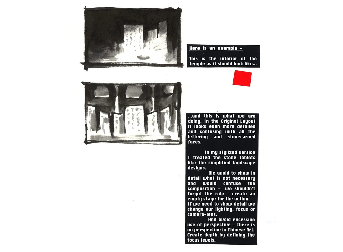
In his 1995 guide, Bacher wrote about the fight to keep Mulan on-style. Disney’s artists loved detail back then: shots crammed with information, and lots going on in the background. That wasn’t how traditional Chinese painting or illustration worked.
As a result, Mulan’s style kept melting in the early stages. Like Bacher noted in 1995:
My stylistic approach was and still is … “less is more.” That means to show detail when necessary and then in limited amounts and in harmony with the staging of the characters.
Unfortunately ... we [have] lost more and more of that idea.
He argued that they should rework certain scenes with his principles in mind. One was Mulan’s moment in the temple, which had gotten way more detailed than he wanted. As he wrote:
In my stylized version I treated the stone tablets like simplified landscape designs.
We avoid showing in detail what is not necessary and would confuse the composition — we shouldn’t forget the rule — create an empty stage for the action. If we need to show detail we change our lighting, focus or camera lens.
And avoid excessive use of perspective — there is no perspective in [traditional] Chinese art. Create depth by defining the focus levels.
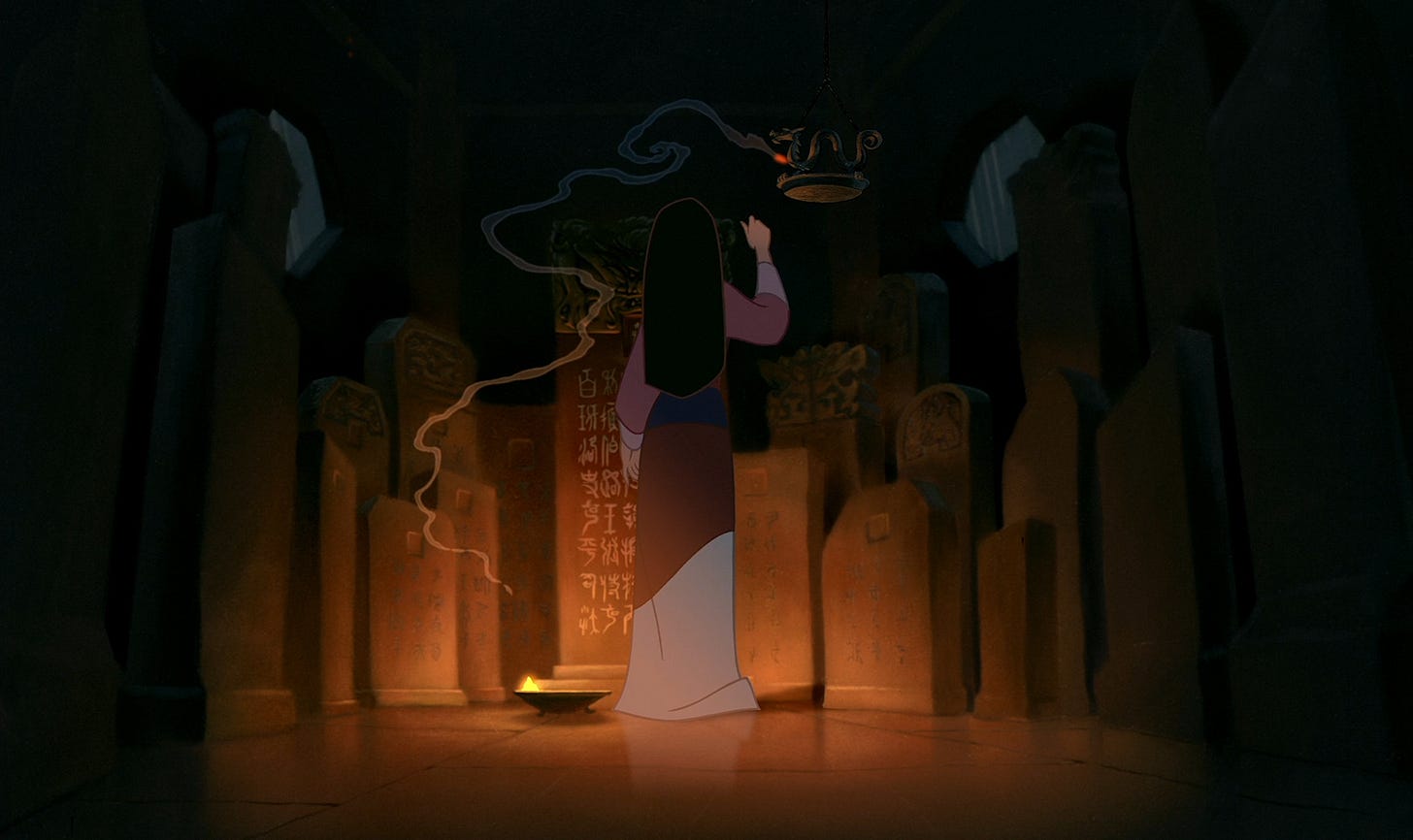
It’s a glimpse at how the sausage was made. Bacher’s proposal was much simpler than the scene that existed at the time, but it’s also simpler than the final scene in Mulan. The temple ended up somewhere in between — a compromise. That happened to many of the ideas he laid out.
Following Bacher’s style guide to the letter would’ve created a much starker, artsier and less accessible film than Mulan. That wasn’t what Disney wanted. Even Bacher was aware that “too much art would destroy the acceptance by the audience,” as he later wrote. This still needed to be “a commercial Disney movie.”
So, the film’s final look used Bacher’s principles, but it kept them subtle — almost invisible. Think of it as the Disney version of his guide.
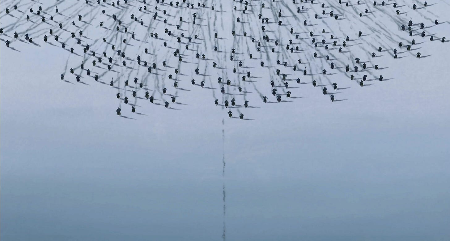
As one example, take perspective. There is perspective in Mulan, but it’s often an illusion that falls apart the closer you look. The landscapes aren’t truly realistic, and many shots are backdropped by mountains at impossible angles. When you’re watching, the effect hits on an almost subconscious level. Although the images feel unique and fresh, the reasons may not be clear.
The same went for Bacher’s insistence on limiting detail and using camera focus to suggest depth. At a glance, many of Mulan’s backgrounds look like standard Disney paintings. Yet there’s theory under the surface: detail often disappears into haze, and most surfaces are only lightly textured. Sometimes, background elements fade into little more than color shapes.
Each shot reads as normal — but it’s built on a ton of thought and design. The images are compelling, and our eyes go right to the things we’re supposed to see.
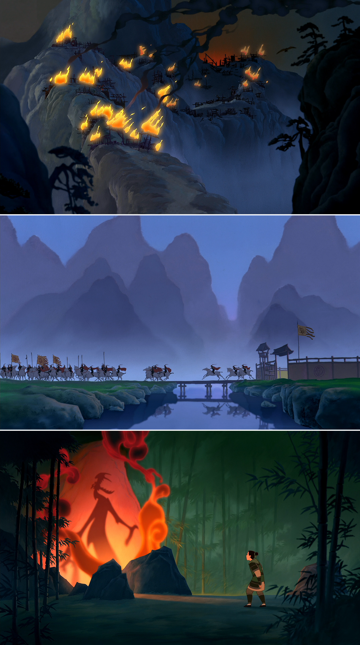
For example, take that last shot with Mulan.
In the background painting, there are no parallel lines or duplicate shapes. Even though a lot is happening on screen, the characters are given “empty stages” for their acting. Detail frames them but doesn’t intrude on the main area of action. It’s like Bacher once said about the Disney classics:
… they created a “stage” for the characters, so there was always an empty spot in some area of the background where there was no detail. It acts like a spotlight. In looking at the old backgrounds alone, it was as if there was something missing. And of course there is something missing: the character.
Alongside this, we get Bacher’s balances. There are busy areas and quiet ones (the detailed sides of the screen versus the smooth ground and hazy forest). Straighter shapes contrast with curved ones (see the bamboo). And there’s a careful arrangement of positive and negative space — note the darker, more detailed rocks that frame the “empty stage” occupied by Mushu’s shadow.
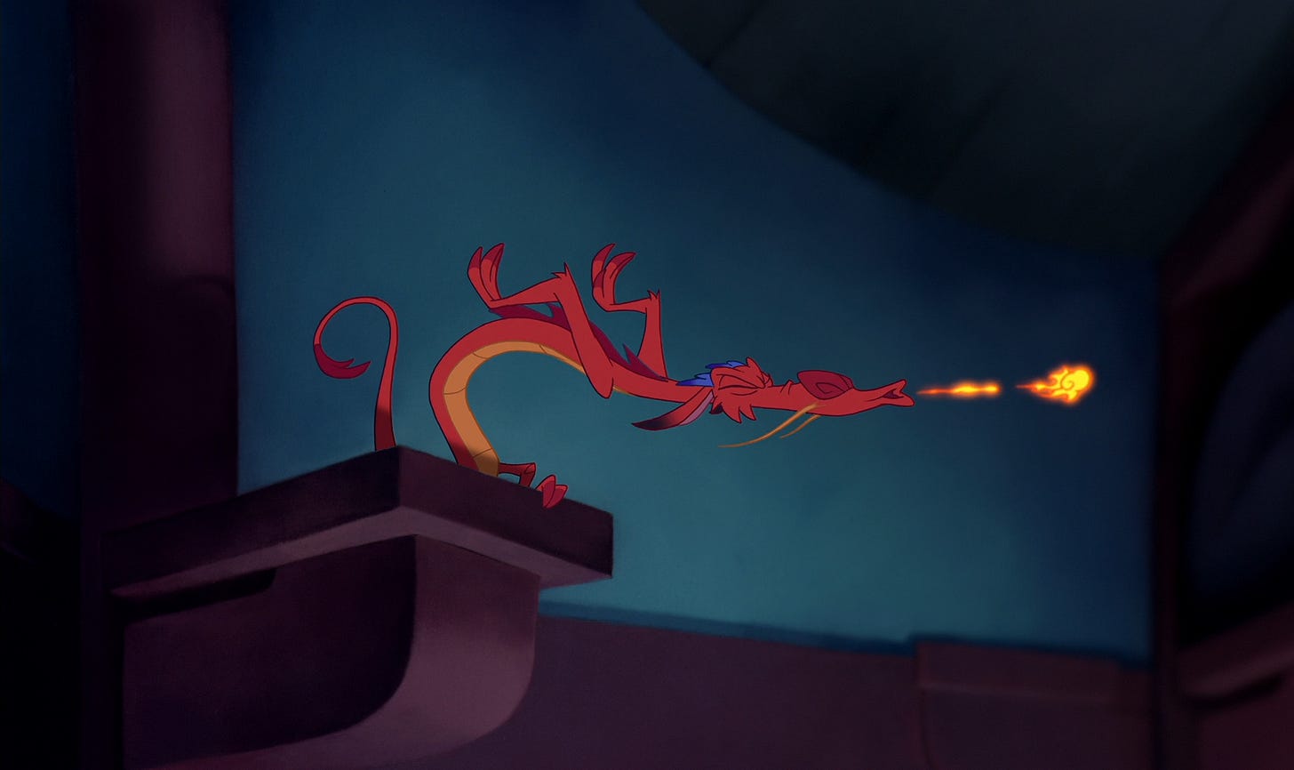
The shot below makes things even clearer.
Here, the background looks straightforward. It’s easy to miss — nothing stands out about it during the film. Yet all six of Bacher’s core rules are in effect. Look at it in light of his slightly revised list from 1997:
Balance between busy and quiet.
Clear silhouette readability.
Balance between straight and curved.
Balanced positive and negative space.
Empty stage for the action — don’t overload with information.
Rhythmic composition.
Above, we find curved areas balanced with straighter ones. Behind Mushu is another empty stage — the negative space of that blue wall. That’s balanced with the surrounding positive space (see his perch), which frames the screen with detail, arranged in a rhythmic way. And every silhouette reads clearly.
All of this was intentional. It was the kind of thought that Bacher had to put into Mulan: “I corrected hundreds of layouts and backgrounds,” he remembered. Without him, it would’ve been a different film.
The same is true of Chen-Yi Chang, whose character designs commanded the stages laid out by the production design. Bacher called him a “good friend” and an essential part of the project. “I could not have designed Mulan without him,” he later wrote. There’s a story there, too — about simplifying characters for readability, using shapes, borrowing from Chinese comics. It’s more of the thinking that built Mulan.
Again: while it’s easy to take a Disney film as a given, a million decisions created it. Bacher’s style guides offer a rare peek into a few of those decisions.
This can be eye-opening reading. For filmmakers, there’s a lot to consider. Bacher’s way isn’t the only way to design a film, but it’s definitely one way — and it worked here. Artists outside the film world can pull things as well from Bacher’s ideas on structuring images. Even for viewers, these guides reveal subtleties about Mulan that can enrich the experience. That was definitely the case for us.
We hope you’ll enjoy reading these guides as much as we have.
2 – Newsbits
Check out this remarkable preview clip from The Most Precious of Cargoes. It comes from the French director behind the Oscar-winning film The Artist, and a lot of the artwork was done in Hungary.
During an interview in Japan, director John Krasinski said, “Everyone has been influenced by Miyazaki’s work. I don’t think there is anyone working in this industry today who doesn’t know his work.” M. Night Shyamalan just praised Miyazaki as well.
Fatboy Animations in Kenya is going big with short, character-based animations on Instagram and TikTok. Founder Michael Muthiga says that he wanted to make “a cartoon [character] you can look at and say this is African.” See a couple of their hits here and here.
In America, the official art book for El Tigre (2007–2008) is almost here. Creator Jorge Gutierrez shared photos on Twitter, and it’s up for preorder on Amazon.
The newspaper El País published an English report on animation in North Korea — what’s been shown there, plus the local studio SEK and its involvement in domestic and outsourced animation.
A Brazilian series called Lupi & Baduki is headed to Max. It comes from the studio Flamma in São Paulo. See a trailer here.
India’s Vaibhav Studios (Lamput) went to the Cannes Film Market with its first feature, Return of the Jungle.
A Japanese documentary about anime producer Masao Maruyama (one of the industry’s most influential of all time) is now streaming for free with English subtitles.
Also in Japan: a huge breakdown of the use of visual effects and software (OpenToonz) in The Boy and the Heron, with many, many pictures.
Lastly, we talked about Peter and the Wolf (2006) by Suzie Templeton — and how she structured the whole film around Prokofiev’s music.
See you again soon!
From The Art of Mulan, quoted a few times today.
From Bacher’s book Dream Worlds, another important source.
Bacher wrote more about this on his blog. It’s worth noting that even the 1995 version shared today is (at least partly) redone from an earlier handwritten copy Bacher seems to have made. See a few pages of that one here.

I loved today's newsletter!! Always inspiring, thank you!
Fascinating! What a wonderful resource and great insight to a beloved and beautiful film. I so appreciate this!