Happy Sunday! Thanks for joining us. Here’s our lineup for the latest issue of the Animation Obsessive newsletter:
1) On Over the Garden Wall’s visual style.
2) Talking about The Remarkable Life of Ibelin with animator Rasmus Tukia.
3) Animation newsbits.
Now, let’s go!
1 – Ten years in the Unknown
Over the Garden Wall debuted exactly one decade ago: November 3, 2014. Since then, it’s become a fall staple — just as planned. “It was definitely intended to be a Halloween special that could be revisited every year,” the show’s creator, Patrick McHale, has said.
“[W]e hoped that the series could become some sort of cult classic,” he added.
It’s hard for a show to reach that status unless it stands out in a big way. But Over the Garden Wall does. It was a curveball for Cartoon Network — a self-contained miniseries with a single story to tell, a blend of comedy and drama and horror, all with a look and tone that were idiosyncratic even in the Adventure Time era. And it worked.
Cartoon Network is almost a ghost today — its old studio building closed, its website gone, its production slate thin. It’s been hollowed out by the troubles at Warner and in Hollywood generally. Rewatching Over the Garden Wall now, it feels like a remnant of a lost golden age for Cartoon Network Studios.
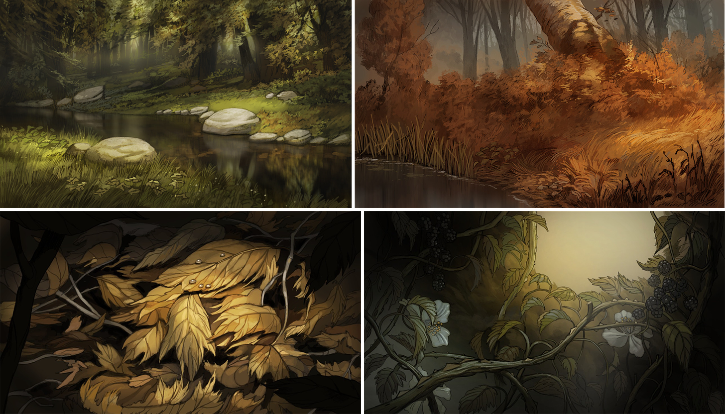
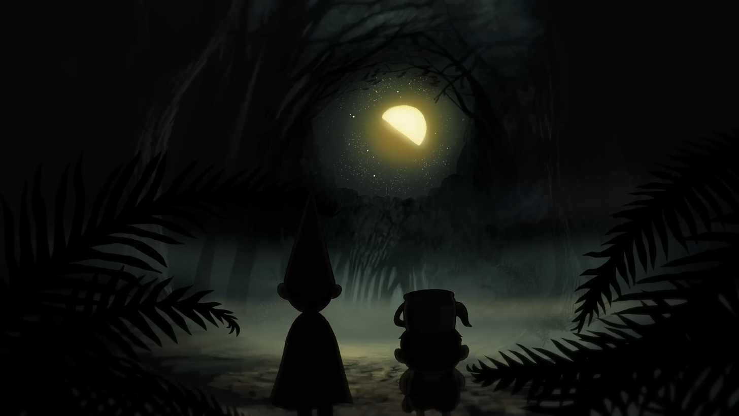
Which it is, in a sense. Yet it can’t be forgotten that this series was weird and risky even at the time. That included its famous visual style: the eerie, autumnal color palette and richly rendered backgrounds, and the design sense that balances turn-of-the-century illustration with Fleischer cartoons. It looks unique — again, even by the standards of the Adventure Time era.
The series’ art director, Nick Cross, has admitted that it really shouldn’t look the way it does. The team set a high bar with the pilot, Tome of the Unknown (2013), and went from there. As Cross said:
A lot of TV is done simply and cheaply. And Cartoon Network said to do whatever we want. So I just went crazy. It was time consuming, which is why most shows don’t look like Over the Garden Wall. For TV, it doesn’t work — you have to keep on moving and moving. Because I was working on the pilot, we had a finite number of backgrounds. ... But I was working really hard. And then when we went to series, it became a bit of a problem. Because we only did ten episodes, it was fine. I don’t think we could have done a full series. It would have been too much. We knew we were only going to do a one-hundred-meter dash, so we could run as fast as possible.1
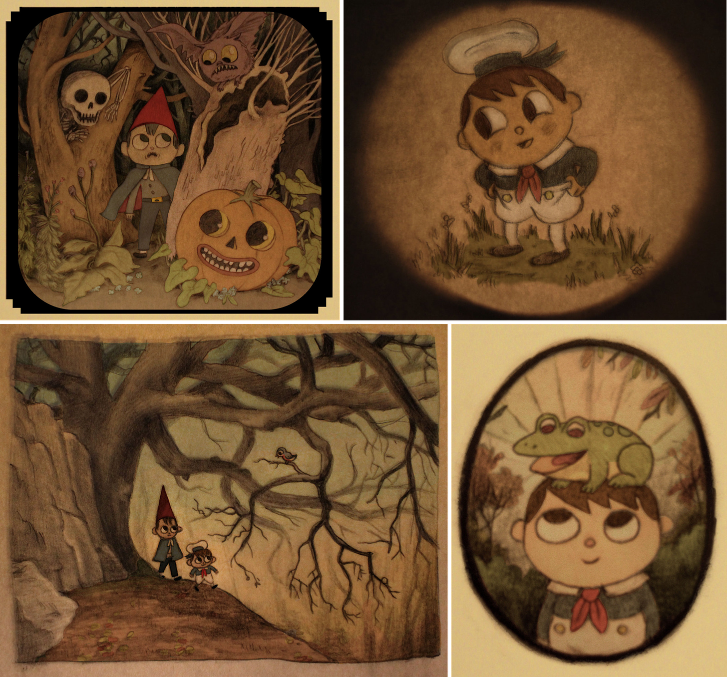
The show’s look is rooted in the ideas of Patrick McHale, and in the pitch for Tome of the Unknown that he put together in the mid-2000s. It didn’t take off at first — only years later would it become a pilot.
“When I was right out of college, I was pitching all sorts of different things and that was just one of them,” McHale said. Still, already, he’d landed upon the basic pieces of the aesthetic: warped Americana, old cartoons and classical illustration in the vein of Gustave Doré. And vintage postcards (McHale is a longtime fan).
When the pilot began, its art director was the veteran Sue Mondt (Dexter’s Lab). She’s the one who emailed Nick Cross, a Canadian animator McHale admired, with an offer to get involved. He agreed. “I received the first background design by Chris Tsirgiotis, in pencil and rendered. It looked just like a beautiful old Disney background,” Cross recalled.
He was obsessed with old cartoons himself — although his roots were in painting and illustration. Cross hadn’t studied animation in school, but he’d lucked into the industry in the ‘90s and had learned from there.2 In his spare time, he did personal animation with a retro style that resembles, in some ways, Over the Garden Wall’s.
As he said:
You end up feeling frustrated doing commercial work, of doing the same thing all the time. It’s a way to branch out ― to explore my own creativity. Generally, I work for a lot of TV shows, and it can get sort of repetitive. I get a lot of ideas and I need a way to let them all out. … I’ve gotten a lot of [industry] jobs from them. Like a lot more jobs than I would have gotten if I had never done them. People see my work, and then they’re like, “Oh, we want you to do something like that for our show.”
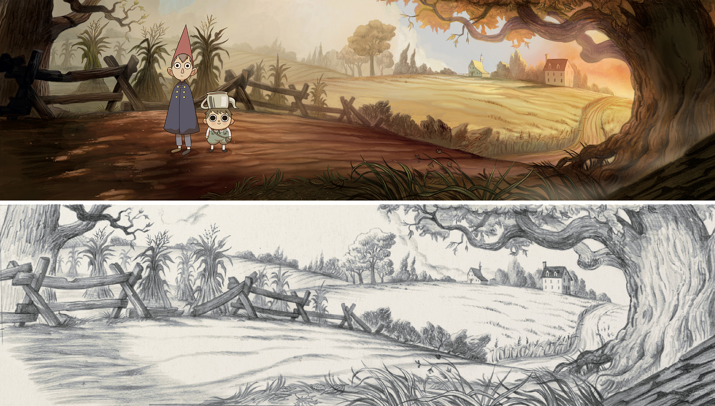
It was this stuff, the projects where Cross cut loose, that attracted McHale. In the end, Cross would paint all of the pilot’s backgrounds.
His personal style informed the look — as did the stack of reference pieces that McHale gave him. “Along with Gustave Doré,” Cross noted, “these included the work of Childe Harold, Edward Lear, Harrison Cady [and] Ivan Shishkin. We also used old chromolithographs for inspiration.”3
This was an industry job, but Cross encountered a type of creative freedom a bit similar to his personal work. That freedom kept up after Tome of the Unknown became Over the Garden Wall, with Cross now in the art director’s seat. He wrote that “Pat and the network were great and let me have pretty much free rein” in its style.
“I like things to look elaborate,” he said. That’s how he handled his own films, and it’s how he handled this show. Here was a chance to do “things that I always wished I could do in TV animation — like play with light and dark in a realistic and cinematic way.”
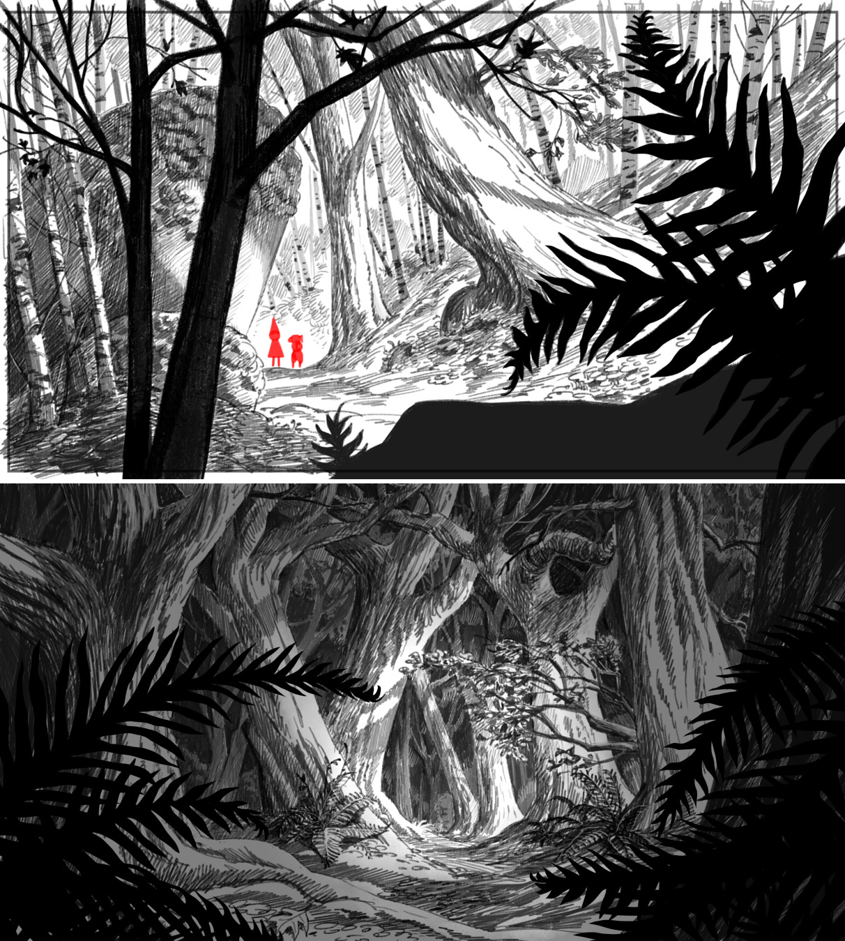
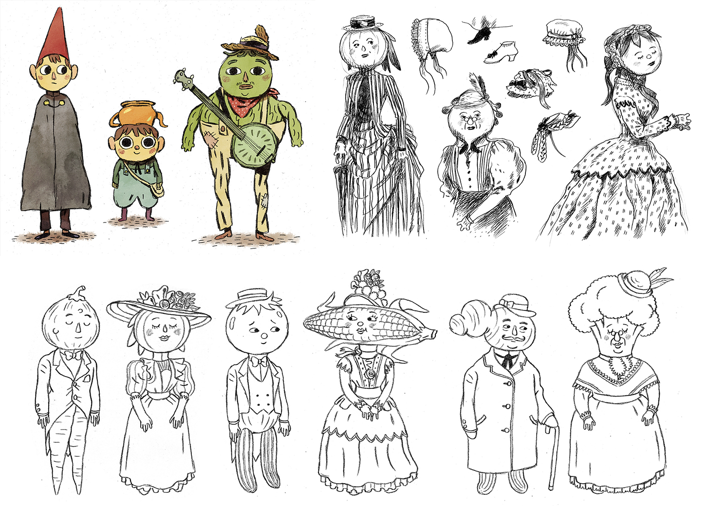
Cross didn’t define Over the Garden Wall’s visual style alone, by any means. The layouts of Chris Tsirgiotis and the character designs of Mikkel Sommer, to name two, were essential to the aesthetic. McHale gave Cross the bulk of the credit even then. “In terms of the overall look of the show, Nick … did most of the heavy lifting,” he said.
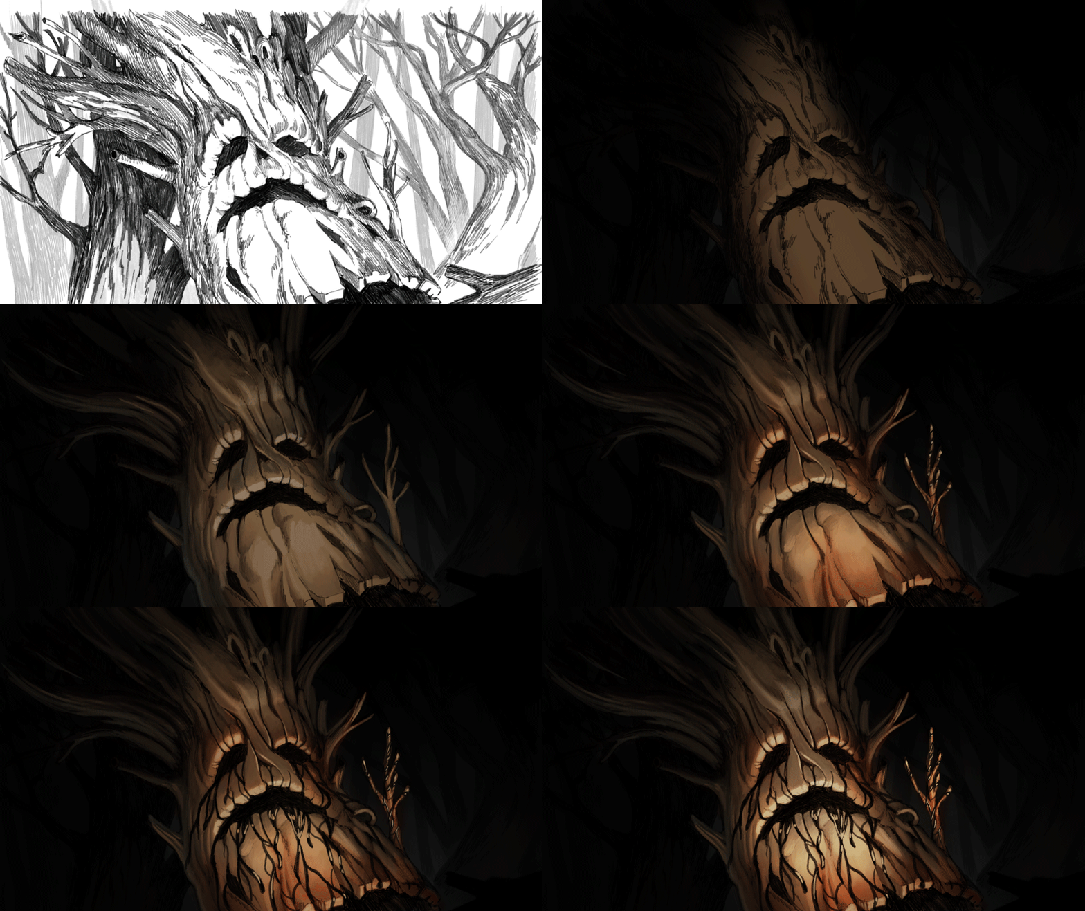
In the past, we’ve shared Cross’s detailed painting guide for the backgrounds. He also created a 72-minute video (embedded lower down) to demonstrate the painting process from start to finish. A key tic of his approach was the heavy use of black. Like he wrote:
… the idea of not using black in painting is actually a fairly modern convention. Historically, painters have always used black (in oil painting anyway). It was the Impressionists that first moved away from it since black theoretically doesn’t appear in the visible spectrum and that was what they were trying to capture. But I feel like it’s been sort of a rule ever since… even though people don’t paint like the Impressionists anymore. It’s sort of one of those crazy ideas that gets regurgitated in art schools by people that don’t necessarily know the reason why…
… [L]ong story short — since the style of the show is based on old paintings and illustrations, the color theory is more based in the academic style which traditionally uses black.
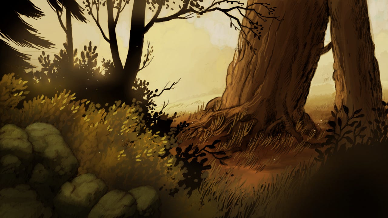
Especially for TV, the resulting backgrounds were (and are) extremely complex. Cross proposed digital methods to mimic oil techniques — like glazing — in his guides. Many steps went into each piece of art. For the second episode, the first produced, Cross painted the backgrounds himself. That set the template.
Which was only part of his job. He also animated a chunk of the series (watch), and worked on the storyboards, and designed characters, and contributed layouts. Cross “was constantly saving the day,” said McHale.
“I … did a lot of the work myself,” Cross acknowledged, “because it was tough to find people who could, and it was asking a lot of artists and the overseas studio. So we hoarded a lot of work to make it easier on everyone.” This was an option because, again, Over the Garden Wall was a sprint — not a marathon. The odd miniseries format made it possible.
Sprinting was difficult enough on its own. Many compromises were made to hit deadlines and to keep the series’ length in check. A few weeks before the November 3 premiere, McHale called the show “torture for me to watch at this point.” In the years since, he’s been open about his problems with it.
But it was also true that the team got the freedom to attempt the show they wanted to attempt. “It felt like we were making an independent film in a lot of ways,” Cross said. Even working in TV, and with an outsource studio in Seoul, the show stretched the limits of the standardized pipeline on which TV relies for its survival. The California team planned it and the overseas staff went above and beyond to execute, as McHale remembered:
Digital eMation came on board to animate the miniseries, and they really put their all into the project to make it special. A lot of their work was just perfect right from the start.
Over the Garden Wall’s look isn’t the only thing that made this show a modern-day classic. There’s a lot to love here: the story and characters, the music and voice acting, the one-of-a-kind strangeness of the pacing. Even the smart way it caters to all ages. (McHale called the series “an attempt to trick kids into liking stuff that they’d normally think was boring and old, and to show adults that kids’ entertainment is more sophisticated than they think.”)
It’s a whole piece — in which the look is one essential part.
This is the type of show that’s always been rare: a daring, original idea, a great team and full support from management to make it real. We’re living through a time, right now, when that third thing is in especially short supply.
A decade ago, Over the Garden Wall was an unusually big risk for TV, but it was a risk taken. In 2024, as Hollywood executives shrink the animation business and slow-walk a new contract with The Animation Guild, there isn’t much of an appetite for this sort of show. And that’s a loss for everyone, major studios included. If Hollywood doesn’t take risky bets on artists and their most exciting projects, it settles for a future of ever-diminishing returns on yesterday’s ideas.
That’s worth remembering as we look back on this series — which has now survived 10 years as a perennial favorite. A lot of series don’t, but a lot aren’t this unique, this unsafe. Like Nick Cross said, the studio:
… wanted to do it, so they were willing to try something different and take a risk. None of us actually knew how to make a mini-series. It was like making a feature in chapters. We figured it out as we went along, which was weird because CN just… let us do it? It felt like we were getting away with something. Personally, I was excited to make something that hadn’t been done on TV before. It felt like proving a point.
2 – Animation news worldwide
Animating Ibelin
The animated documentary is an undeniable force of the 2020s. Consider Flee, nominated for three Oscars a couple of years ago. Consider City of Ghosts or Maalbeek or, recently, American Sikh.
The Remarkable Life of Ibelin joins this group now. The film came to Netflix late last month and is one nobody should ignore.
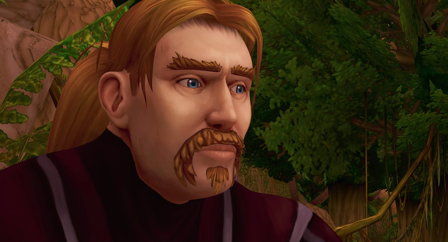
Its subject, Mats Steen, passed away in November 2014, at age 25. He had Duchenne muscular dystrophy and spent many years indoors. Secretly, though, he lived a full life online. He was a World of Warcraft player. The game was his place of belonging, through which he touched many people. Ibelin was the name of his character.
Director Benjamin Ree sifted, painstakingly, through tens of thousands of pages of messages, diaries and blog posts to reconstruct Steen’s experiences online. He reached out to Steen’s internet friends, met them in person. It’s one of the first films to treat online life fully as real life. And it’s beautiful.
Animation enabled it. Beyond the home movies and interviews, the documentary needed to show the stories that took place inside World of Warcraft. A YouTube animator named Rasmus Tukia, a longtime creator of Warcraft fan films, got that job.
“I joined maybe one-and-a-half years into the project,” he tells us. “That’s kind of when Benjamin knew that they wanted animated parts.”
What followed was at least a year and a half of pre-production, as they hashed out exactly which scenes to animate. The film very much came together in editing — Tukia’s scenes spent this period as animatics and previz.
It was an iterative process. They needed, Tukia says, to find moments that “gamers and people who don’t game can both understand.” A 10-minute scene meant for the climax ultimately got cut down to maybe 20 seconds, for example, because the emotions weren’t readable to people outside the Warcraft community.
With the content finally nailed down, it was time for Tukia to animate:
Once the blocking and splining phases started, I spent the rest of the remaining seven or eight months on purely just doing that. And at the time, we had a bit of a time crunch, and I had to, at some points, animate up to six shots a day ... I had some days where I had 10-to-12-hour sessions of just animating. I used a lot of reference footage of myself. ... If you go into my phone library and look through that period of time, all you see are references of myself doing various animations. You could probably stitch together the whole movie [out of those].4
Tukia is a freelancer who learned animation in his own way. He notes that he’s “never actually worked at an animation studio,” that his style is one he developed himself. It’s also the one he used for the film, and his comfort with it is likely what allowed him to finish his work on schedule. “I know that it is considered a fast process to make 40 minutes by myself,” he says — even though he approached the film “as a normal job.”
He explains his thinking behind Ibelin’s animation:
I’ve always been inspired by the Warcraft animations, and that’s kind of why Benjamin felt that I was a perfect fit for this film. … Benjamin gave me free rein to animate however I wanted to. So, it’s done in the style that I’m used to, and that’s the thing I’ve kind of always done. We also had to study Mats, and that we could do with all the logs, his blog and all of the material we had access to, to make sure we actually represented him and his friends in a good manner.
Another key was to represent World of Warcraft accurately, so that Steen’s actual experiences would come across to the viewer. Tukia again:
It was really important that we maintain the [game’s] style because, after all, this is supposed to be a project that is super authentic to the game. It’s not an animated movie; it’s an animated representation of the game, which happens to be in a movie. So, we didn’t use certain effects. There’s no, for example, depth of field. All the VFX are very game-like. The lighting style is very simple. We could have made it [look] really good, but then again, it wouldn’t feel authentic to the game. Same goes for the animations — they wanted it pretty simple, and that’s what I gave them. If we could boil all the animation down into one word, then it would be, “Authenticity.” We really wanted it to keep the same style of the game, while also representing Mats.
To close out the interview, Tukia tells us about his experience of watching the completed film:
The very first time I actually saw the final cut was when it premiered in Norway back in March. And that was not a small event. We went to Oslo’s biggest cinema and the Norwegian Prime Minister was there as well. I’m like, “What the hell?” But most importantly, Mats’ friends, the community he was a part of, were there. And, of course, his family as well. And there was this big, big cinema screen that we had for the evening. It was really humbling and a bit overwhelming. When you work on a project for a long time, you get a bit blind to it. You start questioning if the work you’re putting in is, like, good anymore. As a result, I can’t have a fresh experience, like a first-time viewer. But, watching it there in the cinema, I kind of got close to that. And even I, who had seen the movie like a million times, started crying at the end, just because of the collective atmosphere in the room. So, that was really… that was really amazing.
You can watch The Remarkable Life of Ibelin on Netflix. It’s highly recommended.
Newsbits
We lost art director Hiromi Kono, an industry veteran who worked on Paranoia Agent, Carole & Tuesday, Perfect Blue and many more.
One from Argentina: check out the short pilot for Ele, about its creator’s experience of raising a young daughter who has Down syndrome.
In England, the singer Kate Bush has written, directed and storyboarded an animated short called Little Shrew, set to one of her own songs. See it on YouTube.
Speaking of Over the Garden Wall, England’s Aardman created a three-minute stop-motion short for its anniversary. That’s on YouTube as well.
The French director Michel Gondry (Eternal Sunshine of the Spotless Mind) is making an animated feature film about his daughter. Check out the trailer here.
In America, the industry writer Greg Nix (Glitch Techs) has launched an independent animation called Please Give Me an Oscar Please via his Substack.
Animator Alexander Petrov (The Old Man and the Sea) went to China in recent days, where he picked up a lifetime achievement award from the Beijing Film Academy.
An interesting YouTube documentary, Also for Grown-Ups, has profiled up-and-coming animators in South Africa.
In South Korea, the prestigious Bucheon Animation Festival handed a grand prize to I Died in Irpin by Anastasiia Falileieva (Ukraine). According to Animation Magazine, it’s now qualified for the Oscars. See the trailer here.
Lastly, we discussed animated films about flies.
Until next time!
As quoted in Art of Over the Garden Wall, our main source today.
For more of Nick Cross’s biography, see his interview with the AHAA Podcast.
Another inspiration for Over the Garden Wall was Yuri Norstein, according to McHale.
Tukia’s comments have been edited for length and clarity.


Wow! To get a mention in one of my favorite newsletters, in an issue about one of my favorite shows, slotted right below one of my favorite directors -- it's an honor. Thank you for the shout out, Jules and John!
I love this show. Its our 1 remaining holiday special that has survived my children's teen years. I'll never tire of it. It is brilliant. You did a great job here discussing it.