Welcome back! This is a new Sunday edition of the Animation Obsessive newsletter. Here’s our agenda today:
1️⃣ The roots of Miyazaki’s filmmaking.
2️⃣ The week’s animation news.
For those just finding us — you can sign up to get our weekly Sunday issues right in your inbox:
Now, here we go!
1: A sense of reality
The Boy and the Heron is Studio Ghibli’s biggest opening ever at the American box office. It reached first place in the country over the weekend — right now, estimates have it above $12 million.
Hayao Miyazaki is 82 years old. He’s been animating since the 1960s, and directing movies since the ‘70s. No one in animation has stayed so relevant for so long — or maintained such a power to make new films that speak to new generations across so many decades.
He’s never stopped evolving. It’s more than the flying machines, the weird creatures and the detailed food — as wonderful as they are, they come and go depending on the project. You can’t reduce his work to any single formula. But you can say that his films always feel uncannily real and present.
And that’s tied, in many ways, to Miyazaki’s approach to time and space.
He’s talked about it. During the press tour for Princess Mononoke in the ‘90s, Miyazaki contrasted his style against other Japanese productions. As he said:
The major source for Japanese animation is manga, whose greatest characteristic is its method of expression centered on emotions. In order to express emotions, space and time are freely distorted; in effect, manga does not deal with realism. Anime has changed as it has been influenced by manga, becoming stereotypical and locked in its own enclosed world. ... We [at Studio Ghibli] have consistently tried to make “films,” not “anime.” That is, to express time and space with more universality. We try to find ways of representation understandable to a country grandpa watching our film for the first time.1
In that interview, he didn’t get into specifics about what he meant. How do you “distort” time and space, or convey them with “more universality”? The thing was, he was revisiting ideas that he and his friends and colleagues had discussed for years.
In Miyazaki’s tirade against the anime industry in the late ‘80s, we find these points about manga, time and space again. For him, most anime projects had long since accepted:
… a deformation not only of the designs of the story’s cast and their characters, but of time and space itself. Animators would almost endlessly stretch the time it takes for a baseball to leave a pitcher’s hand and slam into the catcher’s mitt, putting all their passion into depicting the ball and then pursuing this stretched instant as a powerful new form of movement. Similarly, people began to rationalize their depictions of the small confines of a boxing ring as a virtual battlefield, because they believed that to the protagonists the ring was in fact a virtual battlefield. … The technique of making drawings move was thus used to emphasize an extended and distorted sense of time and space … Drawing a character’s subtle but ordinary gestures — something that animators had never been very good at anyway — was actively eliminated as an unnecessary and old-fashioned practice; instead, depicting extraordinariness became the ultimate goal.2
Miyazaki was angry at the time — you don’t have to agree with his criticisms. He didn’t necessarily agree with them, either. Right afterward, he admitted that plenty of exceptions existed, and that there were those who “tried hard to depict both space and time in a realistic way.”
But the quote is enlightening because it offers a clue about his own philosophy of filmmaking. For Miyazaki, action needs to happen in concrete time and space — you can’t treat this stuff like moldable clay. On a deep level, it’s a dispute about directing styles.
Miyazaki has argued many times about the value of concreteness. In the ‘70s, he said, “Lies must be layered upon lies to create a thoroughly believable fake world … when depicting a world with three suns, you have to construct a world that will seem to the viewers like it could have three suns.”
Or, in the ‘90s, “We are creating a fabricated world and everyone knows we can draw anything we want, but if we aim to give a sense of presence to that world we must approach it with humility toward things other than human beings.”3
Those theories weren’t exactly his own invention. By middle age, when he started to direct, Miyazaki had already spent the ‘60s and ‘70s working under Isao Takahata. And these projects helped to imbue Miyazaki with his sense of time and space. The root of Miyazaki’s filmmaking is Takahata’s filmmaking.
Takahata is known for Grave of the Fireflies and Heidi, but he never attained Miyazaki’s fame. Plenty of his classics (Gauche the Cellist, Chie the Brat) haven’t even come to America. But he was an astounding director and analytical thinker.
He started testing concrete time and space on his first film, Horus: Prince of the Sun (1968). Takahata directed it at Toei Doga in Tokyo — Miyazaki was a main artist and animator on the crew. The project was life-changing for team member Yoichi Kotabe. “With animation,” he realized, “you can create a world you can grasp with your hands.”4
Takahata’s book The Visual Expression of Horus (1983) put the philosophy in clear terms. In the years after his Horus experiments, Takahata wrote, he “pursued ‘spatial and temporal continuity’ and ‘a sense of reality’ ” in projects like Chie.
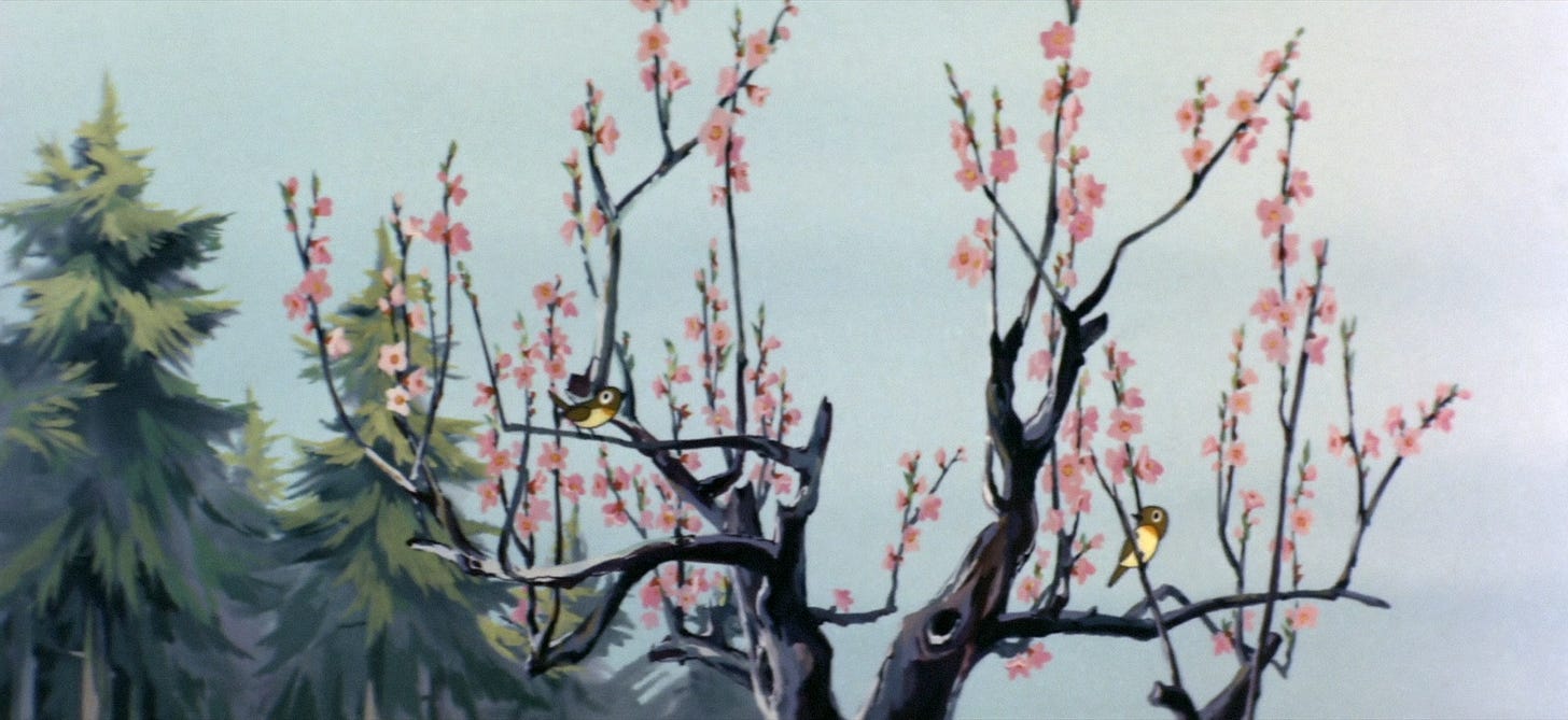
From Horus’s starting scene, Takahata tried to make viewers feel that this world and its events were somehow real. As he wrote:
Audiences get their first impression of a work from the opening, and they decide what kind of attitude to take toward it from then on. … I want them to accept the film that’s about to start as something that really happened, even if it seems like a lie. I want them to actively observe the events that play out one after the next, and take a close look at the development of the content and the actions of the characters …
For example, in the first shot, the camera is positioned right in the middle of the space where the events are unfolding, and the extreme long shot, the sudden close-up and the vertical movements from “long” to “in front of the camera” are all captured in a single shot that’s linked temporally and spatially. And in each shot that follows, except on special occasions, the action is connected in sequence … It may feel hard to catch your breath, but that’s the aim: it’s the result of trying to create a sense of reality and presence by giving the action temporal and spatial continuity.
Below, you can watch the moment he described:
These goals — the sense of reality, the continuity of space and time — were bold. And Horus achieved them imperfectly: it’s an early work full of rough edges. Still, it was a proving ground for the team. Takahata (and Miyazaki) took its lessons to heart.
The easiest way to understand the style is to understand what it opposes. Both Takahata and Miyazaki contrasted it against “montage.” That method appeared often in the anime of the ‘60s, ‘70s and ‘80s — using spatially and temporally disjointed shots to build an overall impression. It goes back to manga, to the more adult gekiga and to Sergei Eisenstein, an all-time master director whose work Miyazaki despises.
Here’s Miyazaki:
Japanese films [today] are boring because they are not infused with multiple meanings on the screen. I think this is because Japanese culture overall has become like gekiga, or graphic novels. The methodology of gekiga is similar to the most worthless type of montage. The Russian director Sergei Eisenstein, who made Battleship Potemkin (1925) in the early twentieth century, promoted what he had done as montage theory, in which the way shots are connected creates a greater meaning than a mere sequential lining up of shots. I think montage theory is a totally worthless theory, and films that are made in that fashion are the worst kind. [laughs]5
Miyazaki is vocal about his dislikes, but this is strong even for him. Still, it makes a kind of sense — given that montage is the opposite of his whole filmmaking ethos. Takahata had developed a way to depict a concrete series of actions in Horus, and they both kept using it from there.
Like Takahata wrote in his Horus book from the ‘80s:
In the scenes ... of the wolf battle and the slaying of the monster fish, the montage technique now in full bloom in Japanese animation does not appear at all. Various shots are discarded that would be effective at creating a sense of rhythm — like intense alternating cuts between opponents, a close-up of the axe involved or following the legs of a running wolf — and the actions are just connected in a way that’s bluntly honest. Instead of trying to express something mainly through the power of katto wari (montage), we first thought about what Horus and the wolves or the monster fish were doing, and what kinds of events were occurring, and then exposed the whole thing before the audience in a, so to speak, play-by-play style (except that the camera position could be freely chosen). It relies only on the compelling reality of the action itself, and on a spatial composition with a strong sense of presence.6
Takahata didn’t hate montage (Horus uses it on occasion), but he believed that this kind of “temporal and spatial continuity” has more power to sway the audience.
He gave an example — what if the first shot of Horus could be done in live action? “Director A” films it so that everything plays out visibly and in sequence, while “Director B” finds this boring and spices it up with a barrage of flashy insert shots. For Takahata, the first approach wins because it immerses the audience. They see the action unfold without interruption, and it feels like a real event that filmmaking trickery could never engineer.
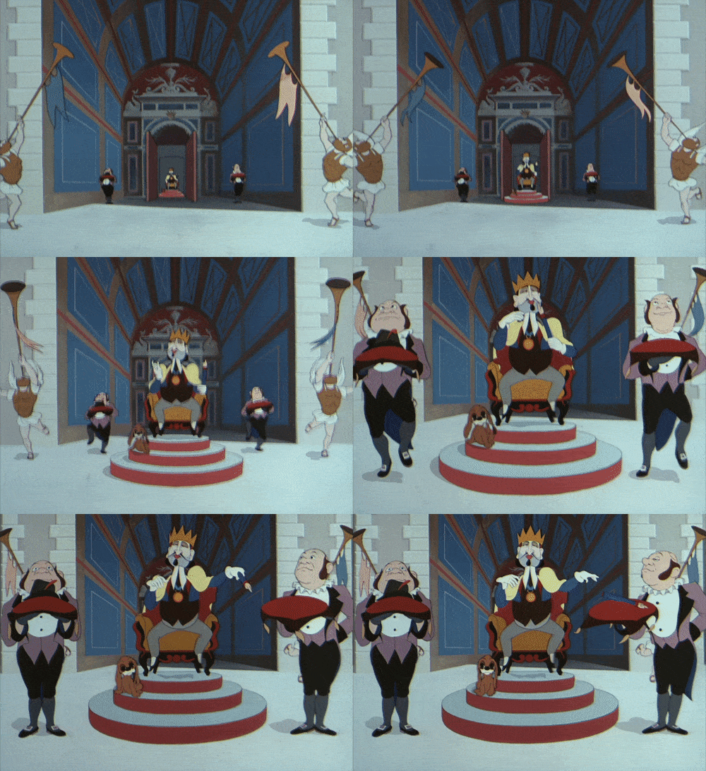
Some of this style comes from Akira Kurosawa — one of Miyazaki’s main influences. But it’s also based on The Shepherdess and the Chimney Sweep (1952), known today as The King and the Mockingbird, the animated film that most impacted Takahata’s early career.

When Miyazaki saw that film at Toei Doga in the ‘60s, he felt “that the sense of space was very interesting.” Compared to Toei’s animation, its world is “more close-knit and has a sense of presence.” The space feels physical, almost tangible. Each location is carefully built, and you sense that the characters actually travel through it.
At the time, the Toei team called its own animated stories kushi-dango, or skewered dumplings. Each one was a series of loosely related incidents, set in vaguely defined worlds. But they labeled The Shepherdess and the Chimney Sweep as misshitsu, or “closed room.” Like Miyazaki said, “Closed room is the type where you create a bit more of a detailed world and complete [the story] within that world.”7
Trying to match this sense of grounded reality and space was a major inspiration for Horus. But it stayed in Takahata’s and Miyazaki’s work even after they left Toei.
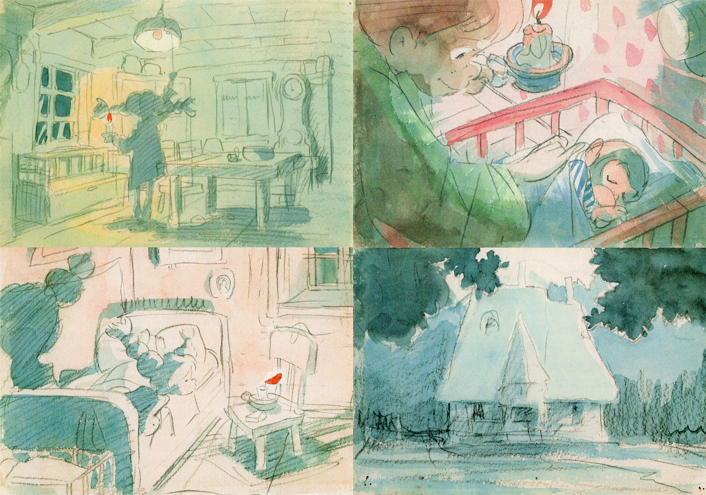
When they and Yoichi Kotabe got hired to do an animated Pippi Longstocking series in the early ‘70s, Takahata wrote a document to guide the production. He wanted this Pippi project to feel real, and he cautioned against using visual “symbols or rote patterns,” the kinds of hackneyed cliches that would take away from its believability. And he wrote this:
Regarding the world around Pippi, we must clearly set up the mood of the interior, the configuration of the furniture, the positional relationship between Villa Villekulla and the town, and so on.
And this is especially important: instead of POV-based or action-based cutting, the storyboard must design the stage direction within the conditions of the setting, and take advantage of the setting. I would like to see a kind of stage direction and shot composition that allows children, in the same way that they know their own homes and surroundings, to naturally become familiar with the setting and to feel Pippi’s world as real. A storyboard with literal continuity.8

Takahata was seeking “a sense of reality” like the one he’d attempted in Horus. Although Pippi was canceled, he kept going down the same path. On Heidi in the mid-1970s, he collaborated with Miyazaki to craft a style of camerawork that went (yet again) for that “sense of reality.”9 Miyazaki was his layout artist for the whole series — he’s been compared to a cameraman.
Miyazaki and Takahata saw their styles diverge somewhat in the late ‘70s, as Miyazaki became interested for a time in zanier, cartoonier projects. What didn’t change was the concreteness of Miyazaki’s work. Even at its furthest-out, he stayed obsessed with the feelings of continuity and reality that had Takahata under their spell.
“So these crazy, innovative concepts got turned into visuals. But the technique he used to do it is very solid,” said Miyazaki’s mentor Yasuo Otsuka. “The timing is precise. The visuals have immediacy. Technically, it’s not realistic. But it has impact. It feels like it could be real. The timing and the poses.”10
In the Horus book, Takahata described the core difference between Miyazaki’s solo work and the montage approach:
If a full shot clearly shows a human leaping five meters at once, it becomes cartoonish, and people will either laugh or be put off. However, by cleverly flashing and stacking fragments of the jump, and then ending with a cool landing, people will be satisfied with the sensation or find the spectacle itself interesting. … By the way, what if these superhuman activities are performed with a focus, simultaneously, on a sense of reality and spatial continuity? With all his might, the person makes a great leap with ferocious energy and a superhuman spring. If you show it clearly, with a sense of reality on the thin line bordering absurdity, the audience accepts it as a strong reality inside a ring of lies, and they’ll be able to admire and relate to the character while laughing at the same time. Such characters often appear in Hayao Miyazaki’s works … Even when creating scenes that make people laugh, Miyazaki always has a sense of physical reality, and he was one of the most important staff members on Horus: Prince of the Sun.
2: Global animation news
Making an animated film in Nigeria
This past week, a new project got our attention. It debuted on YouTube last Sunday, it’s called Hanky Panky and it comes from a team based in Lagos, Nigeria.
Hanky Panky is about an uncomfortable phone conversation in a car. The main character, Osas, is stuck in Lagos traffic with her friends — and her aunt calls about the Instagram videos that Osas has been posting. She’s dancing with another woman.
It’s three minutes long, but it builds genuine tension and emotional investment. And it’s really nicely animated: the work on Osas in particular is expressive, fresh and solid-feeling. The film does a lot with a little. It feels like a snapshot of the modern-day Nigeria that so often goes unshown in media.
In fact, lived experience was the starting point. “It was inspired by real events!” explains co-director Opemipo Aikomo. “I was in the car (the guy in the back) when this happened.”
Aikomo was kind enough to answer a few questions about the project. He told us:
At the time, I was looking to make an animated film and just needed a story. I really love animation and want to see more Nigerian stories told through this medium, so I decided to find out for myself by making a film and documenting the process.
Aikomo produced a documentary short about the creation of Hanky Panky and covered the film’s two-year process in a series of articles on Medium. It was a bootstrapped thing. “Everyone on the team is either my friend or someone recommended by a friend,” he says. “I hired people as needed and directed production remotely over two years using Basecamp for documentation and WhatsApp for comms.”
The studio (or creative collective) behind this film is Wuruwuru, which Aikomo co-runs. His day job is in business software — “building product design and engineering teams.” Hanky Panky was a side project, put together over time for a reported cost of roughly $18,000, and it had to fit around everyone’s other work.
“My biggest challenge was managing rhythm. I chose to go slow and steady, but struggled to maintain a consistent pace. Everyone who worked on the film has a busy schedule,” he says. But they got the project done.
Aikomo is the one who created the plot outline, which was developed into a screenplay by writer Jessica A. and co-director Daniel Orubo. Storyboards were done by Chukwudi Okoro, who co-animated with Joshua Adeoye. Overall, it was a quest “to find out the best film we could make if we had no constraints,” says Aikomo. The results are impressive.
Hanky Panky is also, in part, an attempt to develop and prove the Nigerian animation scene. Like he told us:
Making animation in Nigeria is really tough. The industry is young and mostly commercial, so making an art film is even tougher. Funding is more or less non-existent, the talent is there but unrefined and there’s so much you’ll have to do yourself.
But it is absolutely worth it. Making this film was a very personal journey for me. I’ve made friends, learnt a lot, transferred my skills and created a community of practice that will carry this film forward as an important milestone in their careers.
Longer term, he’s hopeful that Wuruwuru can get “the right kind of attention to build a community-funded, community-run support system for independent creators.” His advice for other Nigerian animators eyeing a project of his scale? “Go for it!” he says. “And make it as excellent as you possibly can.”
Find Hanky Panky embedded below:
Newsbits
The Boy and the Heron is Studio Ghibli’s largest hit in Spain, earning over €1.3 million and attracting around 200,000 theatergoers.
Ireland’s Cartoon Saloon won its first-ever Emmy — for production design on the excellent Screecher’s Reach.
American animator Jeron Braxton is directing a feature film project for Kid Cudi (Entergalactic). Anyone who knows Braxton’s work knows how cool this could be.
The French organization Cinémathèque Française is streaming a collection of restored Ukrainian animation, available worldwide. (Thanks to reader Carlos for the tip!)
In Russia, My Little Pony: Friendship is Magic has been re-rated “18+” on the movie database KinoPoisk (similar to IMDb). Meanwhile, director Alexander Sokurov believes that the ban on his animated Fairytale has ended his career. The film has now been posted on YouTube, where it’s gained over a million views in a week.
Mexican animator Sofía Carrillo (Pinocchio) has won an Annecy residency for her stop-motion feature Insectario.
Luxembourg’s Film Fund has invested in the animated series Magic Mission in Mexico by Hefang Wei (2D animation director on The Inventor). See the fun teaser.
The English studio Aardman has a new Blu-ray collection coming out soon — Shaun the Sheep: The Complete Series, which gathers “170 episodes on seven discs.”
Robot Dreams by Pablo Berger of Spain won the European Animated Feature Film prize. Berger also spoke at length to Radix about the project, including (among other things) the impact of art director José Luis Ágreda.
Lastly, we wrote about the defiantly unique Toys in the Attic by Czech director Jiří Barta.
See you again soon!
From an interview collected in Turning Point (“On Japan’s Animation Culture”).
From Starting Point (“Thoughts on Japanese Animation”).
From Turning Point (“You Cannot Depict the Wild Without Showing Its Brutality and Cruelty”). The line about stacking lies comes from Starting Point (“Speaking of Conan”), a shortened version of a longer interview from Future Boy Conan: Film 1/24 Special Issue (1979).
From Kotabe’s interview in The Phantom Pippi Longstocking (2014).
From Turning Point (“Animation Directing Class, Higashi Koganei Sonjuku II School Opening”).
In The Visual Expression of Horus, Takahata took the overall TV anime approach to task with much the same ideological framework that Miyazaki later used, but more politely.
From Miyazaki’s interview in the magazine Invitation (August 2006). Takahata’s quote about the film also comes from here.
In that last line, Takahata was playing on the Japanese word for storyboard — e-konte, or continuity pictures. He wanted continuity pictures that created a literal continuity to the world. The document appears in The Phantom Pippi Longstocking, but you can also read it via Anim’Archive.
Explained in The Visual Expression of Horus.
From the documentary Yasuo Otsuka’s Joy in Motion (2004).


The whole criticism of Eisenstein’s montage theory leaves me very conflicted! However - I make my peace by taking from the aims that each of these esteemed filmmakers was pursuing: for Sergei I believe it was about finding how to distil meaning in the choice of the cut - audiences can and will populate editing choices with associations and there is huge satisfaction to be found in master editing.
For the Ghibli lads I adore that they wanted to root the work in something that is centred in some form of reality that we can be invested in.
I take peace in agreeing with both traditions because both are interested in finding vitality and truth that we can instinctively trust and therefore lean into it.
Taiji Yabushita -> Yugo Serikawa -> Isao Takahata -> Hayao Miyazaki