A Beautiful Flop
Plus: retro ads, animation news from around the world.
Welcome! We’re back with a new installment of the Animation Obsessive newsletter. Here’s the plan for today:
1 — the story of UPA’s feature film Gay Purr-ee.
2 — the animation news of the world.
3 — the retro ad of the week.
We publish every Sunday and Thursday. If you haven’t already, you can sign up for free to receive our Sunday issues in your inbox every weekend:
Ready? Here we go!
1. ‘This fine-art crap’
Everyone who knows the American studio UPA knows that, at some point, it lost its soul and entered creative bankruptcy. The problem is that no one agrees on which point.
In the ‘40s and early ‘50s, UPA changed the animation landscape in America and beyond. Films like John Hubley’s Rooty Toot Toot popularized a modern style of design and motion — one that even impacted Japan. But UPA was always in turmoil, always bleeding talent. Hubley, its leading light, left in 1952. For some, that killed the studio.
UPA kept breaking ground, though. Madeline is a classic. The studio made many of its artsiest cartoons for The Boing-Boing Show (1956–1958). So, when did UPA lose its soul?
The safe bet is 1960. That’s when UPA’s original owner sold the company to a man named Henry G. Saperstein (dubbed a “typical mid-century mogul with a cigar” by his own daughter). UPA scholar Adam Abraham recounted this early moment of his reign:
Saperstein held a meeting on the patio for the studio’s employees, and he told the gathered artists, “We’re not going to do any more of this fine-art crap.”1
UPA artist Victor Haboush recalled Saperstein as “big,” “grueling” and “hard-nosed.” Someone who didn’t care “about art or anything.” Yet UPA under Saperstein would make Gay Purr-ee (1962) — one of its most visually daring and arresting films ever.

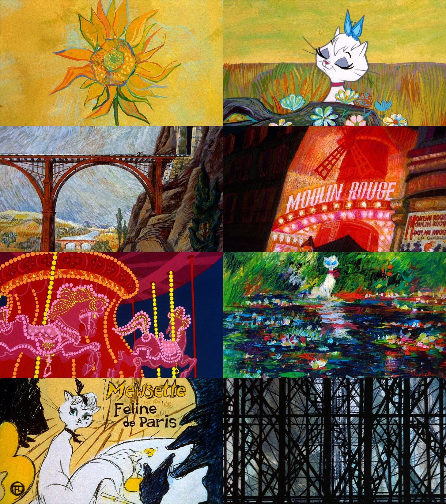
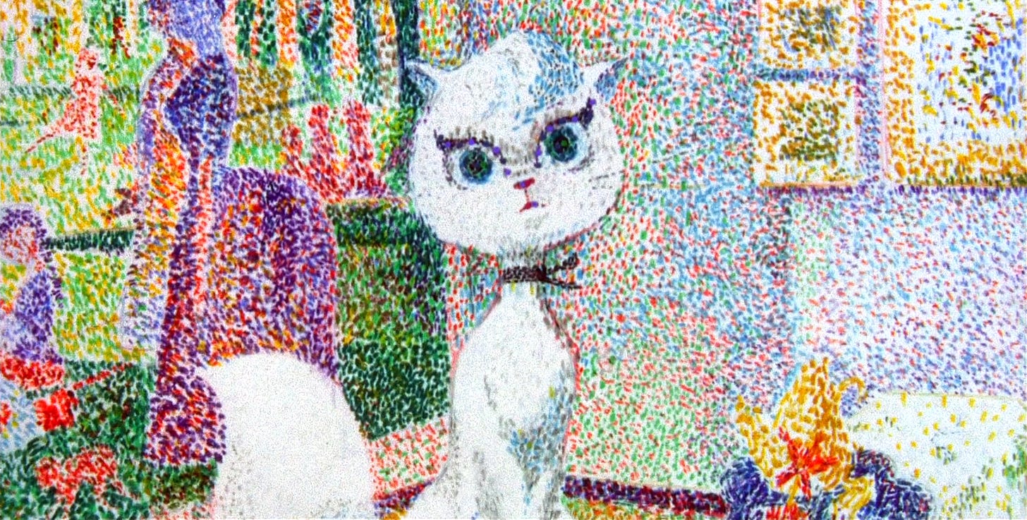
It’s not easy to account for Gay Purr-ee’s existence. The film is the very image of that “fine-art crap” Saperstein derided — pushed further than most UPA projects were willing to go. Set in France during the 1890s, it adopts the styles of the painters of that time, swapping between them regularly, all throughout the film.
According to historian Darrell Van Citters, several factors made it possible:
Disney had lain off a large portion of their staff after Sleeping Beauty and many of the artists found their way to UPA […] this feature gave them a chance to flex their design muscles and it shows; it’s one of the most visually sophisticated animated features ever made. Credit for that artistic freedom belongs to producer Lee Orgel, who trusted his director, and to director Abe Levitow who, as an accomplished artist himself, encouraged his team to experiment.
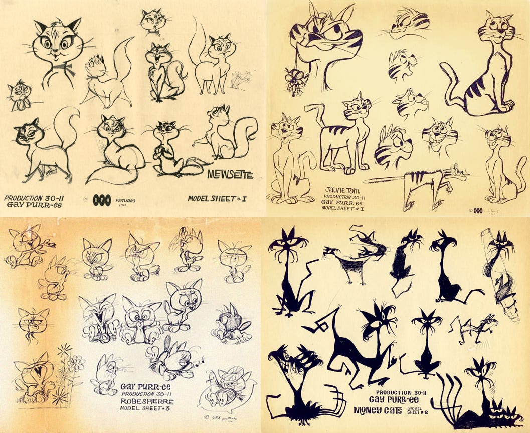
Gay Purr-ee’s plot is a simple frame on which to hang artistry, music and sheer charm — the real stars. Mewsette (Judy Garland), a cat from the countryside, visits Paris and falls under the influence of what might be called a feline trafficking ring. Two other cats from back home search for her.
It’s not a bad story, but it doesn’t take up more room than it needs to. Gay Purr-ee is a style-as-substance film — one that’s almost shockingly noncommercial, although that doesn’t seem to have been the goal.
The project began as Mewsette, an idea co-created by the husband-and-wife team Dorothy and Chuck Jones. After a successful pitch to UPA in April 1961, they co-wrote the screenplay. Orgel had the idea to make it a musical, and UPA picked up the two songwriters from The Wizard of Oz, plus Garland and Robert Goulet.
Quickly, the art team took charge. “Since Chuck Jones wrote the story as a writer’s storyboard, it was not suitable for production,” explained layout and storyboard artist Bob Singer. “We had to re-board most of it.”
Designer Corny Cole later said that he “introduced the idea of making it look like the Impressionists.” Victor Haboush, the art director, took a wild tack — “designing some of the look based on colored tissues overlaid with one another and adding painted elements on top,” according to Van Citters.
Levitow directed Gay Purr-ee alongside UPA’s hour-long TV special Mr. Magoo’s Christmas Carol, but Gay Purr-ee was the studio’s “A-list” project, Van Citters explained. It was supposed to be big. “It was our goal to present on a CinemaScope screen the most beautiful graphics ever drawn,” Saperstein boasted to The New York Times.
Based solely on the idea of using Impressionist art this way, it should have been clear that blockbuster success was out of Gay Purr-ee’s reach. And that was only one problem.

It’s not clear who the target audience was for Gay Purr-ee. (Newsweek famously suggested “the fey four-year-old of recherché taste.”) A funny back-and-forth, early in the film, centers on pronouncing the word plebeian. Even the musical numbers often aren’t crowd-pleasers. Garland sings strange, beautiful lyrics like “make me the ultra, ultra doll Modigliani can claim as his mannequin.” Unforgettable, but pop?
To stage musical numbers like this one, the designers went free and expressive with color, texture and composition. There are intense visuals in every shot of Gay Purr-ee, but the musical scenes take it a step further. They’re full of special effects, quirky layouts, off-the-wall styles. One part appears to be done with paper collage.
Bob Inman, a painter on the film, recalled an open environment for artists at the time. “UPA was the only animation studio I worked for that really let me be creative,” he said. “They never held your hand and made being creative impossible.”
In Gay Purr-ee, design creativity rules. There’s strong traditional animation at times, but a number of first-rate sections are more like what we’d now call motion design. The Take My Hand Paree musical sequence (below) is a showcase of the art of keeping the screen alive with as little traditional animation as possible.
Per historian Jerry Beck, “one of the best moments in the film is not even animated.” He meant the three-minute digression where Mewsette’s portrait gets painted by the major artists of the time — as another character notes their biographical details and stylistic tics. Corny Cole said that he handled the art for “the whole sequence.” From a marketing perspective, it’s hard to imagine a tougher sell.
Selling seems to have confused UPA, too. Press at the time noted a sizable promotional rollout for the film (Saperstein was called a “merchandising mogul”). But, besides an attractive board game and an artful two-page spread in Life, you had a bizarre promo with Friskies. The entire point of the movie is to be slick and modern — and then Saperstein tied it in with something as unromantic as cat food.
Critics couldn’t solve the selling issue, either. “I really can’t think of a good reason why you shouldn’t take the kids to it,” read a review in the Los Angeles Times. “I don’t believe, however, that they’ll be very crazy about it.”2
Gay Purr-ee’s budget was fairly low. Warner financed it for almost $1 million, but Saperstein later bragged about spending only $700,000. He took credit for the film, too, despite making few of the major calls. The idea of having created it puffed him up.
“He thought because he made Gay Purr-ee that he was in the same class as Walt Disney,” Haboush recalled. But the film didn’t do Disney numbers upon release. Van Citters again:
Gay Purr-ee had a wide theatrical release in late November and early December [1962], with generally positive reviews dampened by comments concerning the weakness of the storyline. The artwork received deservedly high praise, but that was not enough to bring in large audiences. […] Attendance was disappointing, and the film quickly disappeared from theaters.
Let’s set aside the commercial aspect for a second, though. In the end, Gay Purr-ee is much more than a failed blockbuster. It’s one of the finest examples of that “fine-art crap” ever made at UPA.
Again, Gay Purr-ee is a film whose existence isn’t easy to explain. UPA wasn’t the same company anymore, and almost none of its veterans worked on this project. The studio had allegedly lost its soul. By all accounts, Gay Purr-ee should be bad. Yet it isn’t.
At the time, Gay Purr-ee was America’s only mainstream animated feature keeping up with the aesthetic boldness coming out of Europe, Russia, Japan and China. Seen today, in restored form, it’s riveting. Not necessarily as a story, but as a whole experience. It’s an art piece that stands, for some mysterious reason, with UPA’s best.
Chalk it up to the power of artists set free to be creative — against all logic, financial or otherwise. “UPA was sincerely trying to go for something different with the feature form,” wrote historian Greg Ehrbar. It’s “a challenge that continues in animation” to this day.
2. Global animation news
Japanese TV broadcasters look to anime
In its latest issue, the Japanese magazine Tsukuru published a huge feature on the moves that Japan’s TV broadcasters are making in the anime world. The short version is that big bets are being made “in response to the worldwide success of Demon Slayer and the sudden increase in overseas demand for anime,” as the magazine explains.
The broadcasters profiled are NHK, Nippon TV, TBS, Fuji TV, TV Asahi and TV Tokyo. Each has a lot to say.
One key theme is overseas sales. In America, there’s a long-running myth that anime producers make their work without considering markets beyond Japan. For the broadcasters here, like Fuji TV, TV Asahi and Nippon TV, that clearly isn’t the case.
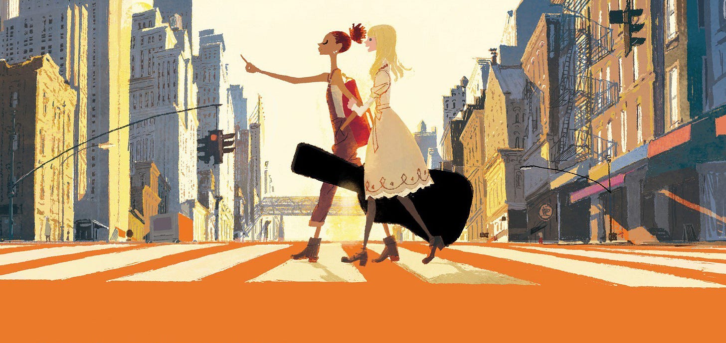
The Fuji TV anime block “+Ultra,” behind projects like Carole & Tuesday and The Heike Story, was designed specifically to foster shows that could sell overseas. (Crunchyroll in America now plays a big role even in series planning.) In recent years, Nippon TV has merged its anime production and overseas business teams into one unit, which has led to major interest and a “great response” from overseas executives.
TV Asahi, for its part, has discovered that anime based on popular manga has greater potential overseas — and it’s greenlighting more licensed shows as a result.
This is just one of the many trends highlighted in the article. For more, see Yahoo! Japan.
Best of the rest
Don’t miss Souls, a short animation created by the Ukrainian team Volunteer Video. In under two minutes, it says everything about the cost of the invasion.
Disney’s Turning Red was a big hit, topping Nielsen’s newest streaming chart for America. Director Domee Shi just got promoted.
For Variety, American directors Phil Lord and Chris Miller penned a fiery guest column about the Oscars’ treatment of animation. “Next year, invite a respected filmmaker to present the award and frame animation as cinema,” they ask.
In Britain, the BBC commissioned six animated TV specials based on the work of illustrator Quentin Blake. The studio behind them is Eagle Eye Drama, which has adapted Blake before.
Makoto Shinkai of Japan dropped the first teaser for Suzume no Tojimari, his next feature. Meanwhile, GKIDS is bringing his early work to Blu-ray on June 7.
Companies in Russia are scrambling to secure film deals in rubles with foreign countries like China. This includes animation. Also on the table is a center for localizing Russian cultural products for the Asia-Pacific Region. Mechtalët, an animation studio in the Russian Far East, is on the ground floor of this plan.
I Am What I Am is a Chinese film we’re hoping to see released widely in the United States. Catsuka just shared its impressive 2D opening sequence, done in a modern ink-wash style.
In India, “AVGC” has a government task force now. “The Animation, Visual Effects, Gaming and Comic (AVGC) sector in India has the potential to become the torchbearer of Create in India and Brand India,” reads a statement.
Turkey’s government just helped to finance Manu by director Şenol Kılıç (Bulmaca Kulesi: Dev Kuşun Gizemi).
Lastly, we looked into “the rise of guoman” — an important concept in Chinese animation, little understood by the outside world.
Thanks for reading so far! We hope you’re enjoying the issue.
We’re doing something special today. The last part of this newsletter is unlocked for everyone — you can read our retro ad of the week section below, even if you’re not a paying member yet.
Speaking of which, each and every member makes it possible for this newsletter to continue. It’s expensive to run, both in time and money, and we deeply appreciate anyone who makes the leap.
If you’ve got a .edu address, you can use the link below to get 40% off membership:
It’s come to our attention that .edu discounts aren’t usable by most students and educators outside the United States. If that’s you, and you’d like to become a member, you can email us and we’ll set you up with a working discount code.
3. Retro ad of the week
This week, we’re looking at a commercial for Royal Prince Yams. Dated around 1960, this is a product of Pintoff Productions in New York — a small studio run by artist Ernest Pintoff. It’s called Bag of Tricks.
In the 1950s, Pintoff had started at UPA as a “fresh-out-of-school designer” and risen to prominence on The Boing-Boing Show, according to Cartoon Modern. He bounced to Terrytoons, where he directed the iconic Flebus, and then struck out on his own.
From the beginning, Pintoff’s style was hyper-modern and ultra-minimal. His work is more about design, audio and timing than animation. (As he once said, “I put all of my ideas into the sound track and became known for that.”) He won his Oscar for The Critic (1963), which barely moves. A hilarious performance by Mel Brooks transformed it into a classic.
While Pintoff disliked the advertising business (“no creative freedom there at all”), his style was a natural fit for commercials. Cartoon Modern explains that his “clean graphic look and fresh designs were an instant hit in the world of TV advertising.” Watching Bag of Tricks, it’s easy to see why. The ad is smart — and mesmerizing.
The main designer for Bag of Tricks was Leonard Glasser, who imbued this nearly-motionless spot with a ton of silly, kinetic energy. And he did it, primarily, with typography. Great design blends with Pintoff’s signature timing, audio and oddball humor to create an ad that does a lot with what looks like almost nothing. Just try to get the announcer’s call of “Rrrrroyal Prince!” out of your head once you’ve heard it:
See you again soon!
From Abraham’s book When Magoo Flew — a key source for the article. Other major ones include the interview with Victor Haboush in Walt’s People – Volume 9, Jerry Beck’s Animated Movie Guide and Van Citters’ book Mister Magoo’s Christmas Carol: The Making of the First Animated Christmas Special.
From the Los Angeles Times (December 6, 1962).


Wow, fascinating piece on Gay Purr-ee. And the Yams advert made me smile!
What a find! It really seems like a miracle this feature was allowed to exist.
By the way, I tried to make my little contribution to spreading this newsletter through a Letterboxd list, for those who may use the website I think it could be a useful source. If I'm missing anything, feel free to let me know. https://letterboxd.com/__carlos/list/animation-obsessive/