Animating 'Almost There' from 'The Princess and the Frog'
Plus: animation news.
Happy Sunday! We’re back with a new issue of Animation Obsessive — one we’ve been planning to write for a while.
First, though, we want to mention a feature called Notes under development at Substack. We’ve been in (and enjoying) the beta since last month. Notes is like Twitter-inside-Substack — a space for shorter, lower-pressure writing and sharing.
Notes isn’t public yet, but we plan to keep using it to post photos of rare books we’ve ordered, film recommendations and so forth once it’s live. As Twitter becomes a more unstable and outright hostile place for newsletters like ours, it’s reassuring that something like this exists.
With that out of the way, here’s the agenda for today’s issue:
1️⃣ How they did the Almost There sequence from The Princess and the Frog.
2️⃣ Animation news internationally.
And now, we’re off!
1: A Disney style
Modern Disney animation catches a lot of flak on social media. We love films like Tangled, Moana and Frozen II — and we’ve shared art from them for a few years. Whenever we do, though, one specific complaint tends to come up:
Why don’t Disney films look more like their concept art?
It’s not always fair, but we get the feeling behind it. There’s a real desire for animation to use more abstract graphics and painterly techniques right now — just look at how popular Spider-Verse or Love, Death + Robots are, for example. Disney concept artists try ideas like these, but only some of those ideas make it to the screen.
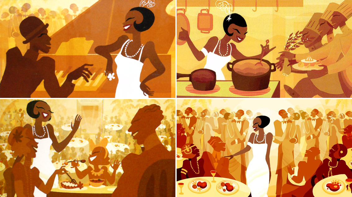
Yet Disney’s made at least one film in modern times that stuck like glue to its concept art — for a scene, anyway. It’s the Almost There section from The Princess and the Frog (2009).
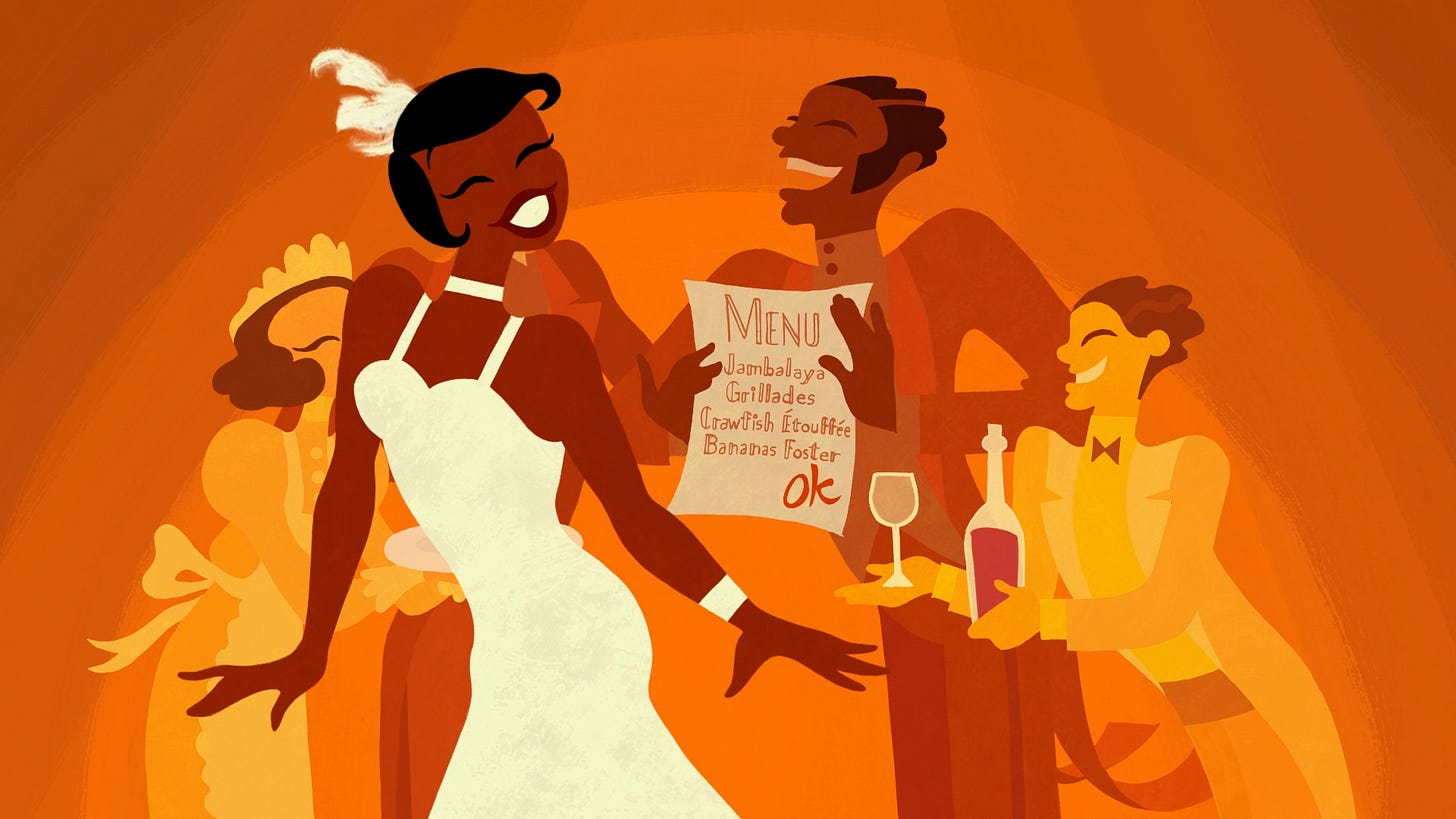
This movie has its critics, and it wasn’t the seismic hit Disney wanted. But nearly everyone agrees that Almost There is a magical, eye-grabbing standout from The Princess and the Frog. It’s a fantasy sequence wherein our hero, Tiana, imagines the restaurant she wants to open in the Roaring Twenties — singing as she goes. It looks essentially identical to the stylish, 1920s graphic design seen in its concept art.
The team had to throw out the rulebook to make it work. John Musker, who co-directed The Princess and the Frog, noted that Almost There was “done through a whole different production pipeline.” Joe Pitt, one of the artists in charge of the scene, described it as “a leap of faith.”1


Collaboration is the Disney way, and it’s always been tricky to pinpoint which ideas are whose. Even so, evidence points to one person as the initiator of the Almost There sequence as we know it: the late artist Sue Nichols.
Nichols had a decisive influence during her years at Disney, with her design work for Hercules and her development of Jafar, to name just two. On The Princess and the Frog, she pushed for the look of Almost There. As John Musker said:
Sue Nichols, a wonderful visual development artist, brought in beautiful “Deco” drawings by Aaron Douglas, a member of the Harlem Renaissance whose work she knew well. She suggested that our heroine’s restaurant fantasy would look great in this style. Ron [Clements] and I had not known Aaron Douglas’s work, but we loved what Sue showed us, and we embraced her idea. It turned out really well.2
Nichols cited her work on Almost There as her “favorite contribution to this film.” It was Nichols’ idea for Tiana to visualize her future restaurant with a magazine clipping — and for Tiana to enter a fantasy world inspired by that clipping. Supervising animator Eric Goldberg described the sequence as “a magazine page come to life.”
The plan developed out of Nichols’ design research for The Princess and the Frog. She was looking at art from the ‘20s to get ideas: Art Deco design, poster art and, of course, the Harlem Renaissance.
The Harlem Renaissance represented an explosion of Black culture across America during that era, not just in visual art but in poetry (Langston Hughes), music (Louis Armstrong) and beyond. Aaron Douglas was a painter known for his expressive, silhouette-driven depictions of Black pride and struggle. It’s a graphic approach well suited to his mural and illustration work, and Nichols adapted it to Disney’s purposes — a crowd-pleasing pop take on the style.

Again, though, Disney is a collaborative place. Despite her impact on Almost There, Nichols didn’t make it herself. It took a team — an unexpectedly big one. They all worked under Eric Goldberg, who’d previously directed the Rhapsody in Blue part in Fantasia 2000.
One of the core teammates here was colorist and designer Lorelay Bové, who developed Nichols’ concepts toward the final look. (Bové wrote that she had the stressful job of painting “all of the backgrounds” for the fantasy sequence.) Present as well were Todd Jacobsen, who worked as an in-betweener and color artist and compositor, and technical director Eric Daniels. Goldberg also credited:
… the great Doug Walker on layouts […] not to mention stellar animators Bert Klein, Hyun-min Lee, Frans Vischer, Bill Waldman, […] Sandro Cleuzo and animation apprentice Sarah Airriess.
Everyone worked toward a single goal: creating a left-field style of animation that fit with the concept art, even as it broke with the look of The Princess and the Frog.
But how? It wasn’t obvious — Aaron Douglas’s art is lineless and, as co-director Ron Clements put it, “very geometric.” The concepts by Nichols used a similar approach. What pipeline would allow Disney to capture it?
They made a few different attempts. When Almost There was still just designs and a storyboard, Joe Pitt and Lorelay Bové came up with their own take. Pitt recalled their thinking that:
… After Effects’ mesh warp and puppeting capabilities could bring [Lorelay’s] concept art to life. Excited by this possibility, we, along with animator Yoshi Tamura, decided to make this proof of concept after hours to show Ron and John what we had in our heads for the song sequence. The final version of the song did not use this technology with the exception of Tiana’s feather, but it did influence the look and feel of the final song sequence.
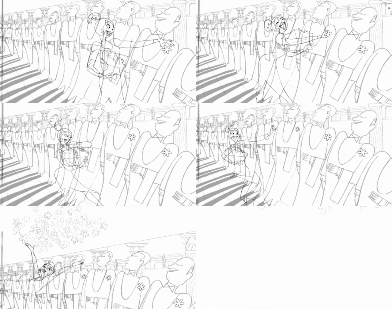
You can see the Pitt-Bové-Tamura test below. It looks promising, but not yet perfect. Even though the puppet animation is good, it’s not quite as dynamic as Almost There became. Still, it’s clear at this stage that the style could be animated:
After experimenting, the Almost There team settled on a hybrid process. It started with traditional 2D animation, pencil on paper.
But the animators’ pencil lines were left untouched by the film’s cleanup artists. Ron Clements explained that “the animators […] worked very tight, and it went right from animation to color.” Pages and pages of animation were scanned into computers — then colored in Toon Boom Harmony. Cutting out the cleanup stage and starting with rougher lines added “a special look,” wrote Todd Jacobsen.
Another element of specialness came from Eric Daniels, who applied digital paint textures to the characters (an idea of Bové’s). Goldberg noted that they “moved in synchronization with how the characters moved.” Daniels was also key to the digital compositing, working with a few people to pull the shots together into coherent wholes.
This is names on names, but that’s the thing — a lot of staffers contributed to Almost There. Tiana’s fantasy sequence is tiny, under two minutes long, and yet it had a team larger than many animated shorts from the classic cartoon era.
It was ambitious, and not only in the visual style. The team switched up the motion as well. “One thing we wanted to do was not make it look like your standard Disney animation,” Goldberg said. They wanted a more graphic, anti-realistic type of movement that drifted away from the illusion of life. Goldberg singled out the crowd that enters the restaurant, depicted as “a block of people with their legs moving.”
It’s a bit like UPA, but not totally. The Almost There team didn’t go all-in on anti-realism — it’s a mix of flat, design-y motion and the usual rounded bounce of Disney. The animators even worked from live-action reference footage, overseen by choreographer Betsy Baytos. It’s a true Disney musical sequence, a specialty of Goldberg’s. As he said:
I think the thing that I enjoyed the most about this — and the whole movie — is animating to music and really determining the best cuts for the sequences, the best kind of movements for particular musical accents and so on and so forth. And there’s a sense of liveliness to it, even though it’s in a completely different style, [that] still feels very musical to me.

Almost There was made in a rush, just as the rough animation stage for The Princess and the Frog was wrapping up. “It was actually one of the last things animated on the film,” said John Musker, “and we had to do it kind of quickly to get the movie done in time.”
It’s far from thrown-together, though. Many of the artists involved were open about how much they liked the finished version. Sue Nichols and Joe Pitt came away impressed — Lorelay Bové called it “wonderful to see it on the big screen, very fulfilling.”
And Todd Jacobsen, who’d worn so many hats on Almost There that he needed two cubicles to do his job, was blown away. “Watching the entire sequence on the day we finished it left me with a shiver like I’d never experienced before,” he wrote.
Almost There is undoubtedly a highlight in The Princess and the Frog, and fun to watch even now. It looks like Sue Nichols’ concept art in motion — a real, Disney-style take on the work of Aaron Douglas. If you’ve never seen it before, check it out on YouTube.
2: Newsbits
Speaking of the demand for new-school animation, the second trailer for Across the Spider-Verse (watch) is “the most-viewed superhero film trailer of the summer” when tracking their initial 24-hour windows, according to Deadline.
If you’re interested in Japanese animation history, the new Animétudes article about Astro Boy is a valuable read that breaks ground for English scholarship.
The all-important Eurimages fund gave a lot of money to two upcoming animated features: Spain’s Treasure of Barracuda (€500,000) and Latvia’s Flow (€400,000). The latter comes from Gints Zilbalodis, best known for his solo feature Away.
Japan’s Suzume continues to break records. It’s now blown Your Name out of the water in China, bringing in more than 708 million yuan (around $103 million) and becoming the biggest Japanese animated film ever in the country. In Korea, Kobis reports that Suzume is almost to $34 million, just below the highest gross of the year (The First Slam Dunk, with around $35 million).
But Suzume’s global earnings were overshadowed by an American film — Illumination’s Mario movie. It had a $377 million opening, defying weak reviews.
Meanwhile, the Ukrainian film Mavka: The Forest Song, completed amid the invasion, became a hit in France.
In what feels like a flashback to the USSR, Russia implemented a new law that allows the government to fund “up to 100%” of film productions aimed at children under 18, provided that they’re deemed educational and promote “physical, mental, spiritual and moral development.”
In Japan, Toshio Suzuki is once again the president of Studio Ghibli, following a confusing (and frequently misreported) controversy. See ANN for more.
In Cuba, journalist Yuris Nórido argues that the country needs an animation school, writing that Cuban animators can overcome their technical limitations with enough creativity — as long as they’re trained to know how.
Finally, we looked at the making of The Swallows of Kabul (2019), taking stock of the European co-production system that allowed it to exist.
Until next time!
Musker’s words come from the commentary track on the Princess and the Frog Blu-ray, which we referenced many times. Meanwhile, Joe Pitt posted his remark in the comments section to this Cartoon Brew article in 2009, during a lively discussion filled with artists from the Almost There sequence. We took quite a few quotes and details from here.
From the interview with John Musker in On Animation: The Director’s Perspective (Volume 1). We also consulted The Art of the Princess and the Frog, where Sue Nichols revealed, “I researched for inspiration the popular styles of the early 1900s. Styles such as Art Deco and its rhythmic artists like Erté, the organic Art Nouveau with poster designers like Alphonse Mucha and [...] Harlem Renaissance artists such as Aaron Douglas.”


Another great post. I always think back to the first Disney films (like Snow White) and the skill and ability animators would have needed. Although, fast forward to present day, the labour intensity may have diminished the quality and attention to detail is amazing. I love it when kids in my own class are inspired by animation, wherever we draw it from for the next generation to develop. Thanks again for an excellent post.
so cool to see digital composite get a shout out here - it's one of the areas of the pipeline I know next to nothing about, yet obviously has such power (as seen in this sequence!)