Free Resources for Artists
A wealth of information on animation, design, storyboarding and more.
Happy Thursday! In this issue of the Animation Obsessive newsletter, we’re doing something a little bit different.
If you’re reading this, you might be involved in visual art. A lot of our readers are — from animation to illustration and beyond. And we love to share art resources with artists. Longtime readers may recall the Hellboy storyboard guide, Cartoon Modern or our write-up on Preston Blair’s Animation.
So, on that note, we’re sharing a few more today. Unlike the ones we just mentioned, these resources aren’t tied to stories — they’re just intriguing, worthwhile caches of material for artists of all skill levels. You’ll probably recognize some of them. Others may be new even to the experienced. All of them are free.
Enjoy!
1. The Paul Felix Notes
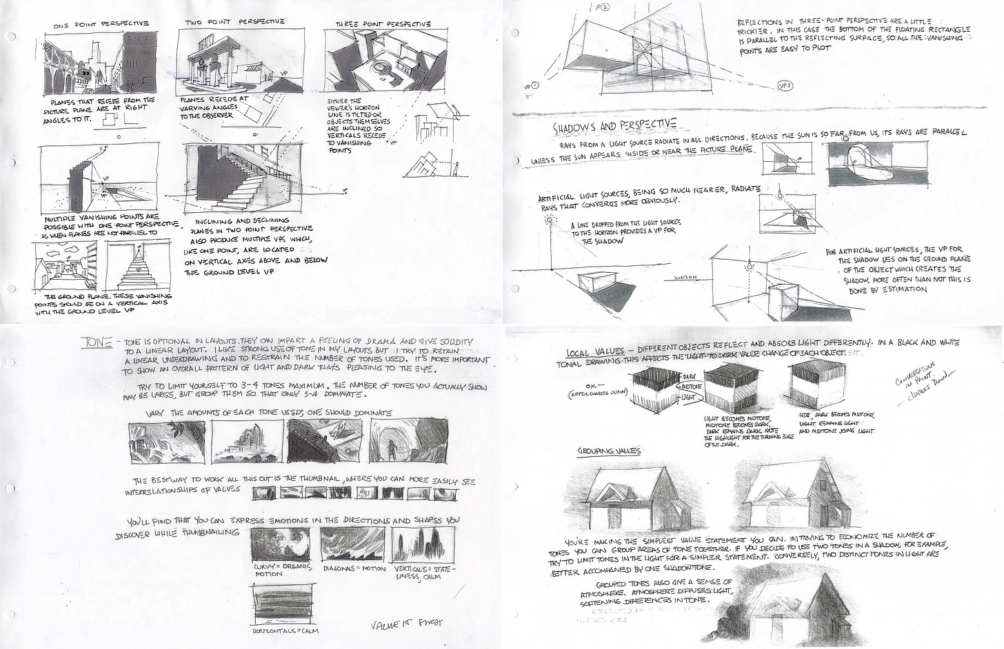
To kick things off, we have an incredible guide to the art of layout — including composition, perspective and lighting. These are the so-called “Paul Felix Notes.” He’s a veteran Disney artist from the likes of Lilo & Stitch, Tarzan and Raya and the Last Dragon.
Felix spent years doing layouts for the company’s TV cartoons, too, and he shares some of that knowledge here.
This guide was first publicized in 2011 by artist John Nevarez. On his personal blog, he explained that the Paul Felix Notes were co-created by Felix and Jim Schlenker (another seasoned layout artist from Disney) as a teaching aid for a class.
The result? “Very thorough, simple and quite awesome!” Nevarez wrote. That’s an understatement. This is the best crash course in layout we’ve ever seen, and it offers a lot to artists of all stripes, inside or outside animation. Whether you’re a beginner seeking tips, or an experienced artist looking to brush up, we recommend it.
We’ve included a few pages below. That’s only a taste. There are 20 pages in total, all of them available on Nevarez’s Unofficial Paul Felix Blog.

Animation Obsessive is a reader-supported newsletter. Both free and paid subscriptions are available. If you enjoy our work and want to support it, the best way is to take out a paid subscription.
2. The Adventure Time Storyboard Notes
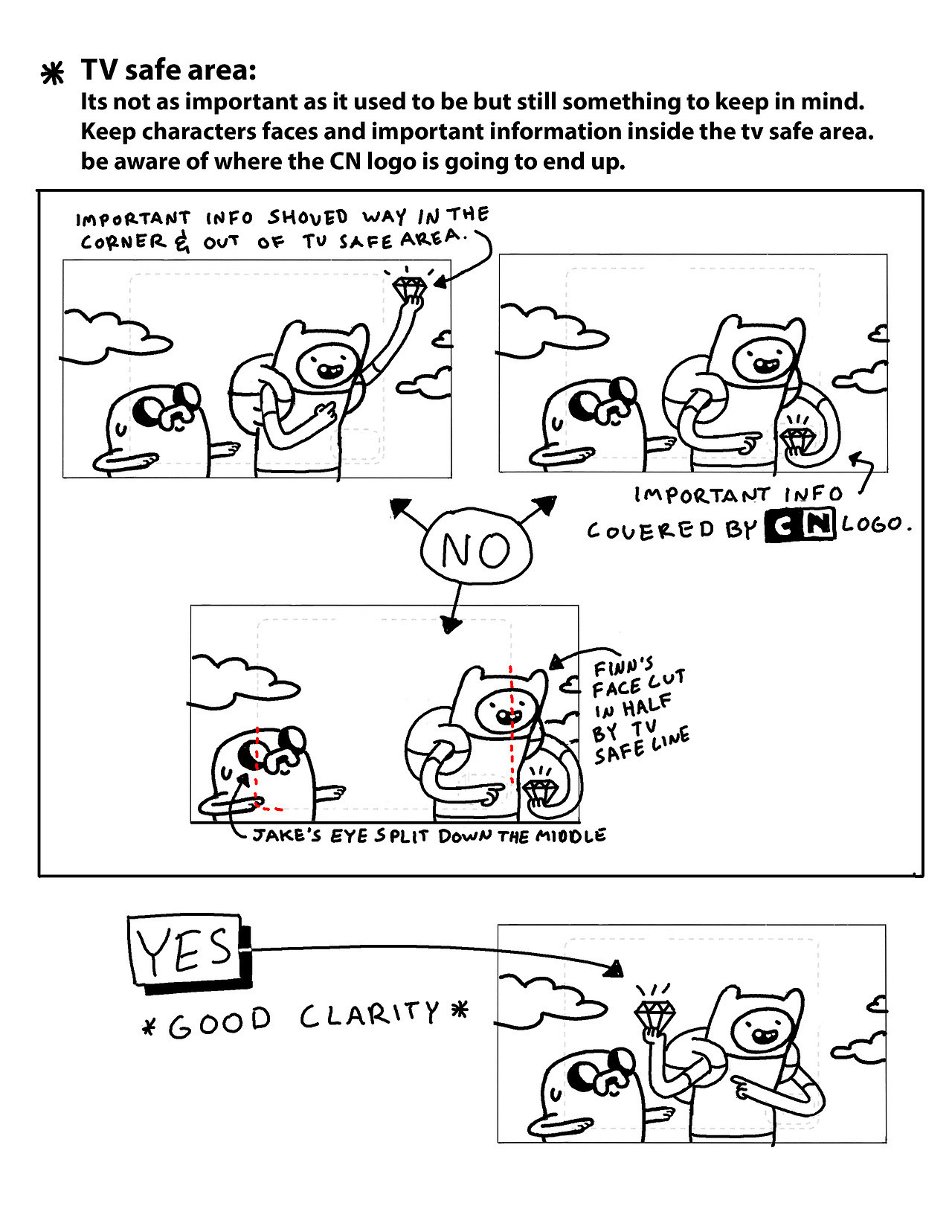
Next, we have a short resource on storyboards. It comes from Erik Fountain, a boarding supervisor on Adventure Time. Across a few quick but clarifying pages, he lays out the best practices for the show’s boards.
There are as many different ways to storyboard as there are ways to animate. In these tips, Fountain focuses on the mainstream American TV style, and on capturing Adventure Time’s staging and pacing. Even if this style isn’t yours, it’s still fascinating to learn that, for example, they had to board around the Cartoon Network logo.
Overall, this is a great little guide. The official Tumblr account for Adventure Time shared it in 2017. It came with a note: “A few years ago, Erik put together these updated AT storyboard guidelines for new board artists and revisionists.” Whether or not you fit that description, the pages are worth a look. Find the whole thing on Tumblr.

3. Temple of the Seven Golden Camels
If the Adventure Time guide skews toward new storyboarders, and TV cartoons, the filmmaking advice on Temple of the Seven Golden Camels is invaluable to anyone who wants to learn the art of building a scene.
Golden Camels is a defunct blog written by Mark Kennedy, another Disney vet — he’s credited as the head of story on Tangled, as a story artist on Treasure Planet and as a storyboarder on Encanto. With this blog, Kennedy spent years sharing what he’s learned.
This is a resource that keeps on giving, but we’d like to single out a few of Kennedy’s write-ups on blocking, cinematography, editing and general direction. Although he works in animation, Kennedy’s advice often draws on live-action films — and it applies to both fields, and even to comics.
For example, check out his posts on the “blocking and storytelling” of one scene from Strangers on a Train, another from It’s a Wonderful Life and yet another from Stanley Kubrick’s Paths of Glory. See his detailed piece on directing the viewer’s eye through composition. And don’t miss his breakdown of match cuts.
If you want to go even deeper, Kennedy has you covered. He recommends the book The Five C’s of Cinematography (1965), which is available to borrow for free via the Internet Archive. Kennedy wrote:
… it’s pretty much a textbook on how to approach “the five C’s”: Camera Angles, Continuity, Cutting, Close-ups and Composition. All of these topics are vitally important to any storyboard artist, and Mascelli does a good job of explaining the basics of each one.
It uses a lot of old TV stills to explain the concepts […] and it doesn’t really provide any insight into more modern, experimental techniques, so it might seem creaky and outdated to some. But I think it’s essential to know the basic, traditional reasons why things like proper cutting and screen direction are so important before you can start experimenting and finding new ways of doing things.1
4. Alex Kirwan’s Mickey Mouse and Wander Over Yonder Guides
Alex Kirwan is a designer from animated series like My Life as a Teenage Robot, Gravity Falls and Looney Tunes Cartoons. He’s known for his intricate, insightful style guides that help artists draw characters “on model.” They’re something to see.
Many of these guides are idolized by animation fans and industry insiders, but they’re worth highlighting once again — especially his work for Wander Over Yonder and the recent Mickey Mouse cartoons. Reading them will change the way you understand these characters, and maybe characters as a whole.
Kirwan is a master at helping you hold shapes in your head — and at breaking down other people’s designs. He leaves no stone unturned. “I was very proud when Craig said he learned some things about his [own] characters from reading these,” he wrote about his Wander guides. On Kirwan’s Instagram account, you’ll find many more pages like the ones below.

5. The Aurora Sheets
When it premiered in 1959, Sleeping Beauty was Disney’s most tightly designed feature to date. Powering that design was world-class concept work by the team — among them Eyvind Earle, who had a big hand in the film’s look.
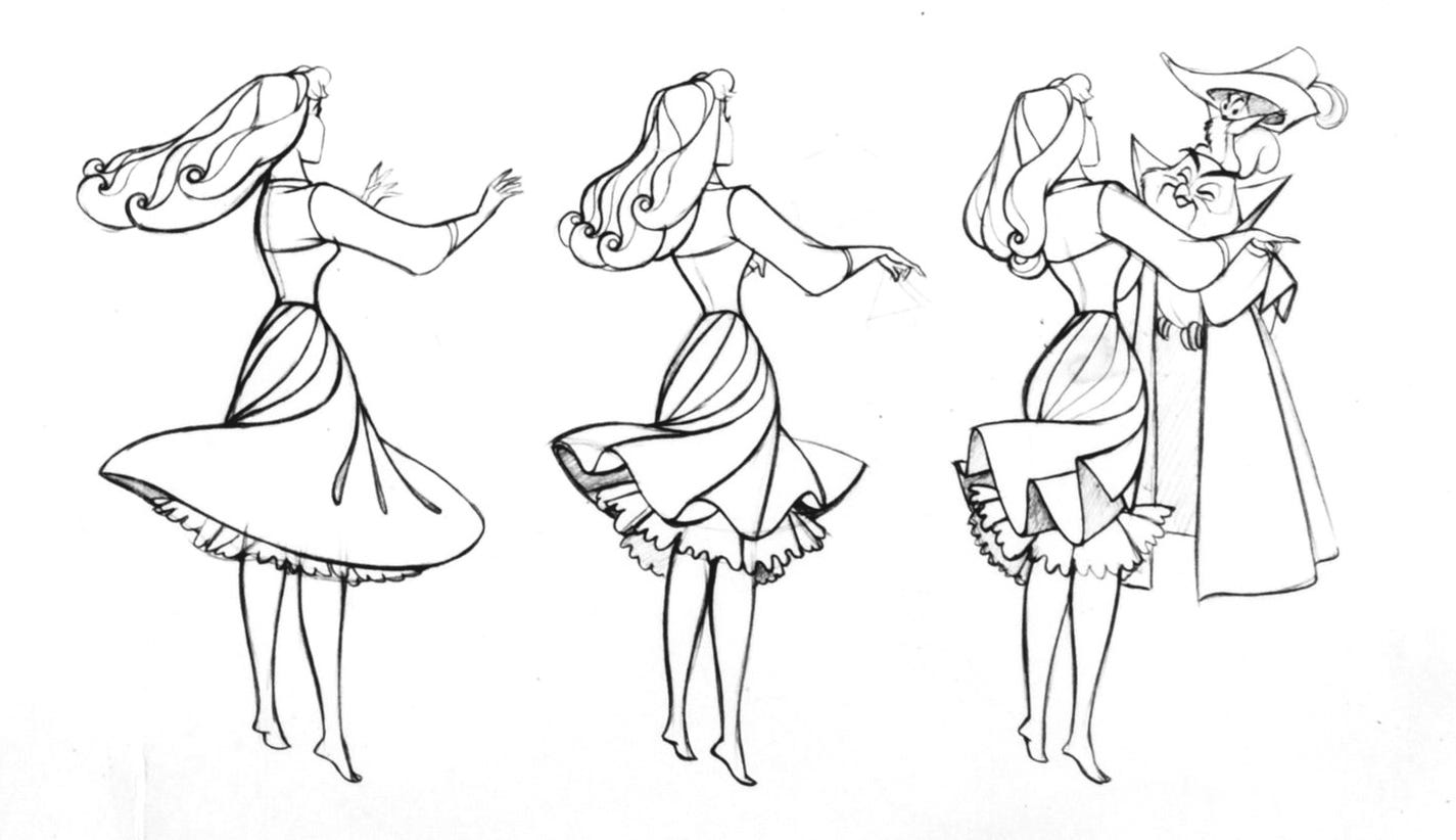
Then there was Aurora herself. The Disney artists put a startling amount of thought into her design, a little of which is preserved in her model and construction sheets. You can see several of them on Twitter in high resolution.
When you zoom in, you find a treasure trove of notes. There’s still stuff to learn, all these years later. “Watch spacing of skirt folds — this can help turning without over-drawing,” reads one. Another warns against letting “spaces between locks of hair around face get too deep” to avoid making it look like Aurora is secretly wearing a wig. (Years later, The Little Mermaid’s team would encounter that exact hurdle.)
Aurora’s hair, by the way, gets a ton of attention in the notes. “Hair should look like hair but, at the same time, be a good decorative pattern,” explains one. A number of visual breakdowns show that her hair is actually a series of complex, graphic shapes. Once you’ve seen it, it’s hard to stop seeing it — in the very best way.
6. Living Lines Library
This is our last resource for today, and it’s one that you likely know if you work in animation. Yet Living Lines Library is essential for every kind of artist — and it can slip under your radar if you don’t have animation ties. So, we’re mentioning it.
Online, Living Lines Library is the directory of pencil tests and assorted animation materials (production art, making-of segments, books). Peter Nagy-Galambosi, a Hungarian animator who works in the game industry, has run the blog since 2010. He’s still expanding it — the most recent update was on April 24.
This is a place where line tests from Summit of the Gods bump up against hundreds of storyboard panels from Grave of the Fireflies. Where you can see how they animated The Breadwinner and The Prince of Egypt alike.
You can lose yourself in this site — and find more inspiration, and education, than you know what to do with. This animation reel from Alessandra Sorrentino is just one of many, many examples:
And that’s a wrap! Thanks for reading — we hope that some or all of the resources above prove useful.
If any of them jump out at you, or if you have one that you’d like to share with other readers, please feel free to leave a comment below. The comment section for this issue is open to everyone.
See you again soon!


I've loved Adventure Time since it first premiered back when I was in 5th grade, so it was such a nostalgic time to view their storyboards! Their art styles, background layouts and stories were some of the best I've seen, plus a lot of the former artists from the show have gone on to create other amazing works that still have some elements from their time on the show! Thanks for always finding awesome work for us to dig further into!
I loved this post and this page! and for a long long time I've been wishing to become an illustrator and to tame wholesome drawing skills. however, all I know I've learnt it by myself and now I feel I'm not growing anymore and I don't know what to do, because my level keeps being basic AF. Can you recommend me an online program where I really can learn how to become an illustrator? I'm tired of those online programss that just offer you basic and superficial knowledge and they don't deep dive in anything. I feel devastated. Thank you in advance.