How They Painted ‘Samurai Jack’
Plus: the secret history of the Tootsie Pop commercial (and global animation news).
Welcome to another edition of the Animation Obsessive newsletter! If you’re new here, we cover exciting animation from all around the world. Here’s our agenda for today:
One — a look into the making of Samurai Jack’s background art.
Two — animation news, across the globe.
Three — the secret history of the Tootsie Pop commercial.
Four — the last word.
Just dropping in? You can sign up to receive our newsletter right in your inbox, every week:
Now, here we go!
1. Samurai Jack’s sense of place
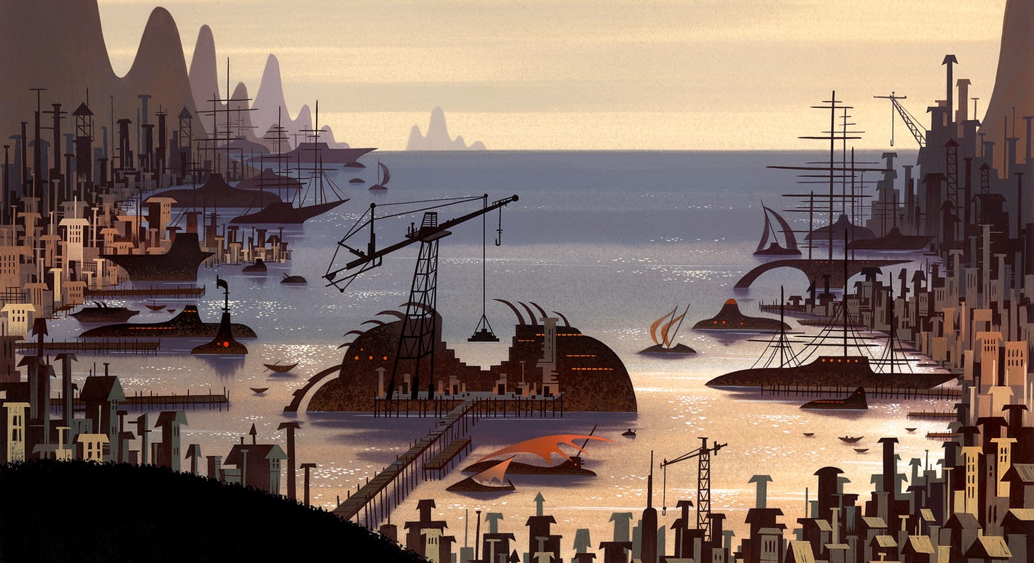
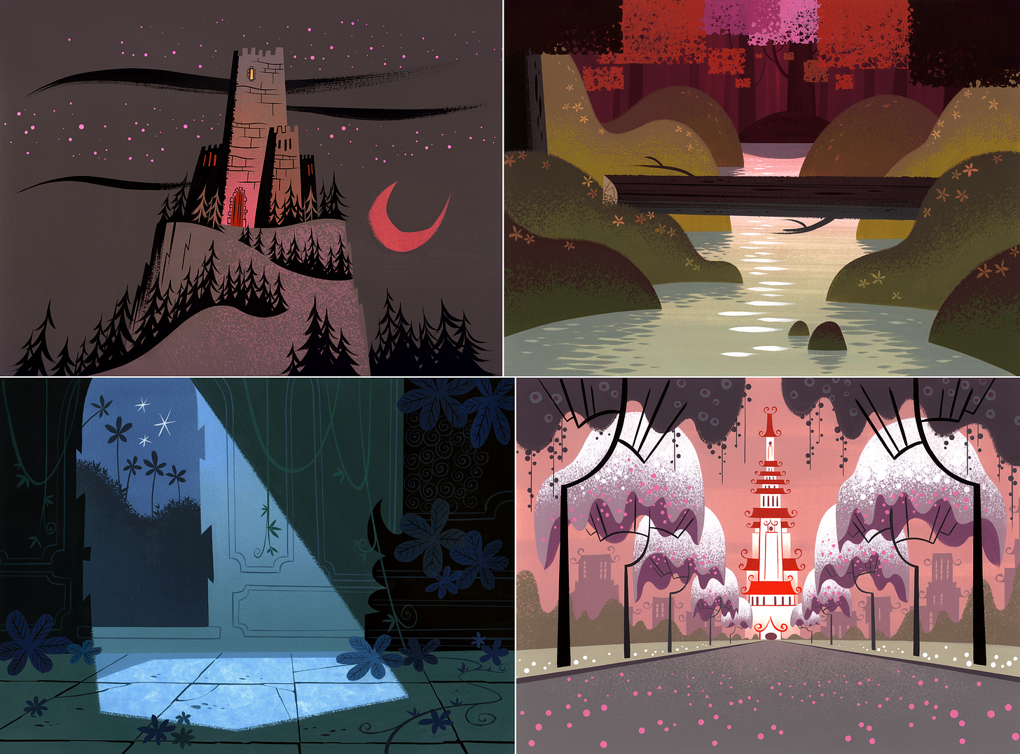
There’s something about the backgrounds in Samurai Jack. Whenever we share them on Twitter, people respond — strongly. Even outside their original context, the evocative colors and shapes in these paintings transport you to another world. They don’t need animation to feel alive.
That was all intentional. Genndy Tartakovsky, Samurai Jack’s creator, has often called backgrounds a “character” in the show. He wanted them to be special.
When Tartakovsky was first developing Samurai Jack, he was watching the films of Hayao Miyazaki and David Lean. Place matters a lot in their work. At the time, TV cartoons tended to treat backgrounds as stages for the characters. Tartakovsky wondered if they could become stars of their own.1 As he said:
… usually we are drawing these backgrounds and they’ll just get a pan and then we’ll just go into the next sequence. I wanted to do, maybe, a minute or two sequence of just establishing environment. You really get to feel where Jack is and because it’s such a fish-out-of-water story, the environment is such a big part of the story. It’s like watching Lawrence of Arabia, you really feel that desert. And it’s a really cool feeling and so I thought, “Ah, how much cooler would you feel if you’re looking at these great drawings with this really unique color and a great mood?” You’d feel the landscape even more.
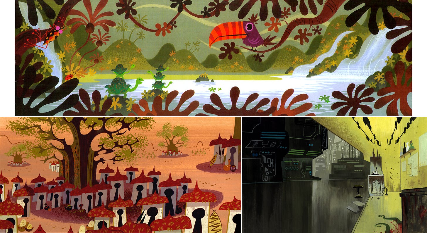
These ideas were already at play in the original animation test for Samurai Jack, made around 2000. Lou Romano (The Incredibles) did environment work for it, but didn’t continue onto the full series. Searching for “someone extraordinary” to supervise the backgrounds, according to the book Makin’ Toons, Tartakovsky reached out to Scott Wills.
Wills was a painter at DreamWorks, doing backgrounds for feature films like The Road to El Dorado. Tartakovsky’s pitch was a little unrealistic. “Whether you’re a painter or an animator, no one leaves features to go to TV — it’s unheard of,” Wills later said. But he’d been feeling stifled, and Tartakovsky told him that the show would switch styles and locations frequently. Plus, the animation test was impressive. Wills agreed.
“It really came together when Scott Wills came aboard,” Tartakovsky remembered. “‘Cause when Scott started to paint, all of a sudden, we had lighting, we had mood and atmosphere.”
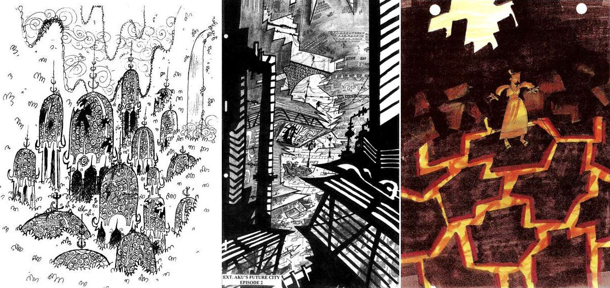
Wills formed a team with artist Dan Krall, responsible for the black-and-white background layouts. Krall sketched them on paper, going for what he called a “flat, sort of a surreal look.” He often ignored perspective, only to bring it back for certain shots. The backgrounds freely switched between realism and pure design, Wills said.
The origin of the backgrounds’ style was a mishmash. Wills, for his part, tried to blend Hanna-Barbera with “Japanese prints and posters.” Tartakovsky oversaw their work and was looking at things like 1950s Disney artwork, UPA and The Little Prince and the Eight-Headed Dragon. But Wills noted one influence as supreme — the painter Charley Harper. In his words:
We’ve a lot of influences, I have to say, but when I feel like I’ve done a painting that’s very Samurai Jack, the way I want it, it’s mostly Harper’s kind of feeling.
Like Krall, the painters worked in physical media. Wills considered it softer, more textured and more alive than digital at that time.
The challenge was that the team was shooting for “feature quality” on a TV schedule and budget. Although Wills got critical help from Jenny Gase-Baker and artists like Bill Wray and Nadia Vurbenova-Mouri, they had no way to make enough backgrounds for a whole TV series without outsourcing. And this caused problems.
The majority of Samurai Jack’s final backgrounds were painted at Rough Draft Korea. That meant a language barrier, a timezone gap and a huge distance (and no Zoom — it was the early 2000s). Yet the show’s fate hung on the quality of the backgrounds, and on tuning their colors to make the cast of lineless characters stand out on the screen.
The team needed to direct the painters as closely as possible. Wills wrote that he and Tartakovsky went through each episode’s storyboard to “pick which shots [would] need a color key” — small paintings that guided the overseas artists’ work on the final backgrounds. Wills, Gase-Baker and others painted these. They also made a number of finished backgrounds “to demonstrate the final technique,” Wills noted.
So far, nothing too unusual. Precision was what made Samurai Jack different. Wills said, “I want the finished paintings to look exactly like the keys.” Each key was painted in high detail — then Wills personally scanned and color-corrected them all on his computer. An average episode had 30 keys, sometimes climbing above 50.
For the fourth episode alone, Wills and Gase-Baker had around three weeks to paint four finished backgrounds, 41 color keys and seven lower-detail “color comps.” Wills scanned and corrected all of it. Designer Lynne Naylor recalled Wills spending much of his time on the show at his computer, inside a black curtain to block the outside light that interfered with color correction. The team dubbed him “The Wizard.”
There was a method to the madness, though. After the team sent both the physical and scanned art to Korea, Wills’ work created a failsafe. He explained it like this:
Now here is what I imagined could happen overseas — the overseas painter paints a final background trying to match the color key but the colors are a bit off. Then they scan their final background which will throw the color off even more.
To get back on track there needed to be a color correction step that matched the final BG scan to my scan of the color key. I actually saw this being done when I visited Korea during the second season of SJ. It was incredible, the final scan was so far off that the people doing the correction were individually selecting every color and forcing it to match the key. They were working so fast I couldn’t believe my eyes!
Wills also filmed tutorials of himself painting backgrounds. In the clip above, he used Cel Vinyl paint, an Iwata airbrush (for both painting and wetting the page), a hair dryer and even a paper towel — to add the all-important texture.
These extra steps didn’t ensure perfection. Wills said that Rough Draft’s best painters had left a few years before. Sometimes, he’d notice that the artists “just took pieces of my one key and ‘Frankensteined’ them together into all the other paintings.” Other times, “they would repaint some of the finals we sent them.” Bill Wray, who painted looser keys than Wills, said that he confused the artists more than once.
Even with the bumps along the way, though, it’s clear that Rough Draft pulled through in the end. Paul Rudish, a main artist on Samurai Jack, remembered the moment when he saw the first episode fresh from Korea:
I just personally was really blown away by the quality that came back. It really looked like our work — everyone, you know, all our colors and all our models. You didn’t see that [deterioration] that you often get in a lot of TV production. It was just really top notch and I really went, “Wow, I’m proud of my job!”
2. News around the world
Cartoon Saloon is doing a Cartoonito series
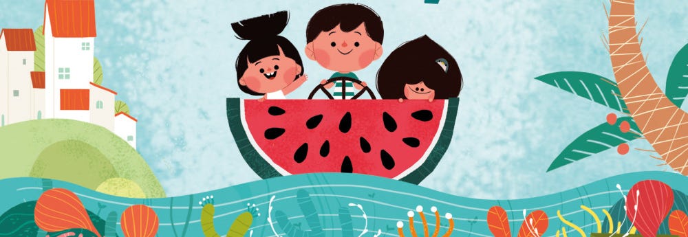
Fresh off the success of Wolfwalkers, Ireland’s Cartoon Saloon has scored a deal with WarnerMedia to make Silly Sundays. It’s a preschool series with a visual style that already looks strong from the first teaser image — as expected from Cartoon Saloon.
The show has been in the works for years. Creator Nuria González Blanco (Puffin Rock, Late Afternoon) pitched it to Cartoon Saloon in 2016. A teaser clip popped up back in 2018. The final show, which looks a bit different from that clip, is about “Sonia, Hugo, Mel, Mom, Dad, and Granny as they create unforgettable memories together during their weekend gatherings.” Given Puffin Rock’s quality, it’s exciting.
Silly Sundays is coming to Cartoonito, WarnerMedia’s preschool “block.” Despite the wording, it’s not really a block — Cartoonito projects are split up across HBO Max and Cartoon Network. In another moment of confusion as media companies try to juggle broadcast and streaming, the official trailer in July even warned preschoolers, “Some shows only on Cartoon Network or only on HBO Max. Check for availability.”
Either way, we’ll be watching for more news on Silly Sundays. It’s due in 2023.
Best of the rest
This week, we learned that effects animator Kathleen Quaife-Hodge passed away last month at the age of 64. She was a veteran of projects like Pocahontas, The Secret of NIMH, The Thief and the Cobbler and many more.
The annual GIRAF Animation Festival in Canada is revving up. It’s going virtual, and one of the highlights is a newly restored version of Jiří Barta’s The Pied Piper. We’ve been invited to serve on the jury for this year’s competition.
Frankelda’s Book of Spooks, a gorgeous stop-motion project from Mexico, is streaming now on HBO Max Latin America.
Sam Spina is an American storyboarder from projects like Regular Show. This week, he released a free autobio comic about his time on Apple & Onion, and it’s searingly honest about the realities of making cartoons.
In Japan, the creators of On-Gaku: Our Sound are selling original animation drawings from the film.
The Japanese documentary The Unnameable Dance, which tells the story of dancer Min Tanaka through a blend of live-action footage and animation, features segments animated by Kōji Yamamura. He also worked on the poster.
The Ministry of Culture in Russia has recommended 61 animated shorts for government funding. Among them are six from Soyuzmultfilm and four from School-Studio “SHAR” — including a new one by Anton Dyakov (BoxBallet).
In Brazil, Pinguim is working on two cool-looking animated features called Tarsilinha and Nihonjin. Find more via Animation Magazine.
Two British studios created fascinating spots about climate. Aardman’s lush Our Planet Now for COP26 has a clear Cartoon Saloon influence. Meanwhile, Nomint did a stop-motion piece using carved ice.
Lastly — in a deal valued around $3 billion, the American preschool series CoComelon has been purchased (alongside producer Moonbug) by a media company that has no name.
3. Retro ad of the week
A boy, an owl and a Tootsie Pop — it’s probably the most famous animated commercial ever. We’ve all seen it before. But its origins are a little mysterious. So, when a member suggested that we look into the ad’s history, the idea grabbed us.
What we learned was surprising. First, oddly enough, its name is Mr. Cow. Second, its director was Jimmy T. Murakami — the pioneering Japanese-American animator.
Mr. Cow is a one-minute ad for Tootsie Pop candy. Before it was shortened into the spot we all know, the full version began with a talking cow (hence the name). It premiered around the second half of 1969. In the papers, there were reports of people testing just how many licks it did take to reach the Tootsie Roll center of a Tootsie Pop. “I got Charlie horse of the tongue,” one Akron girl said.
The ad originated from W. B. Doner & Company — an agency in Detroit and Baltimore that’d landed the Tootsie Roll account in late 1968. By January of ‘69, Doner’s work on the Tootsie Pop campaign was underway. It agonized over whether to have the narrator, Herschel Bernardi, emphasize “how many licks does” or “how many licks does” in the tagline.
The Tootsie Pop campaign was bigger than just Mr. Cow, and included at least one live-action spot based on the same concept. Doner’s Jerry Bernstein oversaw the series. But ad agencies need animators to make animated ads — so Doner hired the studio Murakami-Wolf in Hollywood to do Mr. Cow. An authoritative source lists the credits as follows:
Art Director/Writer: Jerry Bernstein
Designer: Joe Kazlauskas
Director/Photographer: Jim Murakami
Producer: Shevard Goldstein
Agency: W. B. Doner and Company
Production Company: Murakami-Wolf Films
Client: Tootsie Roll Industries
Even before Mr. Cow, Murakami had had a wild career. He’d started at UPA, spent time at Toei and co-founded Murakami-Wolf — “one of the biggest commercial animation studios in America,” he said. But hanging over Murakami’s success was the shadow of trauma, caused by his time in America’s concentration camps during World War II (see the documentary Jimmy Murakami: Non Alien for more).
Murakami is something of a hidden figure in animation history — crucial, but overlooked. His work on Mr. Cow is just one example. It won Doner’s only Clio Award that year.2 Although Murakami got “fed up with doing commercials,” leaving America for Ireland in 1971, Mr. Cow would continue to air for the next 50 years:
4. Last word
That’s it for today! Thanks for reading. We’ll be back next Sunday — and on Thursday, for members.
One last thing. Our Halloween edition about Cartoon Modern surpassed all of our predictions and became our most successful, most shared issue to date. It was great to see so much excitement for the book. Thank you to the dozens and dozens of people who posted kind comments about our scanning project. And a special thank-you to Amid Amidi for generously allowing the book to be scanned and put online.
Among other places, the issue got shout-outs from Comics Beat, Cartoon Brew, Things Magazine and Hacker Newsletter. We reached #3 on Hacker News and stayed in the top rankings for quite some time, which was a big surprise. Really positive discussions also popped up on sites like MetaFilter. It all made our week.
Alongside that, we’ve got good news for anyone who wanted to check out Cartoon Modern but didn’t want to deal with the hassle of downloading it. Amidi dropped our .PDF version onto the Internet Archive for easy reading in your browser. An added bonus: this upload is searchable, making it more convenient to navigate.
As for the uncompressed .CBZ version of Cartoon Modern, it’s now mirrored here. Several readers wanted it to have a more permanent home, and we saw a few struggling to get the original MEGA link to work — this mirror should solve both.
Hope to see you again soon!
From an interview in The Best of Draw! Volume One. Other key sources for this piece include the DVD extras Genndy’s Roundtable and Behind the Sword, and the books The Best of Draw! Volume Three and Makin’ Toons: Inside the Most Popular Animated TV Shows and Movies.
Mr. Cow was also one of the few ads made outside New York (America’s advertising capital at the time) to win a Clio that year, according to the Detroit Free Press.


Thanks for this deep dive into collaborative background painting and art direction across continents! Even just thinking about the logistics of that makes me feel overwhelmed. Watching the process video made me shudder at what the cost of a small mistake must have been—and reminded me how unforgiving physical media can be, even for veterans.
Secondly, the whole scanning process and various efforts to maintain fidelity! They attest to how so much can dilute/obscure/stymie the conveyance of, the story, and how truly incredible it is when stories finally make it to the audience with voice intact.
Anyway, the paintings are so beautiful and alive, and it was fun to see how they came together.
The backgrounds in Samurai Jack remind me of the work of Gyo Fujikawa, particularly her work on A Child's Garden of Verses. I wondered when I read them if she did any work in anime/cartoons.