What Kazuo Oga Thinks About When He Thinks About Backgrounds
Plus: global news and UPA animation.
Welcome! Animation Obsessive returns with more. This is the plan today:
1️⃣ The worlds of Kazuo Oga (Studio Ghibli).
2️⃣ World news in animation.
3️⃣ [MEMBERS] The early UPA cartoon Flat Hatting (1946).
Brand new here? You can sign up for free to receive our Sunday issues — weekly, right in your inbox:
With that, here we go!
1. Oga’s craft
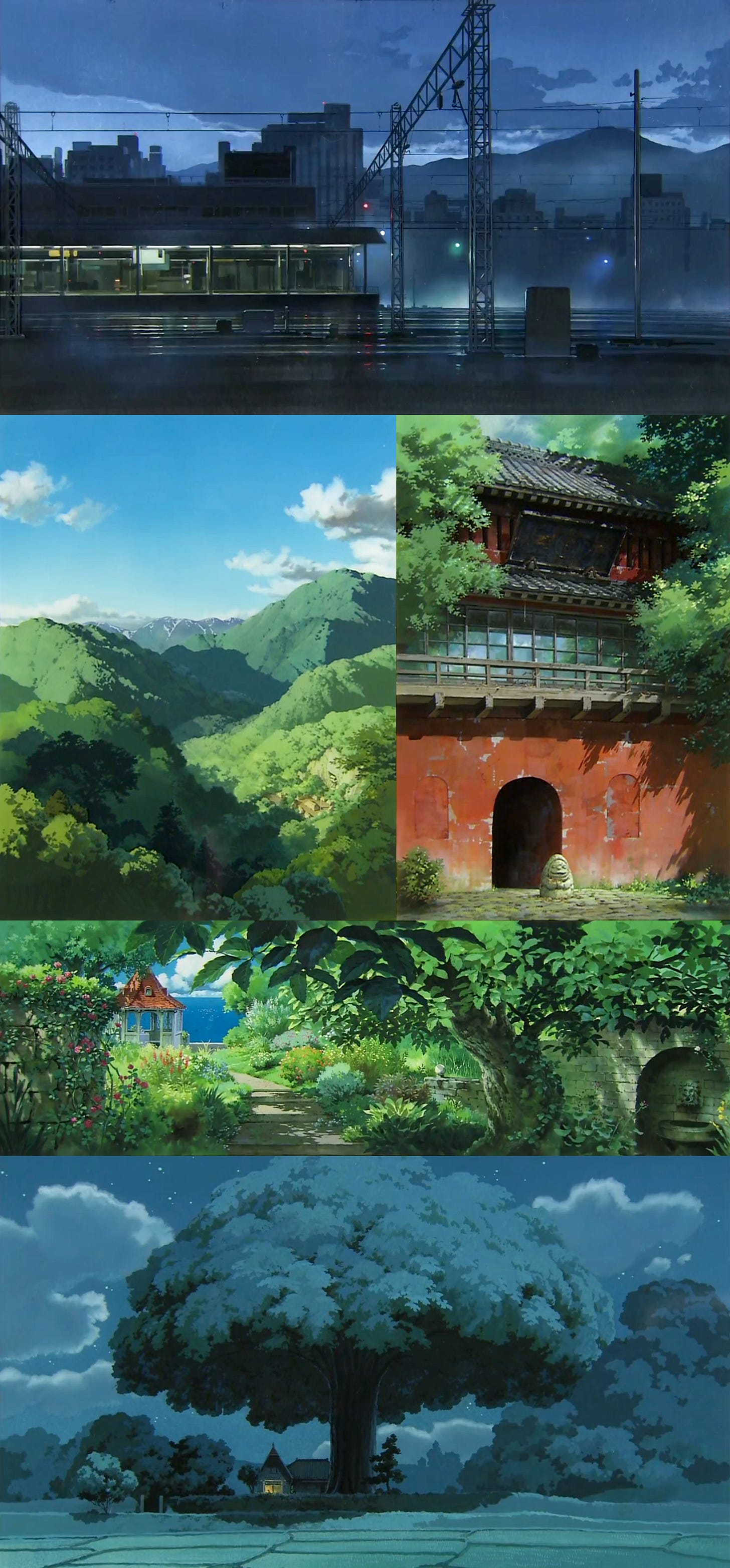
Studio Ghibli is famous for its worlds. Holding these worlds together are their backgrounds — the enthralling, evocative paintings that create a space for the characters.
It’s easy to underrate backgrounds, and hard to overrate them. Katsuhiro Otomo (Akira) once called them more important than character animation: “Without building the foundation, you can’t construct a big building on it.” Great backgrounds can make a film. Who’s really looked at the forest in My Neighbor Totoro and come away cold?
The art director who supervised that forest, Kazuo Oga, is a defining figure for Ghibli. He’s one of the most famous background painters of all time. His sensitivity to subtle details helped to turn films like Only Yesterday and Princess Mononoke into classics.
As another of Ghibli’s top background supervisors, Naoya Tanaka, has said:
It’s not a naturalistic effect. […] He extracts the essence of important elements of the scene. Then he augments them to enrich the image. Oga is very adept at this. What this does is change the landscape from something familiar to something that feels more like déjà vu.
It’s a powerful feeling, and a powerful beauty. But how does Oga do it?

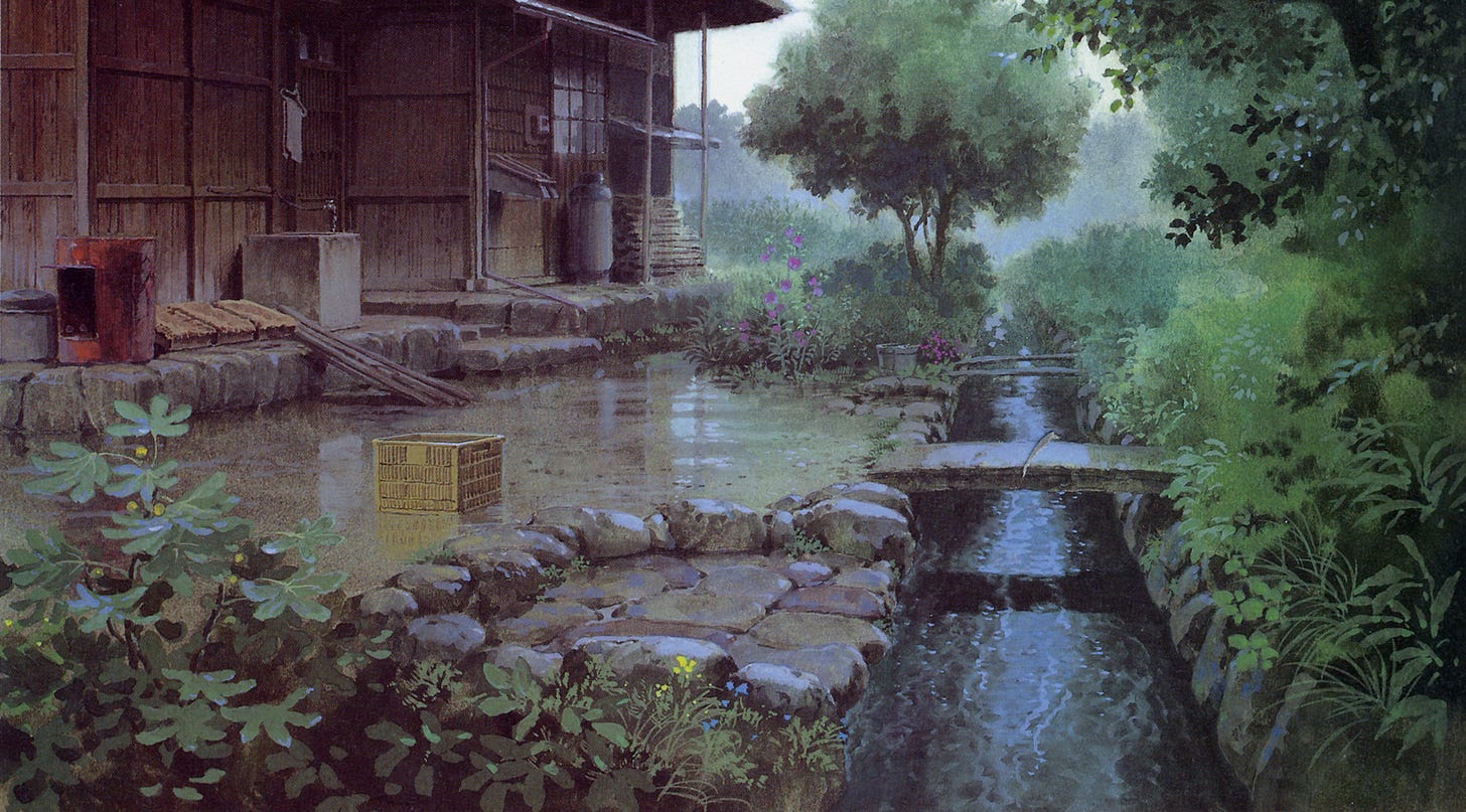
The secret doesn’t lie in expensive tools. “Sometimes, people outside the animation industry ask me what kinds of paint I use,” Oga said in the 2000s, “and most people tend to look surprised when I tell them they’re poster colors.”1
For Japan’s background artists, poster colors were the industry standard back then. Studio Ghibli used a brand called Nicker Poster Color, a bit like an opaque watercolor. Sold in big, cheap tubs, poster colors were designed less for fine art than for school art projects. A disposable paint, not made to last. But Oga liked it.
He worked with around 21 colors at the time, like bleu celeste and olive green — just a few. What mattered, he said, was how he used these cheap paints, rather than how many he had. The look came from the contrasts, the combinations. If you focused on the little things, you could make it work. As he explained:
Because it’s a neat paint, it’s pretty convenient to use as long as you don’t apply a thick coat. If the color gradations are combined well, you can get colors that look like transparent watercolor. […] In addition, even with a small number of colors, you can create a wide range of colors through subtle mixing.
This mixing was freeform — there was no trick to it. He’d simply paid attention long enough to develop a sense of what worked. Talking to Naoya Tanaka, Oga compared it to being a cook at a Chinese restaurant who “scoops up salt or soy sauce with a ladle” and tosses it into a dish. Tanaka felt similarly.
The secret wasn’t hiding in Oga’s other tools, either. They were typical for anime: things like heavy-duty, 400-pound TMK poster paper, or Japanese flat brushes and fine-pointed Sakuyo brushes. He also had water — for soaking the paper at the start, allowing for more color gradation and natural textures.
This water put Oga, like all Ghibli background painters, on a strict timer. Their method was straightforward: paint the base coat (ji-nuri) before the paper dried. You had to dash off the bulk of the painting in one go. As Tanaka noted, this only gave you “30 minutes to 1 hour.” It was tough, and a painter couldn’t afford any distractions.
Although you could refine an image after the paper dried, a bad base coat meant a bad painting. This was quick, manic, unpretentious work, done with basic tools. Despite the beauty, it was very much a job.
And that’s how Oga approached it. “I think background painters are craftspeople (shokunin),” he told Tanaka. The role of the background team, Oga said, was to “determine the shape of what is depicted in the storyboards and layouts in concrete terms.” For him, background artists fulfill the film’s vision — not their own.
In the documentary Kazuo Oga Exhibition: The One Who Drew Totoro’s Forest (2007), Oga put it in an even blunter way:
… backgrounds aren’t solely the creation of the artist who created them. They were created to fill a need. Backgrounds don’t express the artist’s inner world.
It makes him sound distant from the work. And yet Oga’s worlds clearly didn’t come from the hands of a workaday artist. They reveal a deep attachment to what they portray.
So, how does Oga do it? The first step is that he, to use his word, “plays.”
For Oga, doing the job is just the start. “The fun comes in the work when you put something on top of it,” he said. It comes from adding things, sneaking things, learning things, pushing further, getting better. It comes in the extra stuff, the details.
In the documentary, Oga smiles as he notes something he’d put into a Spirited Away scene — one with a large tree. He points to one of its branches. “See here? Those are Dendrobium orchids,” he says. “It’s a parasitic plant that grows around Mt. Takao. You can see them in May and June. I just added them on a whim.”
Oga’s craft drives him to take in more of the real world, to bring out more of his own inspiration, and channel it into the films. He prefers on-site research — the kind that gives you an intuitive sense of things. Although he reads, takes photographs and makes sketches to prepare for a film, he likes to feel the essence of a place. As he said:
Photographs alone can’t convey the atmosphere or the scale. When you actually go, you see the way mist rises from the valleys. You have to see the way the mist looks with your own eyes. Later you can use what you’ve seen as a point of departure for your creativity. With photos, you can’t judge how conditions change through time.
That’s exactly what he does in the video above — painting Paulownia trees he’d seen and sketched in 2006, and finding fresh approaches as he tries to capture their effect. The reality is there, but he’s honing in, departing, intensifying.
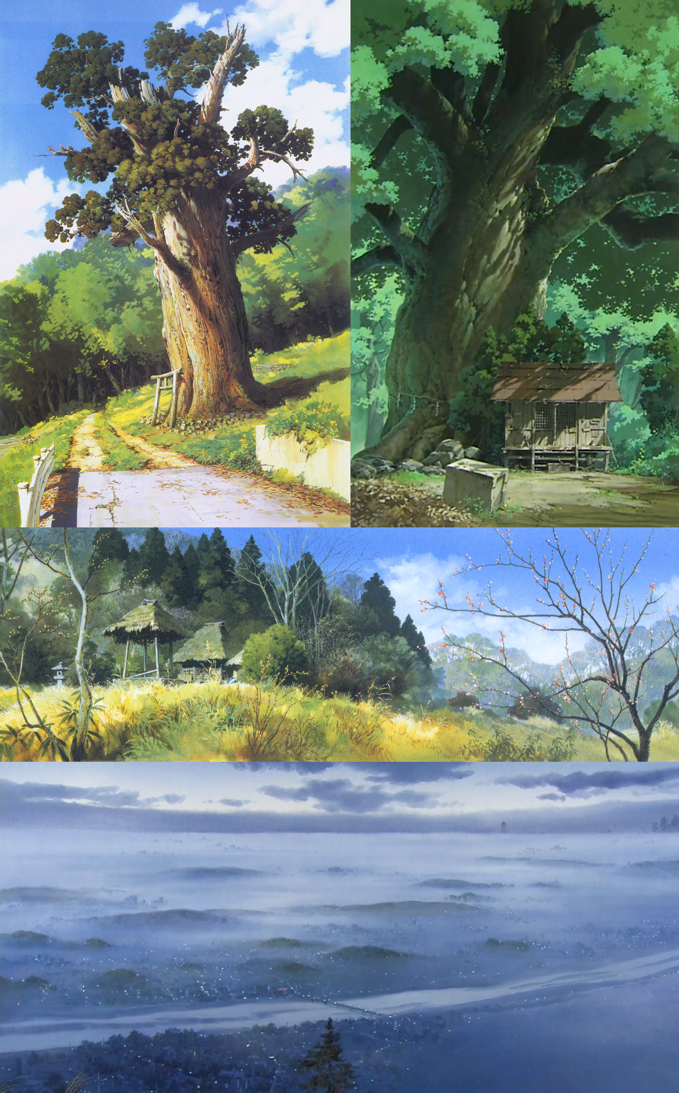
“The goal is to get the essential point across effectively,” Oga says in The One Who Drew Totoro’s Forest. When you look closely at his paintings, you realize how impressionistic they often are. He’s not rendering everything. But he is rendering the little things.
It’s in Isao Takahata’s Pom Poko (1994), too, where Oga depicts the changing of the seasons through small, sometimes subconscious details. The film is set in Tama, where he lived at the time. “I had a sense of the foliage and the scenery,” he said. “I simply created backgrounds that seemed to convey the appropriate settings.”
That’s really the heart of it. Oga notices things — little things. He gets a feel for them. When he sits down to work, he brings with him all the unimportant details that matter the most. Then, with his paint, he creates an artwork that centers those details, elevates them. It’s more a way of seeing and feeling than it is a technique.
In so doing, Oga fulfills the vision of the film as only a master of the craft can. “What I try to do,” he says toward the end of The One Who Drew Totoro’s Forest, “is create backgrounds that do justice to the actual setting.”
2. Newsbits
In France, Gobelins released a new graduation film called Funeral at Nine — a tightly wound, visually imaginative piece where everything leans. Check it out.
A late-breaking story from America: Bob Chapek is out at Disney and Bob Iger is back, “effective immediately.”
China’s Light Chaser (New Gods: Yang Jian) is talking about its next film — 30,000 Miles from Chang’an. Where New Gods reimagined myths for modern audiences, Chang’an does it with history, starring the ancient poets Li Bai and Gao Shi.
Indian studio Bakarmax hit its Kickstarter goal for Aaapki Poojita, billed as India’s first adult animated comedy. Years in the making, with previous interest from Disney, it’s not for kids — but the vision is clear. The campaign continues, aiming for stretch goals now.
On November 18, the Cuban animated feature La Súper premiered at the Cine Charles Chaplin in Havana. Directed by Ernesto Piña, it’s a long-gestating project about a superhero who battles violence against women. Radix has more.
Another from China: the animated version of the popular novel The Three-Body Problem comes to Bilibili next month, and the hype is huge. It’s been in the works for five years.
In Russia, studio Melnitsa and director Anton Dyakov (BoxBallet) are preparing a full-length 2D animated film called “Экспедитор” — literally, Expeditor. It’s set in a future where Earth’s resources are depleted, and space pilots haul in materials from elsewhere. It was pitched to the Cinema Fund this week. See artwork here.
Produced by Fundi Films in South Africa, and created by a pan-African team, the children’s animated series My Better World is now up for an International Emmy.
Lastly, we wrote about three great ‘60s cartoons by Halas & Batchelor — a foundational studio in British animation.
3. Quick look back — Flat Hatting (UPA)
Keep reading with a 7-day free trial
Subscribe to Animation Obsessive to keep reading this post and get 7 days of free access to the full post archives.


