We’re so glad you could make it! This is the fourth bonus issue of the Animation Obsessive newsletter. Not only that — it’s our very first members-only edition. Welcome behind the scenes.
This week, we’re looking at the technique and evolution of Katsuhiro Otomo’s storyboarding. It’s a big topic — Otomo is famous as a storyboarder. He’s known for boarding his films by himself, at an intense level of detail. That includes Akira. In many ways, he’s the father of Satoshi Kon’s storyboarding style.
But Akira, which Otomo based on his own manga, is only the tip of the iceberg. His skill extends far beyond just that film. Today, we’re looking at a range of Otomo’s incredible storyboarding work from the 1980s through the 2010s. Along the way, we’ll dig into exactly what makes him tick as a storyboarder.
Enjoy!
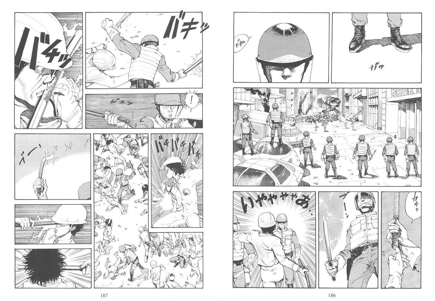
It all began with manga. In fact, if it had ended there, Otomo still would’ve been a star. While his manga work barely registered in America compared to the impact of the Akira anime, you could say that the opposite was true in Japan. Otomo’s manga, especially in the late ‘70s, changed everything. It’s hard to exaggerate just how key it was.
As artist Naoki Urasawa explained in 2009, it was Otomo’s unfinished Fireball (1979) that began to reinvent the way manga was done, across the board:1
… because of Fireball, now everyone draws this way — and I mean absolutely everyone, including myself. […] When I met Otomo, I told him that for us, Fireball was our New Treasure Island [Tezuka’s first major work]. […] It opened the door. It was the beginning of the manga of our age.
Satoshi Kon, who started out in manga (and worked as Otomo’s art assistant), had a similar experience. “I was heavily influenced by Katsuhiro Otomo’s Domu and Akira,” he said in the late ‘90s. “I especially liked Domu, and I figured that if I were allowed to make just one movie from among all the manga I’d read, that would be it.”
It wasn’t just Otomo’s detailed, realistic drawing style. His way of pacing manga was new. As Urasawa noted, it felt more cinematic — Otomo was taking beats from film. “It was different from the conventional rhythm in Japanese manga and more like something lifted from Kubrick or Peckinpah,” Urasawa said.
So, we have to keep this complex blend in mind as we approach Otomo’s storyboards. He came at them like a manga artist who’d come at manga like a filmmaker.
Otomo’s first director credits appeared in Robot Carnival and Neo Tokyo, a pair of obscure anime anthologies from 1987. His piece for the latter, The Order to Stop Construction, is a deeply underrated study in suspense. But it was Akira, the following year, that put Otomo on the map as an anime director.
Alongside his other duties on Akira, he drew the film’s 738 pages of storyboards by himself. “I think I did too much on my own for Akira,” he later said.2
It was a time-consuming process. Otomo boarded keeping in mind that Akira would be shot on 70mm film, a rarity for anime. That thinking was behind some of the intense detail he put into his boards — beyond even many manga of the day. The almost-surreal intricacy of Otomo’s own manga art is another clear influence.
But Otomo struggled, and he approached boarding in a trial-and-error way. Long, fully realized sections of the 738-page storyboard are crossed out in surviving prints, never making it to camera. Otomo discussed the problem, and his general attitude toward storyboarding Akira, at the time:
I took parts that I’d like to see in the movie and drew them, but I took out a lot of those. The storyboards took a long time because I did things this way. … That’s the hard part about animation. You really have to finish it in the storyboard phase. You can’t edit it later. Things get edited, of course, but that’s mainly to cut out bits that overlap. The flow of the movie is pretty much determined during the storyboard phase. That’s tough. It really is.
This way of looking at storyboards helps to explain why, though, so many of the shots that made it into the film play out exactly like the film. As blogger and VFX artist Yonghow Vong once wrote, “Otomo must have seen the finished product play on inside his head over and over again, long before any of us got to watch it.”


The way Otomo constructed the Akira film was less as a traditional story, with specific lead characters, and more as a study of a world. “I wanted to put together something more along the lines of idle ramblings on Neo Tokyo itself,” he said at the time. That meant decentering the main protagonists. In a later interview, he characterized Akira as a fundamentally technical visual experiment:
I thought of it more as a visual work than as an animation. It was less about making the characters move than about the edits and things you have in a live-action film. I wanted to do something more technical with the visuals. Of course, we do animate the characters. [...] The thing is, it’s not really a... What would you call it? It’s not really a character piece. Not a character piece? Well, not a hero piece, I mean. In a hero piece, he shows up and he looks cool and all that. In Akira, there isn’t a hero like that. I wanted to create this movie as more of a total visual piece.
After Akira, it would be a few years before Otomo released anime again. His next one, Memories (1995), would be an anthology of shorts based in part on his manga. He only directed one of its three segments — Cannon Fodder.
Otomo’s focus on visuals and place had grown more intense by this time. His primary goal with Memories was to create “something superior to other Japanese animation films” on the visual front, he said. That’s clearly on display in Cannon Fodder, which in many ways perfects Akira’s emphasis on location and technique.
Cannon Fodder looks like a film shot in one continuous take, without edits. The style “just happened as I was preparing the storyboard,” Otomo said. But a truly unbroken shot wasn’t really his goal, and he didn’t stick religiously to a one-take format as he drew. “For me,” he explained, “it was more about making the picture flow like a scroll.”
Otomo’s boards for Cannon Fodder are even more detailed than Akira’s, breaking down shots and environments with the specificity of an architectural blueprint. (See a few of them here.) But there’s still a film in these drawings, and not just a sequence of locations. The flowing cinematography is immersive, mapped out with a true filmmaker’s eye. And it proved very, very difficult to shoot.
When an interviewer asked Otomo what he saw as the main point of Cannon Fodder, he thought for a moment. He didn’t single out the story, characters or even animation. “I guess I want people to submerge themselves into that world without thinking about it too much,” Otomo said. More than anything else, Cannon Fodder is meant as an exploration of place. It’s about the experience of the world that it presents.

The European, Industrial-Revolution imagery of Cannon Fodder led naturally into Steamboy, Otomo’s second feature film. It would require the most ambitious storyboard of his career.
Otomo began storyboarding Steamboy in July 1996, after a research trip to Britain in April. It took him until mid-2000 to finish the storyboards — years after the film had entered production. Like Akira, they ultimately numbered well over 700 pages. Also like Akira, you can see the film in them, in crisp detail.
But the clarity of action and richness of pose in Otomo’s boards for Steamboy often blow his work for Akira away. Many of the environments are breathtaking, too — even getting into Cannon Fodder territory, despite Steamboy’s much longer runtime.
Steamboy’s boards are divided into alphabetized sections. Otomo drew them linearly. A and B, completed in 1997 and 1998, are handily more rendered than Akira’s boards. By the time you hit D, finished in mid-1999, Otomo is sometimes going quicker and rougher. That may be a reflection of looming deadlines.
His pacing still shines, though, as seen in this sequence from the E section. It’s one of the most iconic scenes in Steamboy, and almost all of it is right there in the storyboard:

Despite the effort Otomo poured into these boards, this wasn’t a one-man show. Otomo relied strongly on the vision of others on his team. “[R]e-creating my imagination is not enough at all,” Otomo remarked at the time. “It would be a boring film if it’s just like I imagined at the beginning. It needs to come out as something different.”
Otomo had a definite vision for Steamboy — one of his top staffers said at the time that the director’s “demands are strict.” Nevertheless, he found Otomo easy to work with.
It’s not quite fair how spotty Steamboy’s reputation is. Like Cannon Fodder, it builds on Akira while solving some of the many issues Otomo personally had with that film, like the overabundance of shots. Most of the flaws Steamboy does have, it shares with Akira.
Ultimately, it let Otomo continue to drill down on the parts of Akira that interested him so much — visuals, technique and place.


Otomo’s focus on that last aspect, place, had almost become a fixation by this point. Even given the length of his storyboards for Steamboy, he noted, “[W]hat I put my most effort in was the process of layouts.” As he said around the time of the film’s release:
Someone asked me once: “You draw layouts yourself. What is the most important part in making animation?” […] I said, “That’s art design and backgrounds.” They go, “Why?” I go, “Seventy percent of the screen is art design and backgrounds.” … That’s where the foundation is. Without building the foundation, you can’t construct a big building on it.
That emphasis on layouts was a sign of things to come. It would culminate in one of Otomo’s very best works — Combustible from 2012.
Combustible is lightly related to a manga short Otomo made in the mid-1990s. But he pulled that story inside-out and started mostly from scratch. “So with no screenplay we began working on the storyboards,” Otomo said.
Those storyboards would turn out very differently from Steamboy’s or Cannon Fodder’s or Akira’s. Gone was the vertical, paneled template used in so many anime productions. The way it’s drawn is strange, too. Otomo’s sketches are gorgeous, but they almost don’t feel like storyboards — there’s a subtlety and stillness to them, and they’re scattered across each page at random sizes.
Maybe it was a luxury that Otomo could afford. His focus on layout in Steamboy had evolved into something much more this time. “I took charge of almost the entire layout and background designs myself — right down to the roof tiles,” he said. Combustible’s lush, rendered world was only partly in the storyboards.
The storyboards are still incredible, though. And they show an artist who’s developed in a way that few ever do — he’s a master whose mastery allows him to be casual, without losing an ounce of beauty. It’s been more than 40 years since Fireball, and Otomo is still exciting.

That’s all for this week’s bonus issue! We hope you enjoyed reading.
This installment has an exclusive audience compared to our Sunday issues. We’re very glad you’re with us. If you’d like, feel free to reach out with your thoughts on the piece, Otomo’s work or anything else in the comments.
Thanks for sticking around until the end! Next Thursday, you can look forward to another deep-dive — one we’re really excited for. See you then.
Taken from a 2009 interview in Freestyle magazine, as translated by an anonymous blogger in 2015.
Otomo made this remark in a behind-the-scenes featurette for the Memories anthology. We rely on it and similar featurettes throughout the article, including Akira Production Report and Multi-Screen Landscape Study (from the Steamboy DVD).


Fascinating! It’s hard to believe that these polished storyboards are first drafts. Are they?? Many also look like they’re in ink…quite humbling in any case.