'And Walt Went Crazy'
Plus: animation news.
Happy Sunday! We’re here with another issue of the Animation Obsessive newsletter. Today’s agenda is:
1️⃣ Surveying August in our newsletter.
2️⃣ Animation news around the world.
Just finding us? It’s free to sign up for our Sunday issues — get them right in your inbox:
Now, we’re off!
1: August in review
Today is the last Sunday of August 2023. Every now and then, we like to take stock of our recent writing in the newsletter, looking at the connections and shared themes between issues. It feels like a good moment to do just that.
Animation Obsessive is a small group, and we’re always in dialogue with each other. Our own interests, and often the conversations we’re having behind the scenes, drive what you see in the newsletter. It means that certain topics reappear over time in varying forms.
A perennial one for us is the art of realism, tangibility and believability in animation. This medium has the power to feel more real than reality, and that fascinates us. As Isao Takahata said in a documentary about his film Only Yesterday (1991):
Live-action films are so common these days that they’re becoming a part of the reality. I don’t think audiences really “watch” live-action features carefully. However, they’d be forced to for an anime feature. Because anime captures things we do, and reflects more solid reality than how they actually are. And it makes people realize what we do everyday.
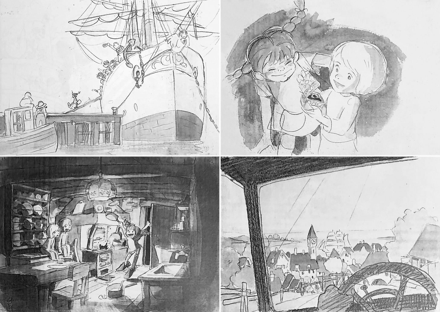
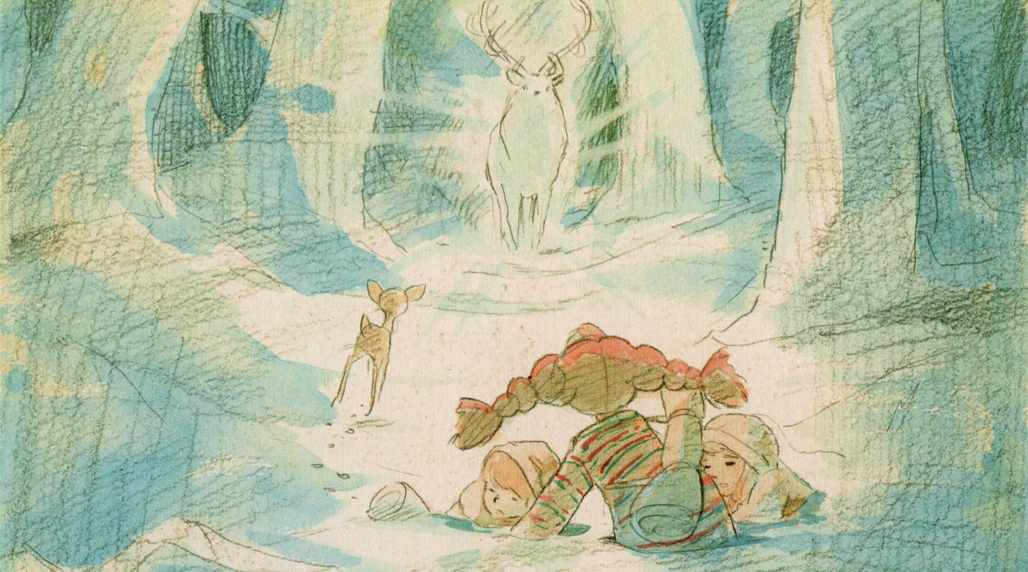
It’s an idea that Takahata explored across his career. Our personal favorite issue this month looks at an early point in the development of this filmmaking philosophy: Takahata’s Pippi Longstocking.
Writing about Pippi was a major goal of ours. The series, planned in 1971 but never produced, had Takahata and Hayao Miyazaki and Yoichi Kotabe (of Nintendo fame) on staff. Documents from the production show how Takahata developed his style: the creation of a sense of concreteness, tangibility, reality. Depicting the everyday.
A line that floored us in Takahata’s Pippi documents is about motion. He felt that the team “should not only depict the intentions and outcomes of Pippi’s actions, but also clearly depict the process of the actions in such a way that they themselves evoke enjoyment and interest.” This act of showing process through animation is pure Takahata, and it’s something Miyazaki would carry into his own directorial work.
As much as animation with a sense of realism grabs us, though, we’re also taken by its opposite: the stuff that abandons realism altogether. Mid-century cartoons that embrace their existence as drawings in made-up, constructed worlds. Modern indie animation that’s more about mental and emotional states than any “solid reality.”
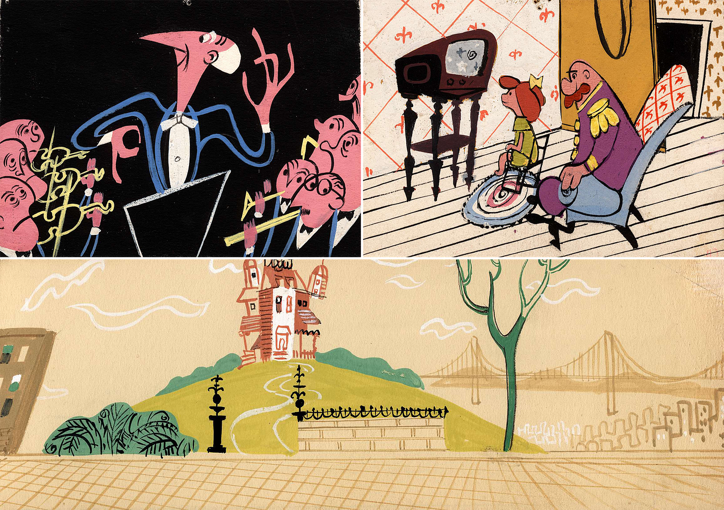
We clearly aren’t alone here. Our most popular issue of August is our introduction to UPA, the animation studio most closely associated with anti-realism. In the ‘40s and ‘50s, it upturned the animation medium. We put together a viewing guide to help more people explore the details of that revolution.
Many UPA films are about 20th century life, but they don’t look like life: everything is flattened out, turned into a graphic or painterly figure. The films don’t move like life, either: this is animation at the other extreme from Snow White and the Prince.
UPA’s modernism wasn’t just a style — there was a political undercurrent to the studio. Most of its staff was progressive, and many had ties to communist art and politics groups in the 1940s. The Red Scare witch hunts nearly destroyed the company. In the ‘50s, modern art itself looked like communism to some Americans.
That problem hit Disney when its commercial wing experimented with mid-century design back then. The book Cartoon Modern quotes an artist from the Disney team:
There was a little kid that used to write Walt telling him to stay away from modern art because it’s communistic. So when the commercial came on, he got a letter from this kid, a little malcontent sitting somewhere, and he wrote, “I’m disappointed Walt. I never thought you’d succumb. What happened to you?” and Walt went crazy. He stormed down there and outlawed us against using any of the Disney characters in the commercials [...] and it basically spelled the end of the unit.
The irony is that, even as some Americans saw mid-century animation as communist propaganda, it was deeply out of favor in the USSR.
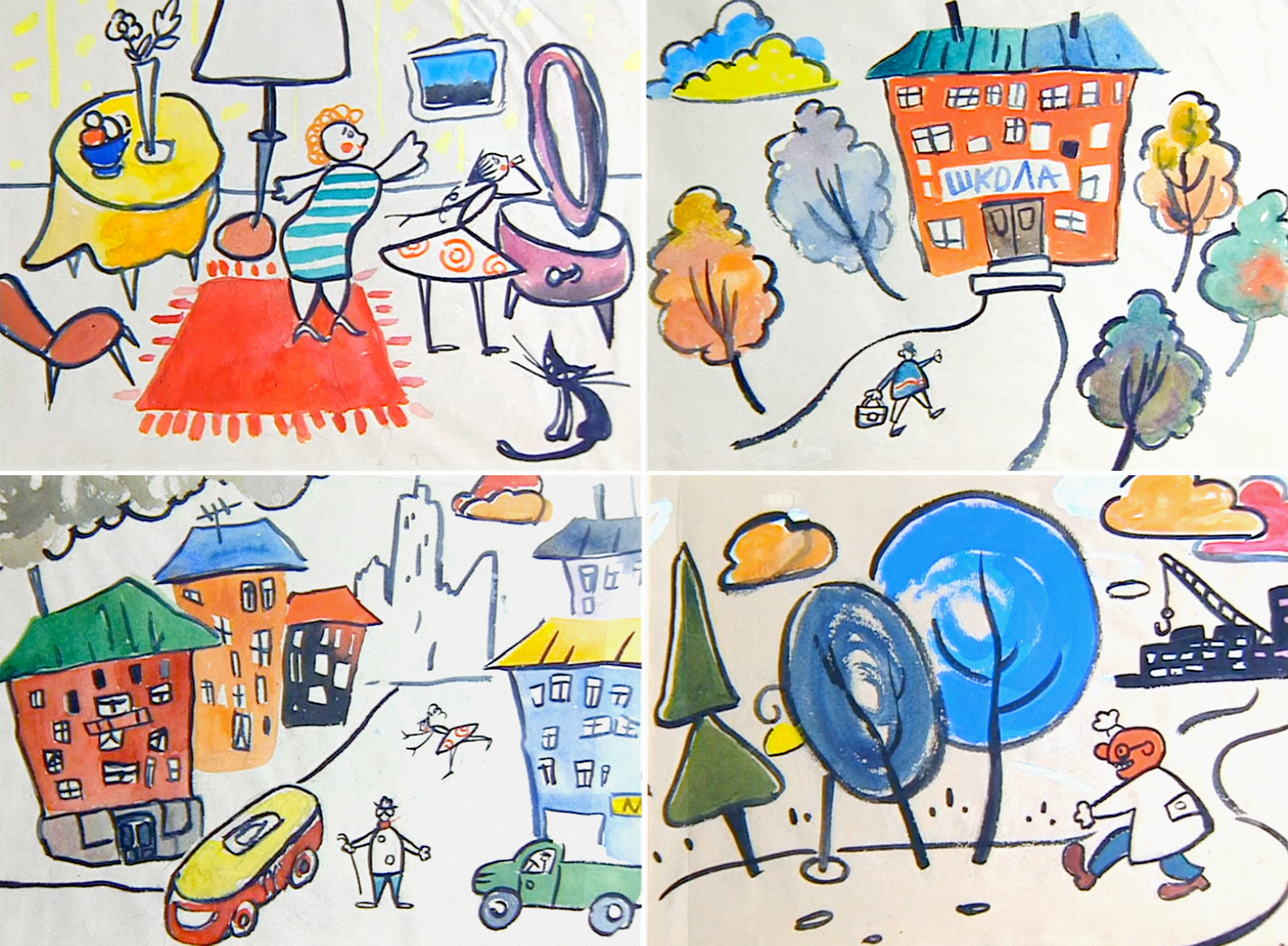
In the ‘50s, Soviet cartoons answered to the dogma of Socialist Realism. Modern art contained a threat of bourgeois decadence and maybe political subversion: after all, what if it confused the proletariat? Animation stuck to a Disney-esque look — often with rotoscoping, and often with a sense of design more indebted to the 1800s than the 1950s. Almost all of it avoided stories about modern life.
At Moscow’s Soyuzmultfilm, there was an open rebellion against this style around the start of the ‘60s.1 This month, two issues for paying subscribers tackle films that led the charge: The Story of a Crime (1962) by Fyodor Khitruk and Big Troubles (1961) by the Brumberg sisters.
The Brumbergs were super-veterans who’d helped to establish Soviet animation in the ‘20s. Their process was famously wild. “Loud cackling, laughter, clapping hands, bassy velvet grumbling, squeals and shouts were eternally heard coming from the Brumberg sisters’ room, which was never empty,” wrote one Soyuzmultfilm director.
Early Brumberg cartoons were modernist and experimental — one of them, The Tale of Tsar Durondai (1934), was a core influence on UPA itself.2 When the Soviet avant-garde was suppressed during the Stalin years, the Brumbergs had to conform. But Big Troubles saw them back in force: it’s defiantly modern and anti-realistic in design and motion. It’s also a clever satire of modern life. It became the talk of Soyuzmultfilm.
The Story of a Crime was an even more extreme push away from Socialist Realism, based on collage and sharply limited animation. Khitruk was a first-time director but a star animator. He’d come up in the Stalin era and grown into a master, even a genius, of the old style. With The Story of a Crime, he helped to destroy what he’d helped to build.
The film captured Soyuzmultfilm’s younger set like no other. As Yuri Norstein (Hedgehog in the Fog) remembered, “It seemed that The Story of a Crime suddenly illuminated us all. Opening other doors, letting in another sun. It was thought that everything done before Crime — old junk, trash.”
What’s odd is that Khitruk himself struggled with the new style of motion — limited animation — in these films. Although he worked as an animator on Big Troubles, he said that he “failed,” being too “rooted in my inveterate realism.”3 On another project, he tried to animate a flat, graphic character and accidentally made a “freak [who] moved naturalistically.”
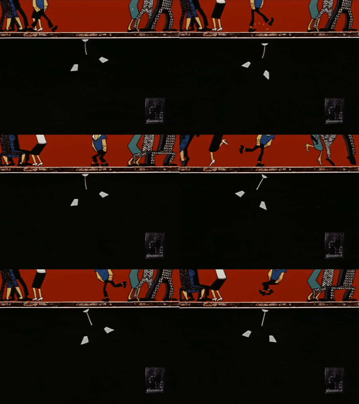
Yet he proved to be a great director of limited animation with The Story of a Crime. He and his animators cut down every motion to its bare essence, until almost no frames were left. As we noted in the issue:
This idea guided the team to one of the best pieces of limited animation ever filmed: the dance of the protagonist’s upstairs neighbors. Starting around the 11:30 mark, we watch the characters’ legs move to folk music, every motion absolutely clipped. But nothing here is predictable — only the most telling details remain, and the team used expressive, surprising frame-rate modulation to vary the timing throughout. You get the sense that this is handcrafted movement, made without any standard formula.
Frame-rate modulation was the subject of an issue this month, too — a revised reprint of a paywalled article from earlier in the year. It’s one of the most technical pieces we’ve made public, but there was a lot of positive feedback, which was amazing.
The examples we used in the article were mostly American, to show how this technique — sometimes seen as specific to anime — has a broad history. But we didn’t touch on the Soviet stuff, which is far from just the dance above. See also the brilliantly clipped dance in Big Troubles, animated by Marina Voskanyants, whose timing is once again free and wholly unrealistic. It happens at 5:17.
Yet modulation can add a frightening sense of realism, too. After we published that piece, we created a short video for Twitter based on a clip from Takahata’s Horus: Prince of the Sun. It shows how a rapid modulation between “ones” and “twos” can give movement more depth, dimension and weighty reality, as seen below:
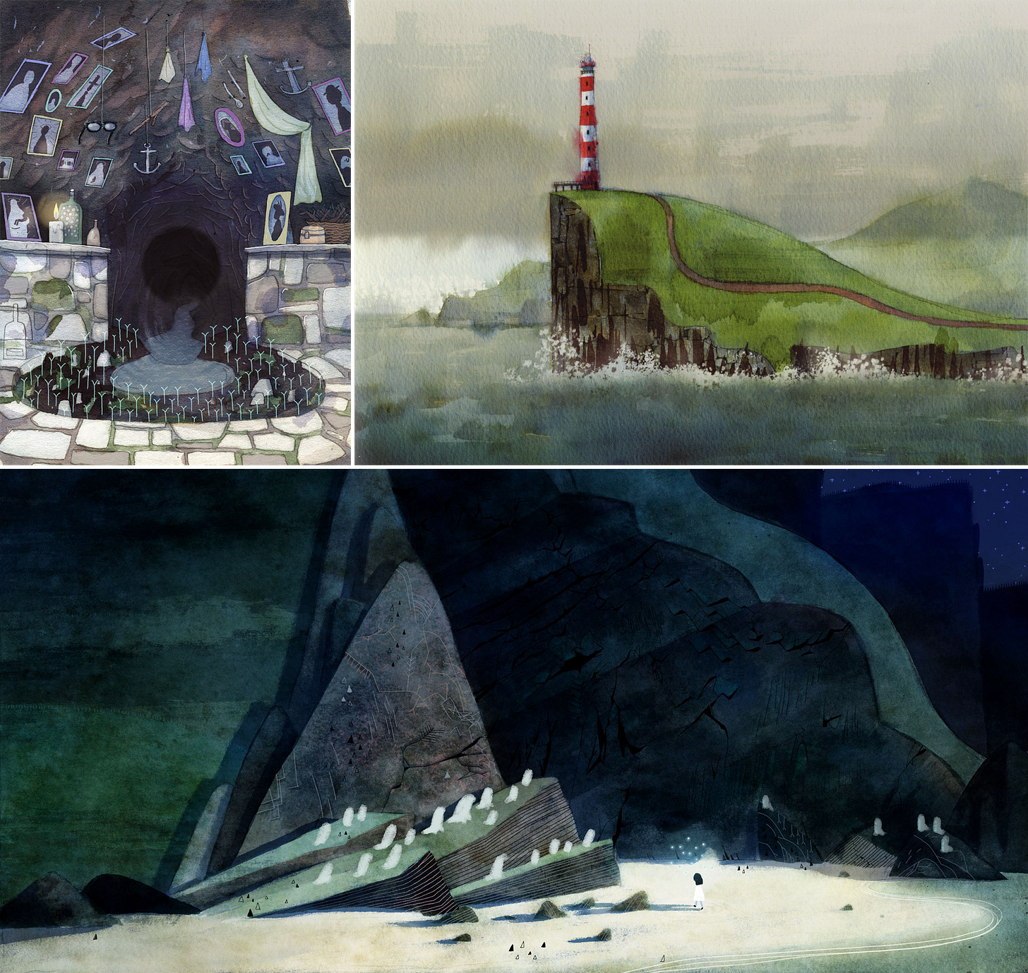
Not everything this month was a clean fit with a set theme. It never is, and we like that variety. For one, we tackled the art direction of Song of the Sea, that visually stunning feature from Ireland. We looked at how Tomm Moore, art director Adrien Merigeau (Genius Loci) and more took the Cartoon Saloon style a step beyond The Secret of Kells.
We also published our first guest-written issue: The Other Yellow Submarine?
Animator Mark Neeley pitched this story to us back in July, and it was so unusual and winding that we had to say yes. His yearslong quest to learn about a canceled Beach Boys cartoon took him to wild places. We’re happy to give the article a home — the second piece of commissioned writing we’ve published to date (after journalist Ethan Bien’s excellent news story on a Russian animation festival in April 2023).
And that wraps up our wrap-up! August had its challenges in terms of workload, but there’s a lot we’re very happy with. The Story of a Crime and Pippi by themselves are two subjects we’ve built toward covering in detail for a long time, and having them in the world is a wonderful feeling.
There’s more set for the coming weeks — stay tuned.
2: Animation news worldwide
Nizo Yamamoto, 1953–2023
There was a late-breaking story as we finalized last Sunday’s issue. Art director Nizo Yamamoto, best known for his work at Studio Ghibli, passed away at age 70.
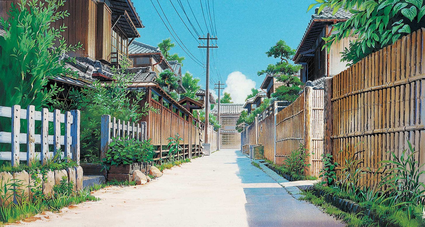
The Japanese term art director (bijutsu kantoku) can also be translated as background supervisor: the “art” in question is background art. And Yamamoto’s great talent touched the backgrounds of Studio Ghibli films like Princess Mononoke, Grave of the Fireflies and beyond.
Yamamoto got his start in art direction in the ‘70s, on a long-forgotten series called Attack on Tomorrow (1977). But it was his second art direction job that changed the course of his career: the TV series Future Boy Conan (1978) by Hayao Miyazaki.
In an interview when Yamamoto was just 26, he talked about his experiences on Conan. “If Miyazaki-san puts all of his strength into it, everyone else will have no choice but to do the same,” he said. Whenever someone on the team fell below a certain level, it stuck out — it looked like they were “cutting corners.”4
Conan was a challenging project that tested Yamamoto’s limits. “But it was physically rather than mentally exhausting. I didn’t really dislike it when it was over,” he said. “I think I learned a lot because I was mentally fulfilled.”
From that point, Yamamoto continued to work with Miyazaki and Isao Takahata on pre-Ghibli projects like The Castle of Cagliostro (1979), Chie the Brat (1981) and the Sherlock Hound series. When Ghibli began, he was one of the two credited art directors on Castle in the Sky (1986). And so it went.
In honor of Yamamoto’s memory, Catsuka shared a snippet from the documentary How Princess Mononoke Was Born, where we watch Yamamoto assemble a background out of eight layers of art and cels. The complexity is astounding.
Besides his long career with Ghibli, Yamamoto also had a role in the backgrounds of films like Magnetic Rose, Perfect Blue and The Girl Who Leapt Through Time. He released art books, had exhibitions of his paintings. His work has been cherished for years around the world, even if not everyone who’s seen it knows Yamamoto by name.
In its obituary, Cartoon Brew quoted an interview that Yamamoto gave to The Statesman a few years ago:
If a background is really good, it’s taken for granted — viewers can ignore it and just immerse themselves in the world of the movie. If it’s bad, they can’t help noticing it, and lose their concentration. When we remember the good times in our lives, we always remember the background as beautiful, even if we didn’t pay much attention to it at the time. That is the kind of realistic beauty that I want to depict.
Newsbits
We lost Arleen Sorkin (67), the original voice of Harley Quinn.
American director Joe Murray of Rocko’s Modern Life has turned his rare, expensive, out-of-print book Creating Animated Cartoons with Character into a free download. (Thanks to Charmaine Verhagen on Twitter for the tip.)
In China, Wuhu Animator Space has an extensive interview (with lots of GIFs and pictures) on the making of Chang’an, and how ancient art inspired its look.
In Brazil, Alê Abreu (Perlimps, Boy and the World) is teasing a new film with charming sketches.
Junk World, the sequel to Japan’s stop-motion cult hit Junk Head, is coming 2025. See the trailer.
Another trailer from Japan: The Imaginary by director Yoshiyuki Momose and Studio Ponoc. The team spoke about the massive difficulties involved in its style. Momose said that, in real life, “there are blood vessels, flesh and bone under the skin, and if you hold your hand up to the sun, it will turn red with heat. I was interested in whether it would be possible to express such a feeling in animation.”
A very cool-looking film from South Africa that we missed when it landed in June — Indlela Yokuphila: The Soul’s Journey (complete on YouTube).
Nikita Diakur, an animator based in Germany, had his bizarre film Backflip featured in The New York Times. (We interviewed its composer and sound designer, David Kamp, last year about his creative process.)
The crowdfunding campaign for the American Lackadaisy animated series, a viral indie production, ended with over $2 million from 16,000 backers.
Lastly, in America, Animation Block Party posted its very good 2023 intro animation (created by Jonni Phillips) and announced this year’s winners.
See you again soon!
Frustration with Socialist Realism was rampant at Soyuzmultfilm in the ‘60s. But there was a careful line to walk — it was still technically state policy, even amid the Thaw. “Attempts to find a new style of Soviet animation do not contradict the demands of the method of Socialist Realism … But until recent times, many believed that the only acceptable pictorial method was to copy human characters,” argued Sergei Yutkevich (The Bath) in the early ‘60s.
After the USSR fell, artists could be more open about their goals back in the old days. The production designer of Big Troubles, Lana Azarkh, called that film the “first harbinger in the breakaway from Socrealism” at the studio.
As John Hubley later said of Tsar Durondai, “It had a big influence on us guys who later became UPA [...] this very avant-garde kind of thing, highly designed. It was in the, I suppose you can call it expressionist style, the kind of style from the Twenties and Thirties. It was so modern and fresh and violated so many of the totems.”
Khitruk made that point in this documentary on the Brumbergs (around 21:40). Thanks to reader Daria Lugina for pointing this out!
From Anido’s very long “Black Book” on the series — Future Boy Conan: Film 1/24 Special Issue (1979). Yamamoto’s interview runs from pages 178 to 183.

Another fascinating issue! Song of the Sea was one of the first movies we showed our children when they were 6 and 4 years old. We probably watched it five times in a year and they absolutely loved it.
Separately, this line from a quote in this issue really got me: "handcrafted movement, made without any standard formula." I think that sums up the very thing that makes animation so appealing to me; same with most human creations.
Coming to this a bit late, but I am always fascinated by the intersection of artists and politics. I understand how these things happen but it's always a shame. The art should be the art. How we put food on our plates is another thing entirely. At least to my simple mind.
Cheers and keep up the good work, Animation Obsessive team.