Animating Chinese Ink-Wash Paintings
Plus: retro ads and animation news worldwide.
Glad you could join us! Today’s issue of the Animation Obsessive newsletter is jam-packed. Here’s what we’re doing:
1 — the history and secrets of Chinese ink-wash animation.
2 — this week’s animation news from around the globe.
3 — the retro ad of the week.
4 — the last word.
New here? We publish Thursdays and Sundays, and you can sign up for free to receive our Sunday issues in your inbox, every week. It’s super easy:
Ready? Let’s go!
1. Animating tradition
Art inspires animation. When animators first went to work, they borrowed from existing art — comics and illustrations, paintings and posters. Disney’s Snow White looks like a storybook.
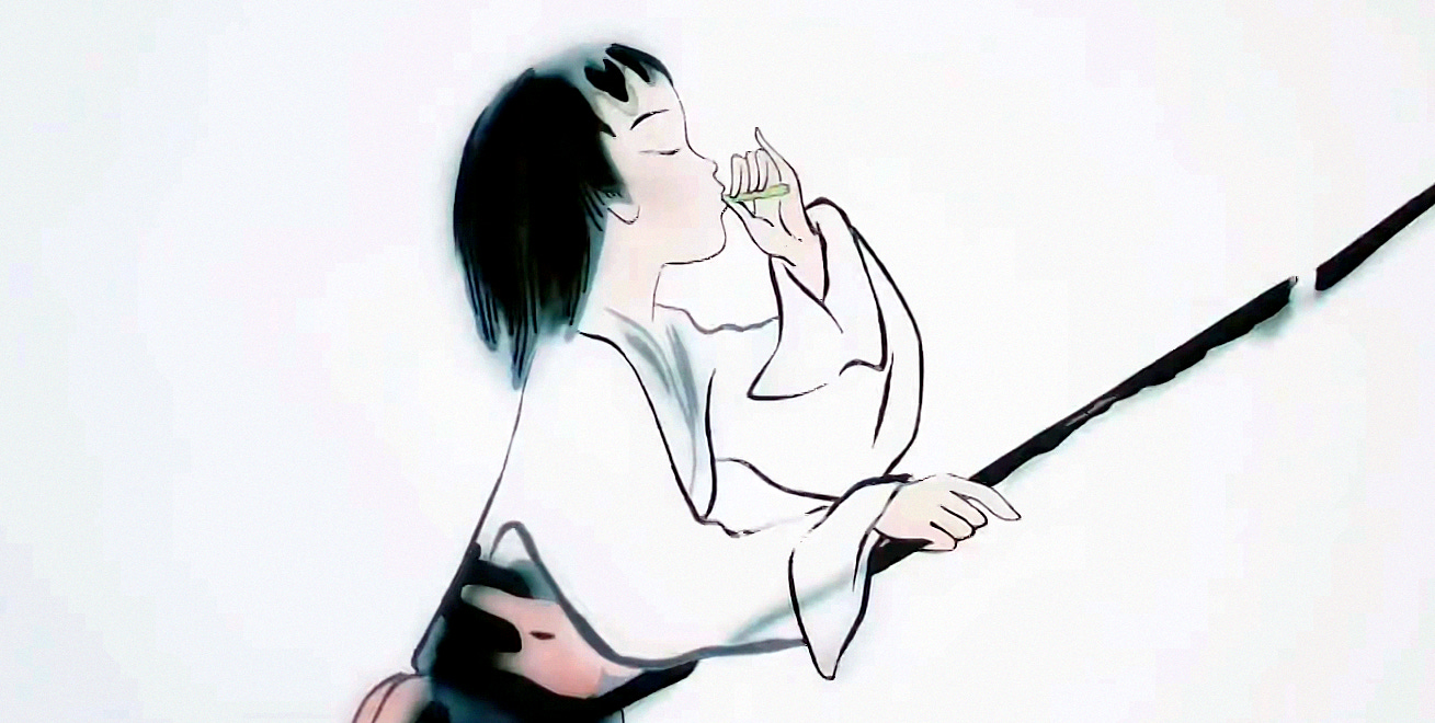
As animation bloomed in countries around the globe, it drew on local styles of art. There’s something magical about seeing an artform, especially a traditional artform, turned into animation. Take Chinese ink-wash painting. When animators first brought it to the screen in the ‘60s, it blew minds. Even today, it wows people whenever we share it.
What is ink-wash animation, though? Why was it born? How was it born? To find the answers, you have to venture back to mid-century Maoist China, an uncertain and chaotic time.
In the ‘50s, Chinese animation was made in Shanghai. Animators at the aptly named Shanghai Film Studio, which was funded and owned by the government, were tasked with creating cartoons for children. The artists educated themselves by studying animated films from America, Japan and Russia.
“We learned everything we could from them, and they all influenced us to a certain degree,” recalled Duan Xiaoxuan, a pioneering camerawoman at the studio. “But how were we supposed to make something actually Chinese?”1
Led by director Te Wei, the Shanghai animators set about solving that problem. The political winds were in their favor in the mid-1950s. Ink-wash painting was in vogue, after being denounced just a few years before. What was praised or banned under Mao could change at a moment’s notice — suddenly, the “opponents of traditional ink painting were considered enemies of the nation,” wrote historian Daisy Yan Du.2
It took time for the Shanghai team to crack the ink-wash code. First, they made cel animation inspired by Peking opera, and puppet films based on folktales. As time passed, and as the Shanghai Animation Film Studio came into being, the first ink-wash film was born — Little Tadpoles Looking for Mama (1960).
Little Tadpoles began as a series of experiments in the late 1950s. Key to these tests were Duan Xiaoxuan and A Da, a major artist and director. “A Da drew; I shot and printed out the film during the night, using a hair dryer to dry the film,” recalled Duan.
The results impressed Te Wei and helped to spark even more ambitious experiments — ones based on the work of a celebrated painter named Qi Baishi (1864–1957). For this round of tests, Shanghai Animation Film Studio created four dedicated units. Each group tried to animate different animals from existing ink-wash paintings, like frogs and baby chicks.
Duan Xiaoxuan remained crucial throughout. That’s because, as she later said, “Photography is the key to ink-wash animation.” The technique that she and the team concocted was incredibly laborious, and it’s mostly secret even today, but the look relies more on shooting than it does on drawing. Daisy Yan Du offered this rough breakdown, relying partly on the speculation of an artist who worked at the studio:
Animators still needed pencils and cels to draw several duplicates of the object to be animated, probably with the help of stencils to control the edges. Each duplicate would have had different ink gradations. The animation photographer Duan Xiaoxuan and her colleagues first shot these pictures one by one, and then superimposed them to create the effect of ink diffusion. They also might have adjusted the lens to take out-of-focus photos, which, if properly superimposed with in-focus photos, would resemble the effect of ink diffusion. […] Usually only a still background such as a landscape was an authentic ink painting unmediated by photography.
The results of their new tests were even better — and Little Tadpoles received a green light. Its story was based on a children’s book. Some of the work done in the tests led directly to scenes in the final film, including the part with the shrimp.
Little Tadpoles was a team effort. Duan recalled that “the whole animation department worked on this film, as did the whole photography department.” Te Wei art-directed it and is often credited with directing it, but recent scholarship suggests that the general director was Tang Cheng (“the big sister of our animated films,” Duan wrote).
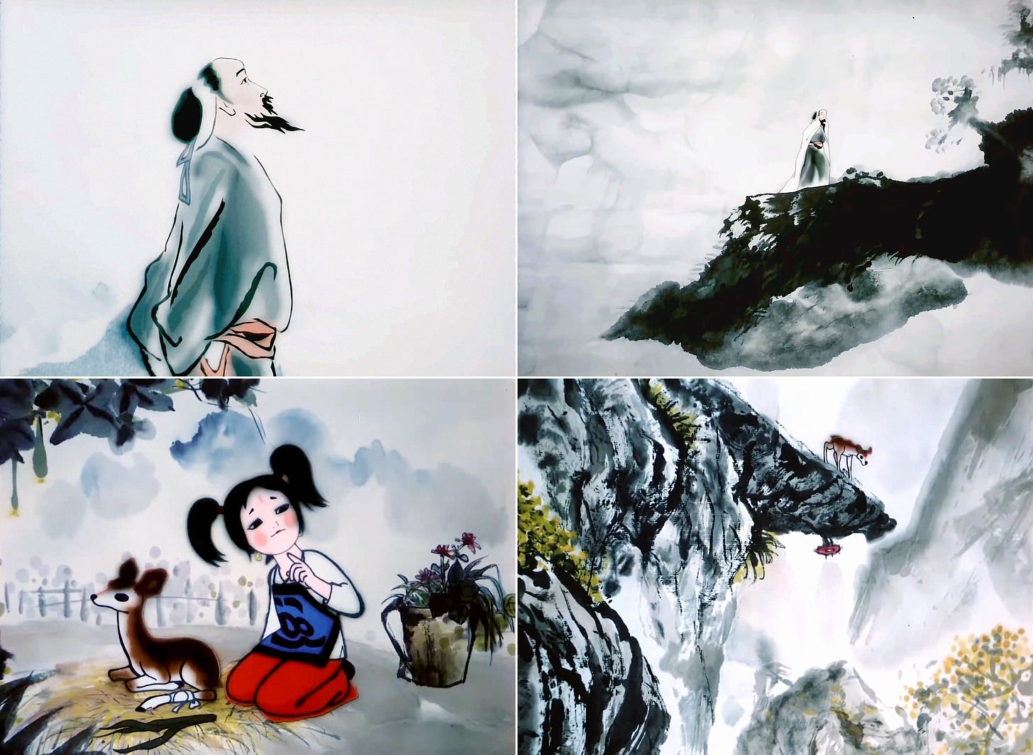
When Little Tadpoles premiered in 1960, it was a success at home and abroad. Ink-wash animation worked — they’d proven it. And so they began to make another film along the same lines, but with far more ambitious methods. This was The Buffalo Boy and His Flute (1963), directed by Te Wei.

Buffalo Boy was a grueling project — one designed to charge headlong into the technical problems that Little Tadpoles had dodged. The team wanted to expand the creative range of ink-wash animation. Its characters, particularly the water buffalo, are much more complex. So are the backgrounds and perspectives.
Duan noted that Buffalo Boy has “many scenes of zooming in, zooming out, panning and tracking.” Shots like these were nearly impossible to achieve with ink-wash animation, and the artists had to improve their process from Little Tadpoles, creating something like a standardized pipeline.
They also spent several months in rural China for research. “Every day we went out with the herd boys and their water buffaloes, always on the road,” Duan recalled. They studied their movements and way of life, taking reference photos along the way. Rather than Qi Baishi, the team drew from painter Li Keran — his herd-boy paintings were well known at the time.
Buffalo Boy almost broke the team. One scene was animated and shot 10 times — another, 16 times. And the story was more sophisticated than the one for Little Tadpoles. It’s mysterious, even a little mystical, and Te Wei noted that it was “designed for adults.”
The film, completed in 1963, is unquestionably a masterpiece. But the political landscape had shifted under the feet of the Shanghai animators. As always, what was acceptable was ever-changing. Daisy Yan Du explained that “traditional ink painting, which stood for China’s unique essence in the early 1960s, came to be regarded as old, conservative, escapist, feudal and reactionary.”
Buffalo Boy was quickly banned. And that was just the start. As the Cultural Revolution began, animation itself became suspect, and Shanghai Animation Film Studio was basically closed until the early 1970s. In the intervening years, many of its artists were sent to labor camps, only to return to the studio as forced propagandists. Speaking to the Los Angeles Times, A Da later recalled:
In 1972 we were sent back to Shanghai, to make propaganda films. That was better, because I could rejoin my family. But the films were very bad […] there was no art in them.
Only in the late ‘70s, after the death of Mao, could the animators work freely again. Buffalo Boy was unbanned — its ink-wash style was no longer deemed “reactionary.” Films like A Da’s beautiful Three Monks (1980) heralded a new golden age for Chinese animation. And, finally, new ink-wash films could be made.
The first was The Deer’s Bell (1982), directed by Tang Cheng and, when she fell sick during production, Wu Qiang. Despite the leaps that Buffalo Boy had made, this new film still strained the team. That’s because they had to relearn ink-wash animation.
“Twenty years had passed […] and the technical requirements, from the film to the technology we were using, had all changed,” Duan recalled. But she still had her notes. They adapted to the new film stock (Eastman), trained new artists and borrowed from yet another ink-wash painter — Cheng Shifa, who also worked on the film.
This time, the government showered their work with awards. Duan herself felt that the achievement of The Deer’s Bell “was especially impressive because we had managed to do it again, twenty years later.” The ink-wash animation technique hadn’t been lost in the chaos of the Cultural Revolution.
A few years later, this success led to the crown jewel of ink-wash animation — and the final film made with Shanghai Animation Film Studio’s process. That’s Feeling from Mountain and Water (1988), co-directed by Te Wei, Yan Shanchun and animator Ma Kexuan.
Feeling from Mountain and Water is a work of inexpressible beauty. To create it, the team once again went on location. As two historians explained:
… crew members hired a bus and went to the mountainous area of the Fuchun River in Zhejiang Province, a region Duan described as looking “like a painting.” They invited two professors from the Zhejiang Art Academy, character designer Wu Shanming and background designer Zhuo Hejun, to paint the mountains and river not with clear lines, but by spreading the ink to create a foggy atmosphere. Duan photographed the painters as they worked.
The result contained many technical breakthroughs for ink-wash animation. Duan noted that, for several scenes, the team filmed ink live — rather than frame by frame. This let them pull off several effects that had been impossible before.
Feeling from Mountain and Water was the fourth and final ink-wash film for several reasons. The main one is that Chinese animation entered a troubled new era in the ‘90s.
The government pushed the studio to favor quantity over quality. That made ink-wash animation impossible. According to Daisy Yan Du, “It is said that the process of producing an ink-painting animated film was so complex and time-consuming that in the same amount of time animators could have produced four to five single-line-and-flat-color works of the same length.”
Even still, we have these four films. They continue to inspire. They’re testaments to the teams that made them — in artistry, technique and sheer resolve. People look back in awe at this work. Some even attempt to recreate the style with computer-based pipelines.
The dream represented by ink-wash animation isn’t dead. It’s just biding its time.
2. Global animation news
The creator of Kaleidoscope is back
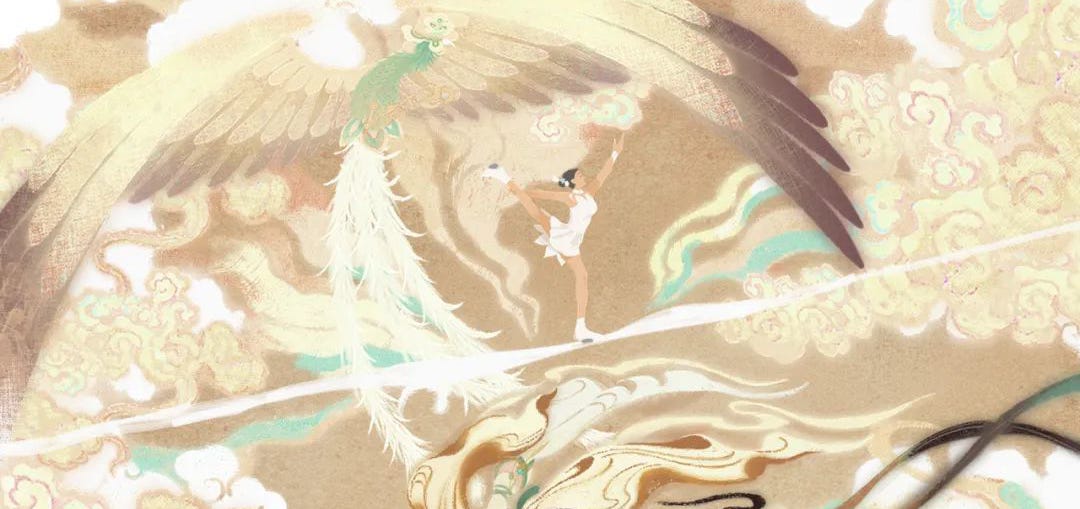
Speaking of Chinese animation, one piece of it has ping-ponged around China’s internet in recent weeks. It’s a one-minute short, made in honor of the Beijing Winter Olympics, whose title roughly translates as A Wonderful Tour of Ice and Snow.
This is the latest project by animator Zhou Fangyuan, known for her gorgeous student film Kaleidoscope (we interviewed her about it). This time, she’s joined by co-director Shi Chenchen. They’ve produced another visual stunner in Zhou’s signature style, tying Olympic sports to traditional Chinese imagery.
A Wonderful Tour of Ice and Snow is shorter than Kaleidoscope, but it’s more technically ambitious. Talking to a Chinese outlet, Zhou explained that it took around three months from concept to completion, and more than a dozen team members. It has the backing of People’s Daily, the government’s main mouthpiece, and streamer Bilibili.
You can watch A Wonderful Tour of Ice and Snow here. There’s also concept art available in this article.
Best of the rest
We’ve lost a lot of legends this month. One was Manabu Ōhashi (73), known for his work on anime like The Golden Bird and Robot Carnival. There were also Borivoj Dovniković (92), one of the founders of the Zagreb School of Animation, and Lina Gagnon, who drew “every other frame” of The Man Who Planted Trees.
American artist Steve Lowtwait broke down background design for a current TV cartoon.
Making an animated short and looking for tips on how to release and promote it? American animator Andrew Zimbelman has a rundown on Motionographer.
In Britain, there’s a major petition underway to restore the Young Audiences Content Fund, recently axed by the UK government. It’s looking for signatures.
The French director Benjamin Renner (Ernest & Celestine, The Big Bad Fox and Other Tales) is doing an American animated feature for Illumination — it’s called Migration.
The acclaimed animation school Gobelins, based in France, is opening a training course for motion designers. Applications close March 10.
Kidscreen has an intriguing story about Tadpoles, a Finnish series designed and storyboarded vertically rather than horizontally. “Even the smallest of details, such as the direction characters’ eyes point, needed to be rethought.”
Soyuzmultfilm in Russia has announced that it’s done rebooting Soviet classics. An upcoming project based on Umka (1969) will be the last of these. (For context, the recent reboot of Nu, pogodi! faced explosive blowback online.)
The latest Boonie Bears entry is a hit in China — it’s the highest-grossing film in the franchise’s history, with revenues above $140 million.
Lastly, ViacomCBS is rebranding as Paramount Global and “going all-in on streaming.” There’s a Baby Shark movie, and a bunch more. The company’s stock dropped around 20%. We also got the week’s scariest corporate spiel:
An iconic global company deserves an iconic global name. One that reflects the power of our content; one that reflects our role as stewards of a rich heritage and as leaders in the future of entertainment.
3. Retro ad of the week
John Hubley returned with a vengeance after his lost years. His new studio, Storyboard, grew into one of the hottest makers of animated TV commercials within a year of opening its doors. It started in early 1954 and was a big deal by year’s end.
One of the commercials that made this happen was Fluff. First aired in November ‘54, it’s an ad inside an ad. The spot stars Fred Fluff, a bumbling salesman, as he tries and fails to sell Heinz Worcestershire Sauce to the camera. It’s very, very funny.
The concept for Fluff reportedly came from comedian Stan Freberg, and Art Babbitt handled its fun, graphic animation. The results were groundbreaking. It was “one of the very first [ads] to employ humor at the ‘expense’ of the advertiser,” according to the Clio Awards. It boldly announced Hubley’s style — ads meant to entertain.
Hubley was something of a rebel. The old guard in TV advertising pressured viewers to get them to buy. Hubley, who railed against the “prosaic hard-sell dead spots on the air,” argued for a world where ads were fun and fascinating vignettes. Here’s Billboard:
Pointing out that the viewer in his own home does not turn on his set to be sold [to] but to be entertained, Hubley concluded that the content of commercials should be broadened to contain as many factors of human interest as possible.
Fluff satirizes the salesmen that viewers knew all too well. “All the classic ingredients of the early ‘stand-up’ TV commercial are present,” wrote Lincoln Diamant, an ad historian. That includes “the pompous announcer” and “the off-camera product which must be handed in and brandished toward the camera.”3 After years of being subjected to Fred Fluffs, TV audiences relished the chance to laugh at one.
But Hubley was still trying to move Heinz product — and he succeeded. Fluff’s sell is clever, subliminal. By making fun of advertising, it gains the viewer’s trust. One ad man noted that it even “succeeds subtly in emphasizing the fact that ‘Worcestershire’ is a generic name and that Heinz is the important thing to remember.”
As another put it, Fluff was a “milestone in understanding the viewer.”
The spot picked up a number of awards, and it aired for years. While it initially ran alongside the Heinz-sponsored series Studio 57, Fluff took on a life of its own, popping up on TV even into the early ‘60s. Diamant noted that it “never wore out its welcome.” All this from a one-minute cartoon that cost roughly $5,000 (around $52,000 today). See it below:
4. Last word
That’s that! Thanks for reading. We hope you’ve enjoyed our issue today.
If you missed our previous issue, we chatted with the legendary illustrator R. O. Blechman about his formative years in animation — back in the 1950s. Blechman is 91, and he got his start at Storyboard under Hubley. He’s one of the last living artists to have worked at Storyboard at the height of its success.
Blechman shared a ton of amazing details about his time at the studio and at Terrytoons. We study this stuff, and even we learned a lot. We hope you’ll check it out!
See you again soon!
From Chinese Animation and Socialism (2021), the best book on Chinese animation ever published in English — and a frequent source for this piece.
From Du’s essential book Animated Encounters: Transnational Movements of Chinese Animation 1940s–1970s, another primary source for the article. We also heavily rely on the book Comics Art in China by John Lent and Xu Ying.
From Television’s Classic Commercials (1971).


