When Is a Storyboard Good Enough?
Plus: a mind-blowing music video and the world's animation news.
Welcome back! It’s Sunday, and that means a new issue of the Animation Obsessive newsletter. Here’s the lineup today:
1 — storyboarding simply (or not).
2 — global animation news and newsbits.
3 — one of our favorite animated music videos.
We release on Thursdays and Sundays. If you’re new here, you can sign up to receive our Sunday issues in your inbox for free, every weekend:
Ready? Here we go!
1. “It’s enough!”
Last week, we finally published our deep dive into Mamoru Oshii’s greatest scene, a beautiful moment from Ghost in the Shell 2: Innocence. We’d started developing the piece way back in January. There was a lot of kind feedback — thank you to everyone who’s checked out the issue.
We followed it up on Twitter with a clip of Oshii’s storyboards for the scene, side by side with the finished animation. To our surprise, the video got a reply from the scene’s primary animator, the legendary Toshiyuki Inoue. He wrote:
The simplicity of Oshii-san’s storyboards stands out, but it’s enough! I just drew the pictures according to the storyboards; comparing it this way really makes that clear.
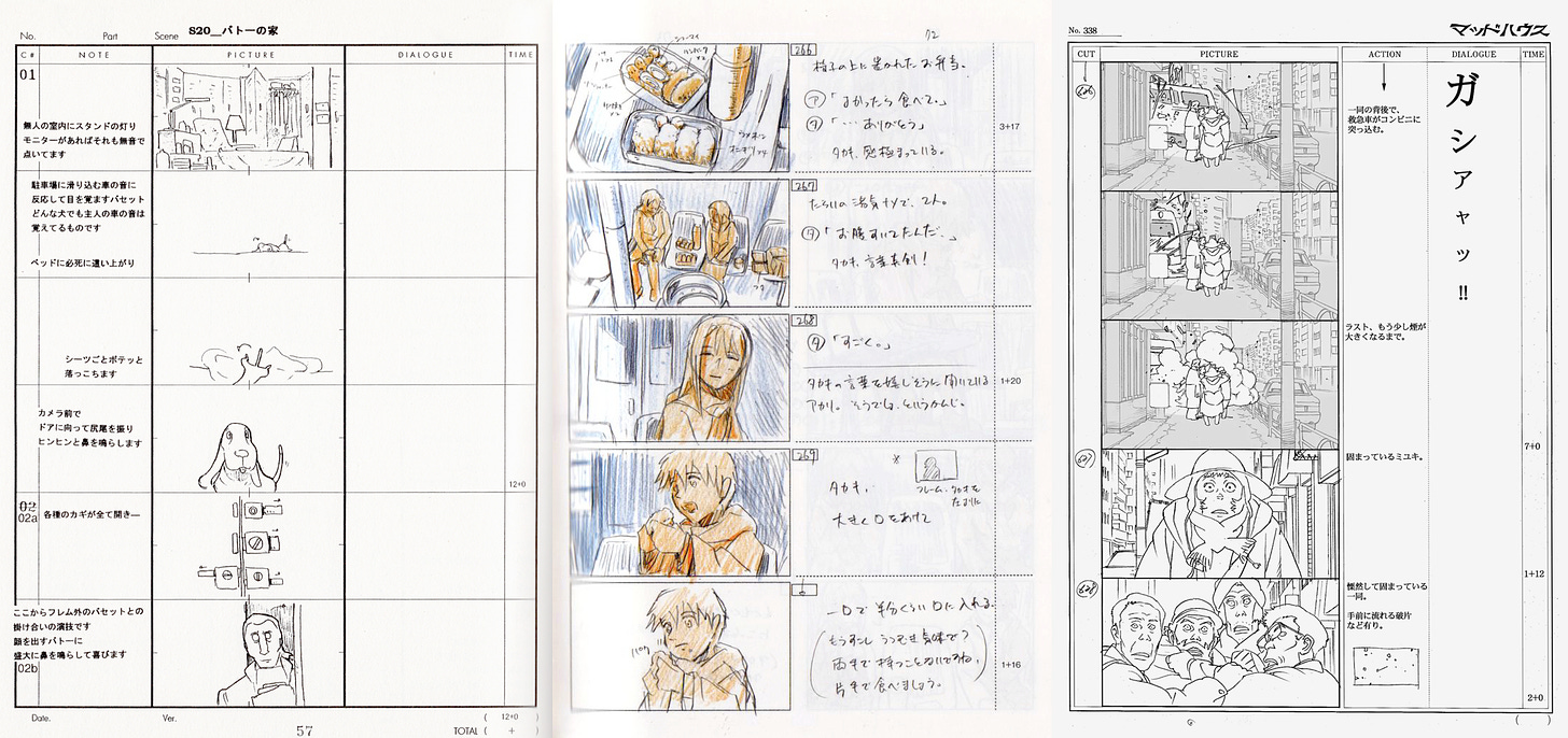
It’s a remarkable comment that deserves unpacking. Oshii’s storyboards for Innocence are rough doodles with wide intervals between them. Inoue’s animation is intensely realistic, full of careful detail. On the surface, they’re nothing alike. Yet Inoue wrote it himself — he followed the sketches, and the sketches were “enough.”

Inoue wasn’t just being polite — he’s not the first artist to say this about Oshii’s storyboards. As animator Tetsuya Nishio (Innocence, The Sky Crawlers) explained in 2008:
… Oshii-san’s work must be painful for people who aren’t used to it, right? [Innocence sequence director Mizuho] Nishikubo-san says, “It’s that kind of picture, but it contains all of the information that’s needed.” It’s a storyboard that tells you whether you’re shooting with a telephoto lens or a wide-angle one, or whether the camera position is high or low. If you take that as your clue, Nishikubo-san says that you have nothing to worry about.
Nishio contrasted Oshii’s style against the one used by Satoshi Kon, who was storyboarding at an unthinkable level of detail at the time. Kon’s boards for Tokyo Godfathers (2003) are so intricate that they could almost pass for key animation. The film’s artists used a number of them as layouts without any extra drawing.1
Thanks in no small part to Kon’s superhuman storyboarding, Tokyo Godfathers became a masterpiece. But Oshii’s doodles created a masterful scene in Innocence, too, per Toshiyuki Inoue himself. The storyboards are diametrically opposed in style, one ultra-detailed and the other as loose as can be, but both produced great results.

This raises big questions that stretch well beyond the anime industry. Essentially all animation made today is storyboarded first — and there’s a serious dispute, especially in the United States, about how detailed storyboards should really be.
Even just a few decades ago, the storyboards for American cartoons like Samurai Jack were good, but fairly loose. Now, we have projects like The Cuphead Show, where every storyboard panel has a background and every character sketch is basically on-model, animated and timed.
Some in the industry call these “animated storyboards,” and The Cuphead Show isn’t unique here. An extreme level of detail is increasingly the norm — these very impressive boards for Rapunzel’s Tangled Adventure could almost be called animated layouts. Many storyboarders feel the pressure to make their work as detailed as possible.
That pressure radiates partly from the top. Showrunner Lauren Faust, a vocal opponent of this approach, once wrote that more traditional storyboarding is “often seen as slow or lackluster by execs who are used to animated boards.”
And it’s strange, because this trend is fairly new. When we shared a comparison of Samurai Jack’s boards to its final animation a while back, artist Bob Flynn (who’s also a critic of animated boards) highlighted it as an example of boarding done right. As he wrote:
Putting this out there for everyone who says we over-animate storyboards nowadays. (We do. Pose-to-pose animatics dominate the industry.) Seriously, take a second to appreciate the format, structure and language of these boards. Especially considering the resulting animation.

The sensibility behind these Samurai Jack boards could hardly be more different from current American boarding. They’re roughly sketched, and the intervals between the drawings are so wide that you might expect animators to get lost in the gap. But they didn’t. The boards may be loose — but they were clearly enough.
There are as many valid ways to storyboard as there are ways to animate, as we’ve noted before. Boarding has no one-size-fits-all solution. But it does have two main goals. Above all, it’s about filmmaking and storytelling. If those are present, and the artists down the line can see the vision, it’s not always necessary to do more.
Oshii’s boards for that scene in Innocence, as rough and basic as they look, were like that. Their looseness gave Inoue plenty of room to work, but not so much room that he was left rudderless. Even as he added and improvised, he followed the sketches, and the sketches were enough.
2. Global animation news
An update on Russia

As we write about classic scenes and the quirks of storyboarding, a historic war rages in Europe. This isn’t lost on us. We may not write about it, but we follow it. The Russian military is doing unspeakable things — and threatening worse.
Yet art matters in times like these. Great art is necessary because of times like these — the need for beauty and life only grows clearer as the world gets darker. So, even if an animation newsletter can’t cover the war directly, we try to do what little we can by shining a light on beauty and life as we find it.
And, when animation news intersects with the war, we cover it. That happened this week, as Russia’s film industry (animation included) continued to face down the economic crisis caused by the Kremlin’s refusal to end the bloodshed.
It’s no secret that sanctions and boycotts pose an existential threat to the Russian cinema ecosystem. As one report explained this week, Russian theaters survive on foreign films. (Russian films made up only 3–5% of summer screenings in recent years.) With nothing to show in 2022, over 36% of Russian screening halls closed between January 1 and mid-April, and that number is rising fast.
Emergency measures keep coming. The mayor of Moscow just approved a bundle of grants for local theaters that play and promote Russian films, and for film companies stationed in Moscow. Soyuzmultfilm is bringing Soviet-era animation from its “Golden Collection” to theaters in June, trying to fill the slots left by foreign films.
More alarmingly, the government is still trying to create a legal fig leaf to allow Russian companies to distribute pulled foreign films. (In the memorable words of one distributor, Russians could use foreign studios’ work “legally, even without [their] consent.”) The measures would violate international law and exclude Russia from the global business world, which is why Russian streamers like Okko oppose the plan.
Meanwhile, Russia’s isolated animation industry is securing every foreign partner it can find. It met this week with the South Korean government’s content outreach agency, on the subject of co-producing and exporting Russian animation. The meeting reportedly went well.
Best of the rest
Check out Dreaming Together, a captivating film that the United Arab Emirates commissioned from British directors Alan Smith and Adam Foulkes. We’re just seeing this now via Animation World Network.
In France, there are gorgeous new stills from Ernest & Celestine 2: A Trip to Gibberitia.
The lush, painted posters you see for Chinese animated films like Jiang Ziya? Many of them are the work of artist “Ageng,” and she’s just been interviewed by Wuhu Animator Space about her career. Along the way, there’s a ton of her art.
An American item we missed last week: Microsoft made its classic 3D Movie Maker software free and open-source because someone asked.
This year, Canada’s prestigious Ottawa International Animation Festival has put animator Jonni Phillips (Barber Westchester) on its shorts jury.
Chilean animators Cristóbal León and Joaquín Cociña (The Wolf House) made a very disturbing music video for The Smile — a band composed of Thom Yorke and Jonny Greenwood (Radiohead), and Tom Skinner (Sons of Kemet).
The Hungarian film Resting Fog impressed us at GLAS last month. It’s set to appear at Annecy. Now, MOME in Hungary has interviewed the film’s director.
Ahead of its June premiere in Japan, the amazing Flee is drawing praise from the likes of Yoshiyuki Tomino (Gundam), Kōji Yamamura (Mt. Head) and Hideo Kojima (Metal Gear Solid).
Italian artist and showrunner Zerocalcare (Tear Along the Dotted Line) has a new series coming via Netflix — although not much about it is known yet.
Lastly, we told the stories of two overlooked African stop-motion films.
We hope you’re enjoying the issue so far! Thanks for giving it a read.
We’re changing things up this time — the last part of the newsletter is open to all readers today. Below, you can learn about one of our favorite animated music videos, even if you’re not a paying member.
On that note, each and every member makes it possible for this newsletter to continue. It’s expensive to run, both in time and money, and we hugely appreciate anyone who makes the leap.
If you have a .edu address, you can use the link below to get 40% off membership:
To students and educators without .edu addresses: you can contact us (animationobsessive@substack) to get a 40% discount even without the code above. Thanks!
3. Music video — Old City Ward
Ryu Kato’s work still isn’t recognized in the United States, and it’s a shame. Now in his early 40s, he’s one of Japan’s most unique animators. His works are quite literally paintings in motion — all rich brushwork and evocative imagery. He’s said that he pursued traditional drawing and painting before animation, and those roots show through.
Kato’s style feels noncommercial, but it isn’t. In Japan, he’s even animated the opening titles to Hodo Station, a mainstream news program. You’ll find his work not just in the Ghibli Museum but in viral music videos. And among the best of those videos is the one for Old City Ward, a 2010 song by the Japanese alt-rock band People in the Box.
Kato got this job, more or less, because his graduation film had a giant tower in it. The lead singer of People in the Box, Hirofumi Hatano, saw the film and resonated with that image — which happened to tie into the lyrics to Old City Ward.
So, People in the Box reached out. Kato hadn’t heard of the band — but, as a fan of Sonic Youth and My Bloody Valentine, he clicked with the music.2 Then things got started. As Kato said:
Hatano-kun had the idea, “A huge tower should be a motif.” There’s a tower and the hero climbs up, but the story’s axis is that another “self” exists at the top as king.
This, and several of Hatano’s other ideas, mirrored the lyrics. It all worked remarkably well. Yet the final video also goes past literal interpretations of the song — Kato showed the protagonist’s journey in his own way. He explained:
Visualizing the lyrics as they are only locks down the image, so I thought it would be nice to have pictures a little further away from the lyrics, which would expand the imagination of the viewer accordingly. I aimed to create a mysterious feeling like Alice in Wonderland.
In Old City Ward, Kato offers up a vivid and dreamlike series of images and visual references — the protagonist travels through a surreal world where Basquiat’s style meets Bruegel’s Tower of Babel, and beyond. Scenes like the fateful card game and funeral procession linger in your mind. The senses of color, texture and composition here, again, have more in common with painting than animation.
Old City Ward opened doors for Kato. It was the first of many A-list collaborations between him and People in the Box — and it kept paying dividends. The video made such an impression on musician Haruko Nagaya, who saw it in junior high, that she dedicated herself to one day making a video with Kato. In 2020, it happened.
Kato has done a lot of great music videos since Old City Ward, but this early work still sticks out. Even now, it’s a real achievement — as you’ll discover below:
See you again soon!
Kon wrote about the layout process for Tokyo Godfathers on his blog. All of his storyboards were enlarged and used as the foundations for the layouts, with extra details drawn in. More than 10% of the shots, though, were built on layouts from storyboards that weren’t edited.
From a 2017 interview with Ryu Kato, accessible through this archived page (which sometimes loads and sometimes doesn’t).


I’m always struck by super detailed, as well as animated, storyboards. When working with a large team where there are many variables, I'm sure detail can reduce uncertainties in production.
I work on much shorter pieces, doing both storyboard and animation solo, so in that respect there are fewer reasons to add detail early. Another reason for me though is that I simply may not have that detail yet! I often don't know exactly how a scene will resolve until I get there (again, for 1, 2 min films potential issues that could arise from this kind of ambiguity and consequent shift down the line don't have time to compound much).
Anyway lack of foreknowledge wrt details hasn't yet been an issue for me; in fact the flexibility afforded me + allowing me to get started without knowing everything ahead of time, has been a boon.
It's fascinating to see how differently artists and teams work, and the solutions that fit different needs. Reminds me once again the vastness of gamut in animation. Thanks for a super fun read 🙏
Gosh. I have so much to say about storyboarding. Lol, but I'll make it quick because I respect the fans of this magazine and wouldn't want to bore them. In short, I experience storyboards as a testament to how specific a artists vision is, and in America, respect for a directors vision has taken a backseat to meta data analysis and bottom lines. Hence rushed and often times corner cutting lazy storyboards. Corporate studios love to make creative decisions by committee. I mean absolutely love checking boxes. Art doesn't work that way. It won't appear on a quarterly basis - and be unique: if viewers want it to be truthful work. Economic pressures aside, I've always appreciated artists who leave room for collaboration by finding a vision with the help of others. There doesn't appear to be a right or wrong way to do storyboards at all! I just wonder about the integrity of decisions made on storyboards by major studios when the choices come from fear of failure, or fear of financial losses. Instead of curiosity and exploration. Eeesh, hope that didn't get me kicked off the forum lol. Apologies other readers. - Dar