Breaking Away from Disney Animation
An introduction to limited animation, plus news.
Happy Sunday! It’s time for a new edition of the Animation Obsessive newsletter.
Before jumping into it, we need to mention two anniversaries that recently passed by. August 14 marked five years since Animation Obsessive began — as a Twitter account, a casual way to highlight work we loved. People responded back then, to our surprise, and the project grew.
Two years later, or three years ago now, we opened up paid subscriptions to this newsletter on August 28, 2021. Reader support has since transformed our work and our lives. Both of us (Jules and John, co-runners since 2019) are truly, truly grateful. We’ve said so many times, but it’s always worth repeating. Thank you, to each and every reader, for allowing us to do this!
Now, here’s the plan for today:
1) Introducing the limited animation revolution.
2) Animation newsbits.
With that, here we go!
1 – Minimalist movement
At Disney, in the studio’s golden age, the team devised a specific way to make characters move.
Walt Disney and his artists refined this style over years — the rules of animation, of turning a drawing into a living thing. They got results, quickly: Snow White (1937) arrived less than a decade after Steamboat Willie (1928), but it feels half a century ahead.
Through Disney, the 12 principles of animation were set down. Ideas like anticipation and follow-through. A character should “wind up” before each action — and shouldn’t abruptly stop after finishing it, but instead overshoot a little and fall back. (“Things don’t come to a stop all at once, guys,” Walt Disney told his people.)1
The bodies of classic Disney characters stay in near-constant motion — always selling the idea that they’re alive, rather than drawn. It took a large number of drawings, and serious talent, to ensure this.
But the Disney style was strict. Many types of storytelling and design didn’t suit it. That included the art of Mary Blair, as we wrote last week. “[O]nce Mary’s drawings began to move by the principles of animation that Walt had decreed they often lost the spirit of her design,” noted Disney animators Frank Thomas and Ollie Johnston. And other ways of moving them didn’t have the all-important illusion of life.
Disney’s innovations had pushed animation forward, but some artists came to feel held back. They wanted fresh ways to draw and to convey story through art in motion. One of their tools to do it was limited animation.
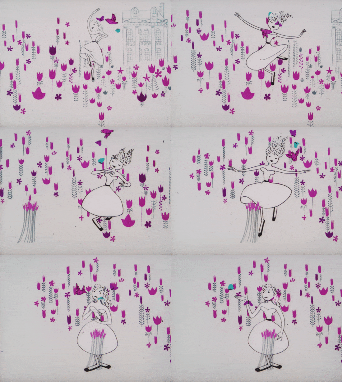
Limited animation takes many forms. In general, it calls for fewer drawings than the Disney style, and it tends to break some (occasionally most) of Disney’s rules. Thomas and Johnston described Mary Blair’s art as “crisp” — the same word applies here.
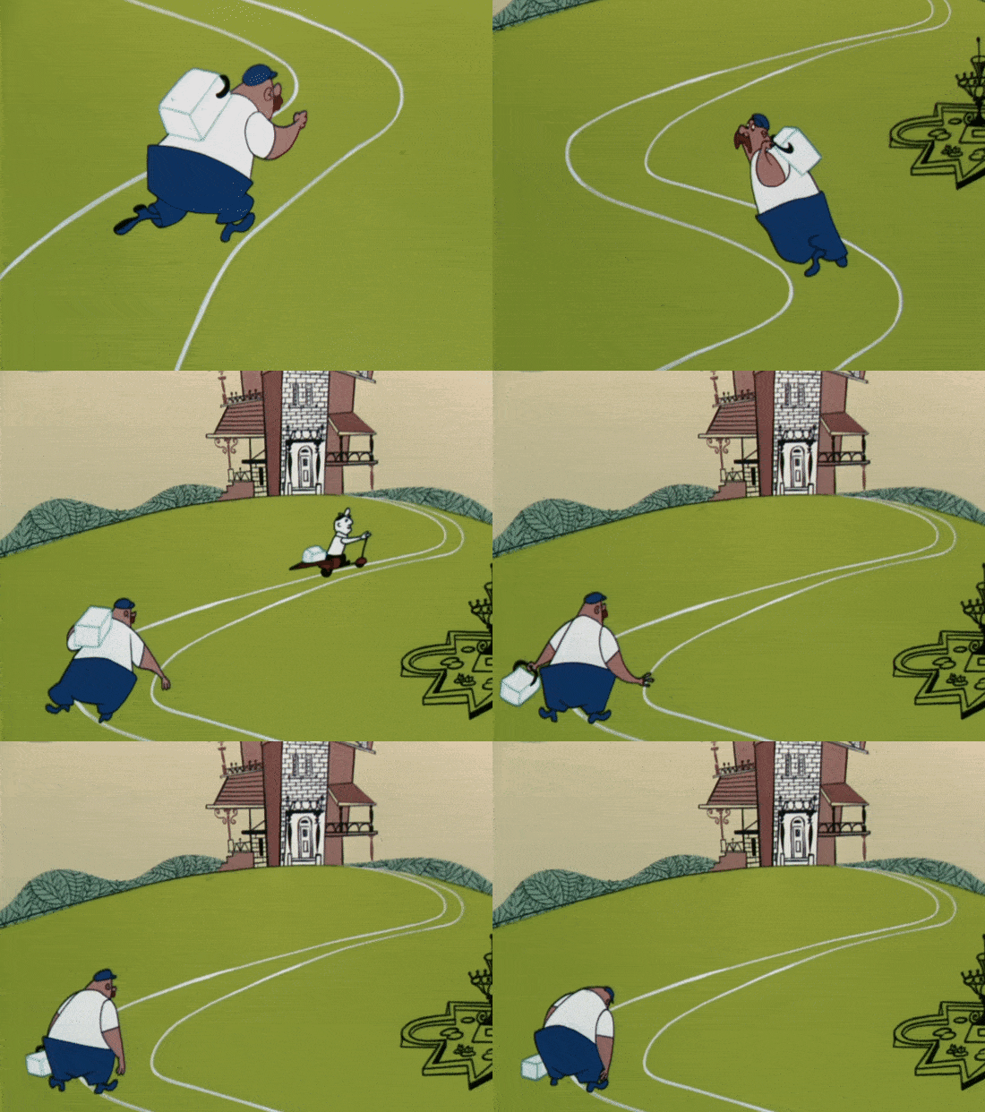
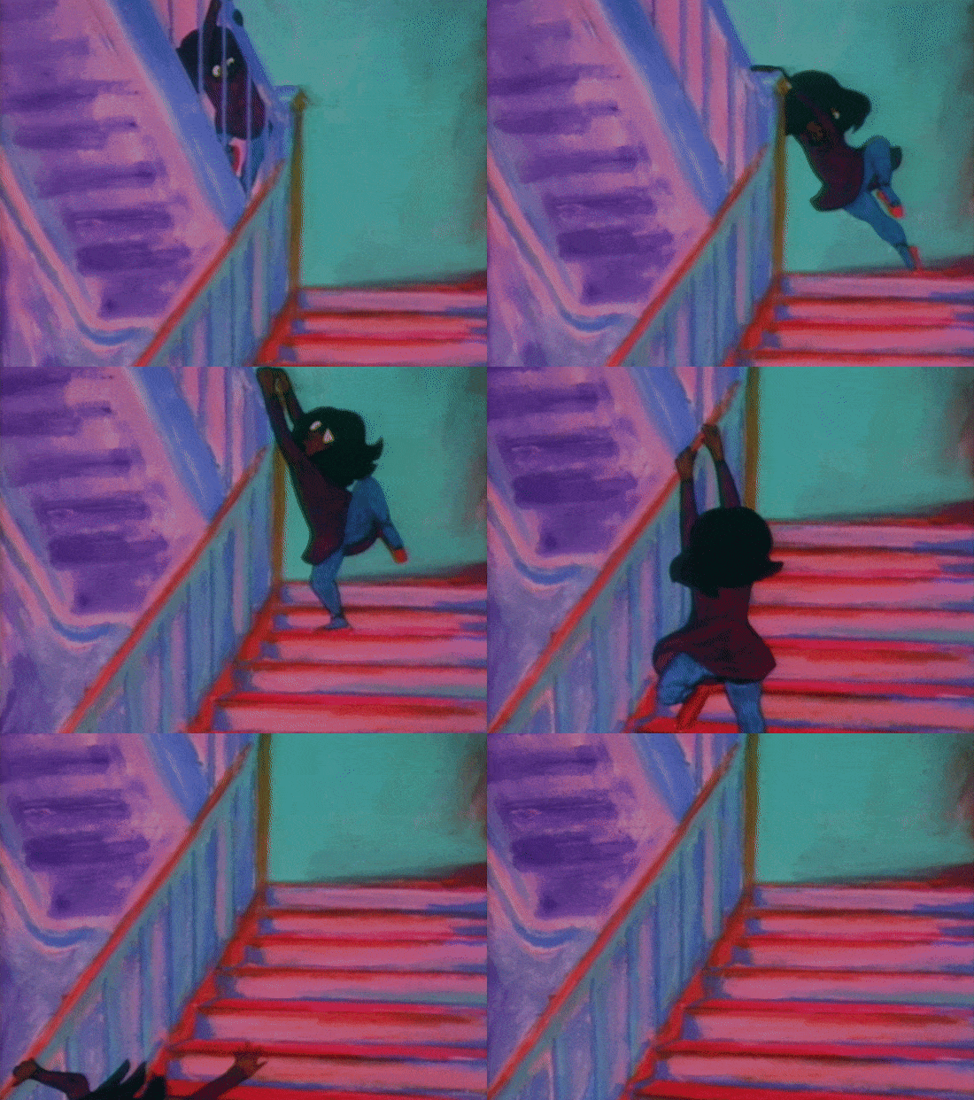
Limited animation is often more clipped, more abrupt, less complicated. Movement can stop and start and be as stylized as the artist chooses, and it can adapt to an incredible range of design techniques. At times, a character might freeze, or slide weightlessly, or pop from one pose to another, or move only one part of their body while the rest stays still.
In the ‘40s and ‘50s, UPA made limited animation famous. Not everyone at the studio liked the name, though. It sounds like an insult, and some in the industry used it that way. UPA’s top animator, Robert Cannon, offered “simplified” animation as an alternative.2 Studio artist Jules Engel said:
... often people refer to that kind of animation as limited animation. They always downgrade it, which I think is very stupid because there’s no such a thing as limited animation — there’s such a thing as limited talent ... They don’t understand that the best performance that you can get from that medium should be a kind of limited gestures. Because if the animator really looks for performance to the stage, the gestures there are truly limited ... very seldom do you find a really great stage actor ... [who] would make as much movement as the best animator made for Walt Disney.
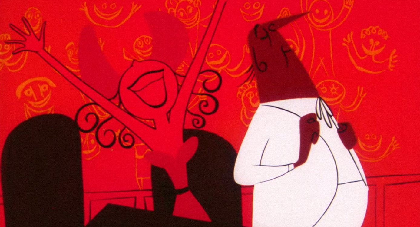
Limited animation showed up in all of UPA’s films. It fit the team’s mid-century design, its modernist shapes and forms. You see it in Rooty Toot Toot (1951), for example, and in the Magoo films. “We developed strong, definite, clearly readable poses, with a minimum of follow-through,” said UPA’s Pete Burness about Magoo.3
Animating this way accommodated UPA’s lower budgets, but the motivations also went deeper. For certain people, Disney’s style was too much. Unclear and overly busy, even vulgar. Some accused its artists of “over-animating.”
One such accuser was animator Tissa David, who worked for UPA in the ‘50s and then made a career as an independent. She was among America’s animation greats, and a longtime Disney critic. Her feeling was that it wasn’t “necessary to make a million drawings when you can say the same thing with 10 drawings.”
As she explained in 2006:
… limited animation doesn’t mean it has to be bad animation. On the contrary, it’s just a different style of animation. When you learn how to animate limited, in a limited way … then you can make very good animation.
… [I]n the Disney studios, I feel that they are over-animating. They are making too many drawings. That is not necessary. For example, the Japanese film, Spirited Away ... there is that little girl. It’s beautiful animation. And it’s really very limited animation.
Tissa David was right that Spirited Away uses a limited approach. Most Japanese animation does. In fact, it’s rare for animators anywhere to follow the old Disney style to the letter now. At least a bit of limited animation tends to be in the mix.
The new way changed the medium. In some cases, even the original Disney vets followed. Much of Rooty Toot Toot was animated by Art Babbitt and Grim Natwick, essential people from Snow White. Natwick became Tissa David’s mentor. Babbitt considered his own best animation to be a limited shot from a Magoo film.
While at Disney, Ward Kimball of the Nine Old Men was impressed by UPA (like Flat Hatting) and used limited animation in Toot, Whistle, Plunk and Boom, among others. “My contention was there were certain types of comedy staging that were best done with limited animation. A lack of movement would put over the gag,” he said.
Eventually, some studios did co-opt this style as a cheat to get faster, cheaper, less imaginative animation. Still, for the true believers, limited animation wasn’t about cheating. It was liberation. That held around the world.
In the Soviet Union, for example, animators copied Disney through most of the ‘30s, ‘40s and ‘50s. It was mandated. Yet they wanted to try other things. During the ‘60s, they broke through.
Fyodor Khitruk (1917–2012) was at the head of that movement. He was a master of the old way, and strongly indebted to Disney, but he was intrigued by modern cartoon design and the limited animation that went with it. One of his colleagues wrote:
The new image required different animation. Fyodor [Khitruk] wished to free himself from the shackles of soft, flexible movement; he wished to do everything more economically, more concisely, but no less expressively. That is, to achieve the maximal result with minimal means.
Khitruk could’ve stayed with the Disney style. In fact, he saw his animation for the Disney-like Snow Queen as his best — and limited work wasn’t his specialty. While he could direct it, he struggled to draw it (and to escape what he called his “inveterate realism”).4
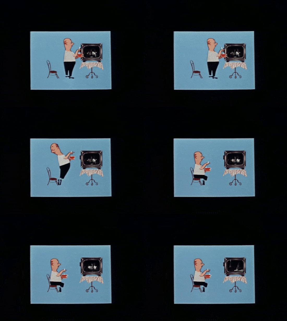
But that wasn’t the point. There were creative possibilities here. With The Story of a Crime (1962), Khitruk and his team used collage and sharply limited animation to tell a daring tale of modern life.
Khitruk referred to the film’s animation as “lapidary,” meaning as finely cut as a gem. The idea was to hone motion down to its absolute essence. For this team, that was more of a challenge than knocking out another traditional cartoon. As he wrote:
In The Story of a Crime, we looked for details, more lapidary movement — what is now called limited animation, which all the more requires such spontaneous details: [protagonist] Vasily Vasilyevich approaches the TV and sits down with a cup of tea. But before he sits down, he looks back for a moment at the chair he is about to sit down on. This is not done in the style of classical animation and lacks the usual multitude of particularities, which in this case are simply cut off ... But this detail is very important. It colors the scene. After all, there was nothing in the frame; it was empty. And this detail fills in the empty space, puts everything in its place. The rest is up to the viewer to complete.
The Soviets’ turn toward limited animation was inspired, in part, by foreign work. Khitruk saw it crop up in Czech cartoons. There was also the Zagreb School of Animation, based in the former Yugoslavia.
The animators of Yugoslavia weren’t UPA followers when they began in the late ‘40s and early ‘50s. “Precise animation in a realistic style, we considered to be the ultimate achievement,” wrote Dušan Vukotić, the leader of Zagreb’s animation scene.5
Then things changed. The artists were exposed to UPA, to Czech animation, to the design magazine Graphis. They ran into a shortage of money and supplies, too. In the mid-1950s, these factors guided them to something they called reducirana animacija, or “reduced animation.” It meant fewer drawings and a wholly different take on motion. Once again, that matched the modern design they were starting to adopt.
Vukotić wrote in 1960:
The characters in the films were gradually freed from realistic movements — which inevitably carry with them a longer duration of time, thereby slowing down the tempo of the film — and gained a new way of moving that stylistically complemented them and visually enriched the scene. Their movement now became more functional, more expressive. …
Of course, this method requires much more studiousness and a terrific knowledge of animation, because the uninventive use of schematized cycles — closed movements and a reduced number of key frames, dictated primarily by economic calculations — gives bad results, which are encountered quite often today …
Our experiments with reduced animation yielded very good results, which imposed a new way of framing, new mise-en-scène solutions and a [new] method of editing.
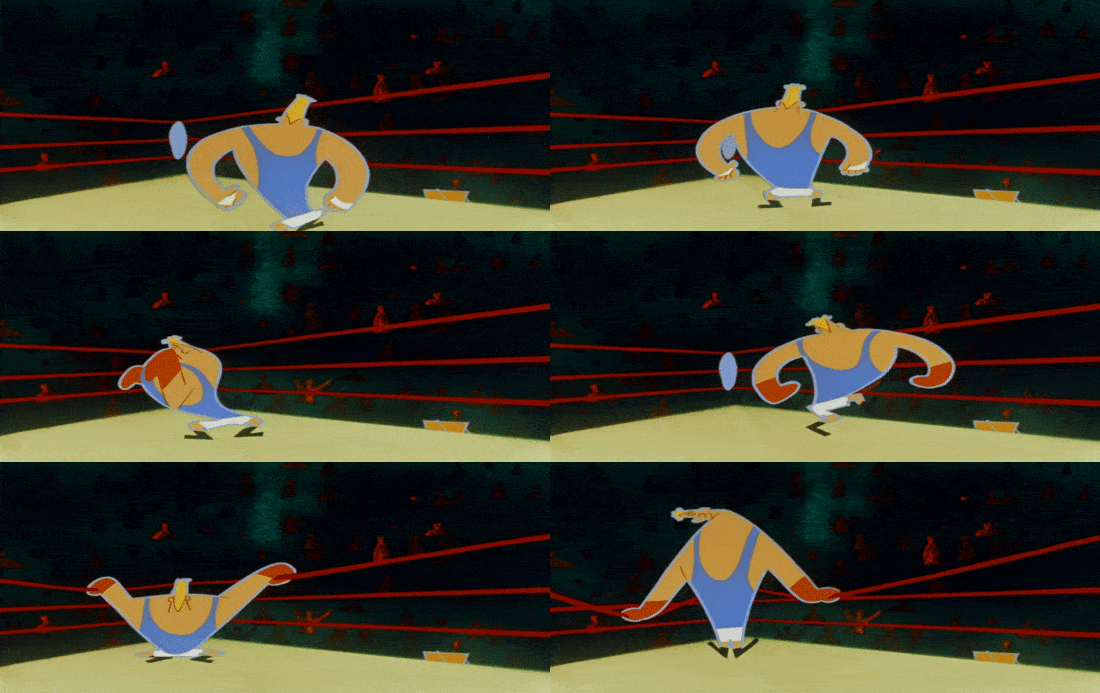
Unrealistic motion became a pillar of Zagreb cartoons, as Vukotić said elsewhere. These characters moved in wildly abstract ways, without drawing “on real-physical movement — that is, on the anatomical law of motion.”6
In 1959 alone, Zagreb Film produced work like Ring, At the Photographer’s, The Inspector Returns Home! and The Great Jewel Robbery. They pushed UPA’s ideas even further. There’s barely a trace of classic Disney here.
Around this same time, modern cartoons were hitting Japan. Disney’s Toot, Whistle, Plunk and Boom screened there in 1955. Osamu Tezuka became a Rooty Toot Toot fan. The country’s animators grew aware of another kind of movement, and it would change their work.7 In turn, their work would change animation as a whole.
Magoo and more were known to Toei Doga, the seat of mid-century Japanese cartoons. Limited animation was a topic there in the early ‘60s, as one director recalled:
At that time, there was a mood [within Toei Doga] that limited animation had potential, with people saying ‘Disney is old’ and ‘Hanna-Barbera is better.’ [Animator] Makoto Nagasawa was at the vanguard of this movement.
It showed in Toei films like The Little Prince and the Eight-Headed Dragon (1963), whose Nagasawa scene we’ve covered before. He borrowed from studios like UPA to put flat, graphic design into sharp, clean motion. Similar tics appeared in many Toei artists’ work, including Hayao Miyazaki’s.
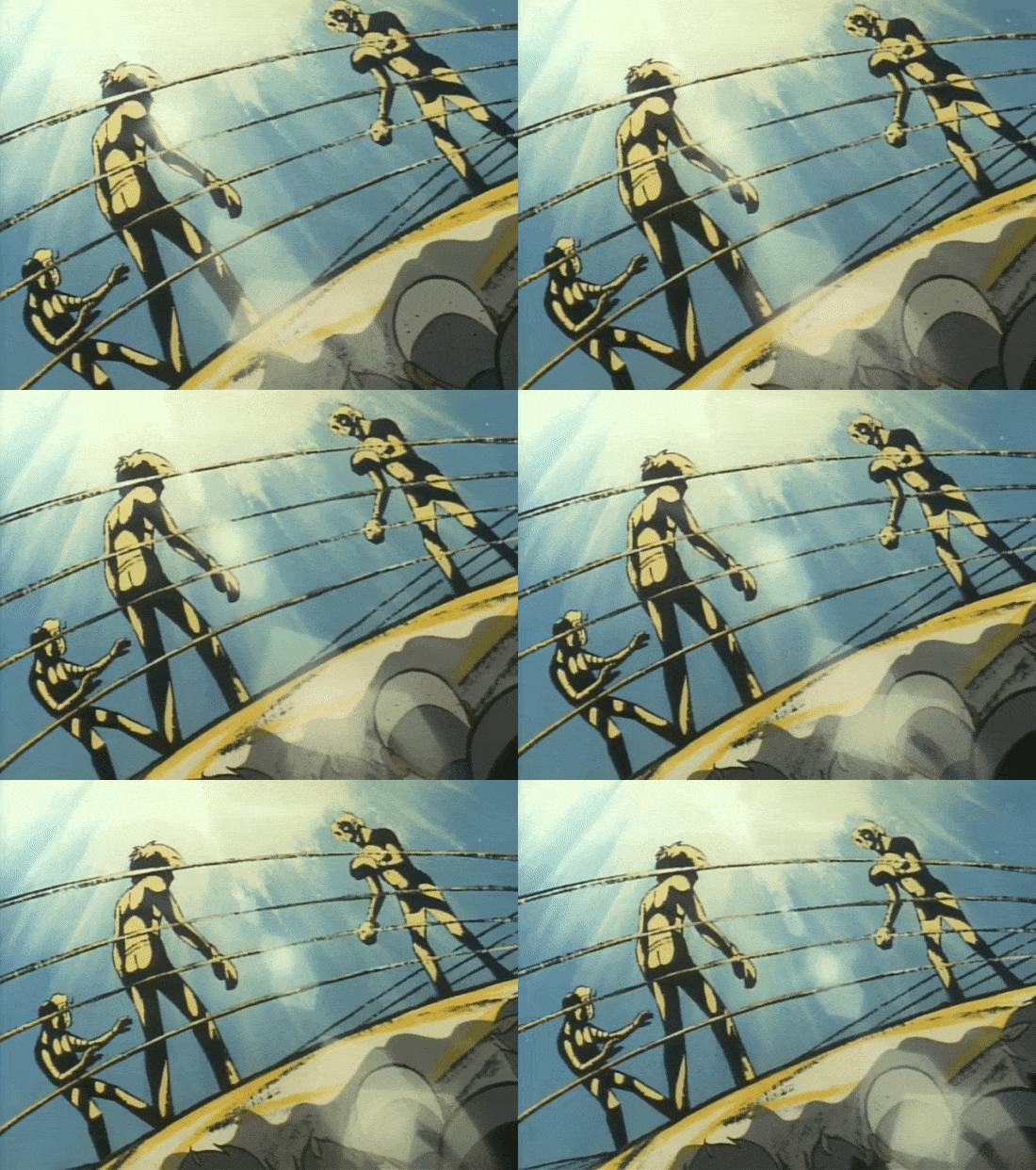
But limited animation took greater hold elsewhere in Tokyo, at Tezuka’s Mushi Production. That team used it another way. Mushi animation often stops altogether — it’s full of still frames. Tezuka liked foreign limited cartoons, but this was a cost-saving measure.
His artists developed a style based on stillness, and on detailed drawings that make the most of it. Mushi director Osamu Dezaki (Ashita no Joe) said that the studio:
… kicked off the trend of limited animation with Astro Boy. In limited animation, due to the severe limitations in budget and frame rate, it was focused on expressing the qualities of the [single] illustrations themselves. The quality of those illustrations is what crafted the scenes.
Dezaki’s projects hardly move, but he used filmmaking tricks and complex, often more realistic artwork to compensate. Once, when he collaborated with Toei people, he found that they didn’t get it. They “just couldn’t draw stuff adhering closer to realism” and were “much more concerned with movement over illustration.”
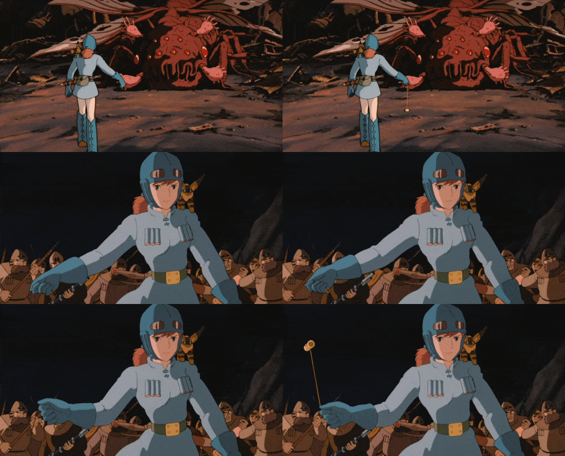
These were early steps toward anime realism — which would repurpose ideas from limited animation (still or reduced frames, animating only one part of the body, breaking the 12 principles) to depict detailed characters who mimic real-world movement. Although Miyazaki has criticized limited animation, he did this in Nausicaä during the ‘80s, and again in Spirited Away, and in most of his films.
At the far extreme, that style leads to things like Jin-Roh: The Wolf Brigade (1999), whose hyperrealism goes against the spirit of the limited animation revolution. But it’s a natural progression, too. A new kind of design, character and storytelling came into the world again, enabled by limiting movement and breaking Disney’s rules.
Even beyond anime, limited animation as a creative idea (not just a cheat) long outlived UPA. The “UPA revival” series from the ‘90s and ‘00s, like The Powerpuff Girls and Samurai Jack, were utterly limited. But they showed how much life this style still had.8
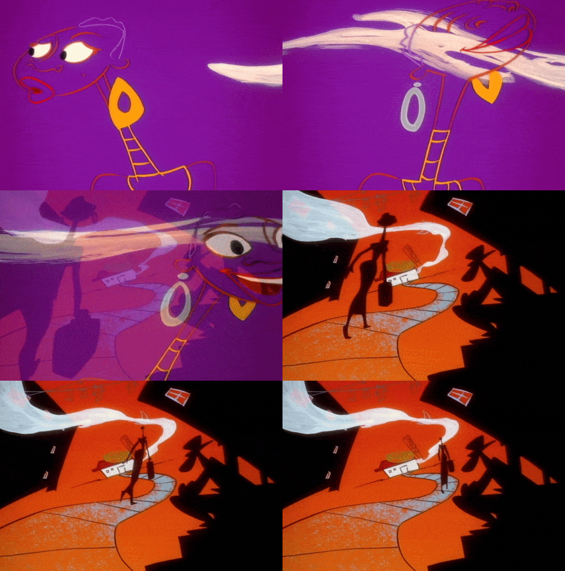
One of our own favorite pieces of limited animation is The Big City from 1995. Its director, Ed Bell, said earlier this year that its low budget forced him to get inventive. “I kind of had to get rid of my snobbery and see what I could do with limited animation,” he remembered. Bell learned from the older animators he knew and drew movement that still feels like a discovery — not a throwback.
The potential remains wide open now. Limited animation shows up in the Spider-Verse movies. Among the best-animated work we’ve seen this year is an episode of Lamput, from India, that’s pure limited animation. Any animator willing to study this style today can benefit. And any viewer willing to watch it with an open mind can, too.
2 – Newsbits
Speaking of limited animation, the English comedian Alasdair Beckett-King did a very entertaining skit that involves UPA-like animated inserts.
The Canadian YouTube channel Every Frame a Painting is back with its first video essay since 2016. It isn’t directly about animation, but (as with its past work) it should interest anyone looking to learn about filmmaking.
An American feature milestone: Inside Out 2 is now the biggest animated hit ever, toppling the Lion King remake.
In Russia, School-Studio SHAR pitched a project by the legendary Andrei Khrzhanovsky (Glass Harmonica) to the state Cinema Fund.
In China, the summer movie season underperformed — falling to 11.6 billion yuan (around $1.63 billion) from the 20.6 billion of 2023. In the top 10 are three animated films: Despicable Me 4, White Snake: Afloat and Inside Out 2.
Following its success on Kickstarter, the Japanese classic The Dagger of Kamui (1985) should be getting a fully featured, region-free Blu-ray release.
As the Russian government throttles YouTube, animation for kids is reportedly seeing a huge viewership spike in the country.
In Japan, Studio Ghibli’s Ocean Waves is getting a full art book.
The French series Samuel may receive an English release now that Folivari has picked up its distribution rights. It’s done in rough, appealing, black-and-white doodles, and has been very successful in Europe. See a trailer here.
Lastly, we wrote about Frédéric Back’s Crac (1981), an Oscar-winning masterpiece — and one of Studio Ghibli’s biggest influences.
Until next time!
As quoted in The Illusion of Life, also the source for the words of Thomas and Johnston.
Adam Abraham wrote this in When Magoo Flew: The Rise and Fall of Animation Studio UPA. The point about Ward Kimball’s enjoyment of Flat Hatting also comes from there.
See the essay “Memories of Mr. Magoo.”
Khitruk wrote about his time on The Snow Queen in Profession: Animator (Volume 1), and discussed his trouble with limited animation in this documentary. One of his colleagues wrote more about that trouble here.
This quote and the large one after come from the 1960 article “Jugoslavenska Škola Crtanog Filma,” collected in The Zagreb Circle of Animated Films 3.
From The Zagreb Circle of Animated Films 3, page 135.
The Toot, Whistle, Plunk and Boom date comes from Anime: A History. For more on Tezuka and Rooty Toot Toot, and his views on limited animation, see this interview. Makoto Nagasawa discussed the rise of modern cartoons at Toei here.

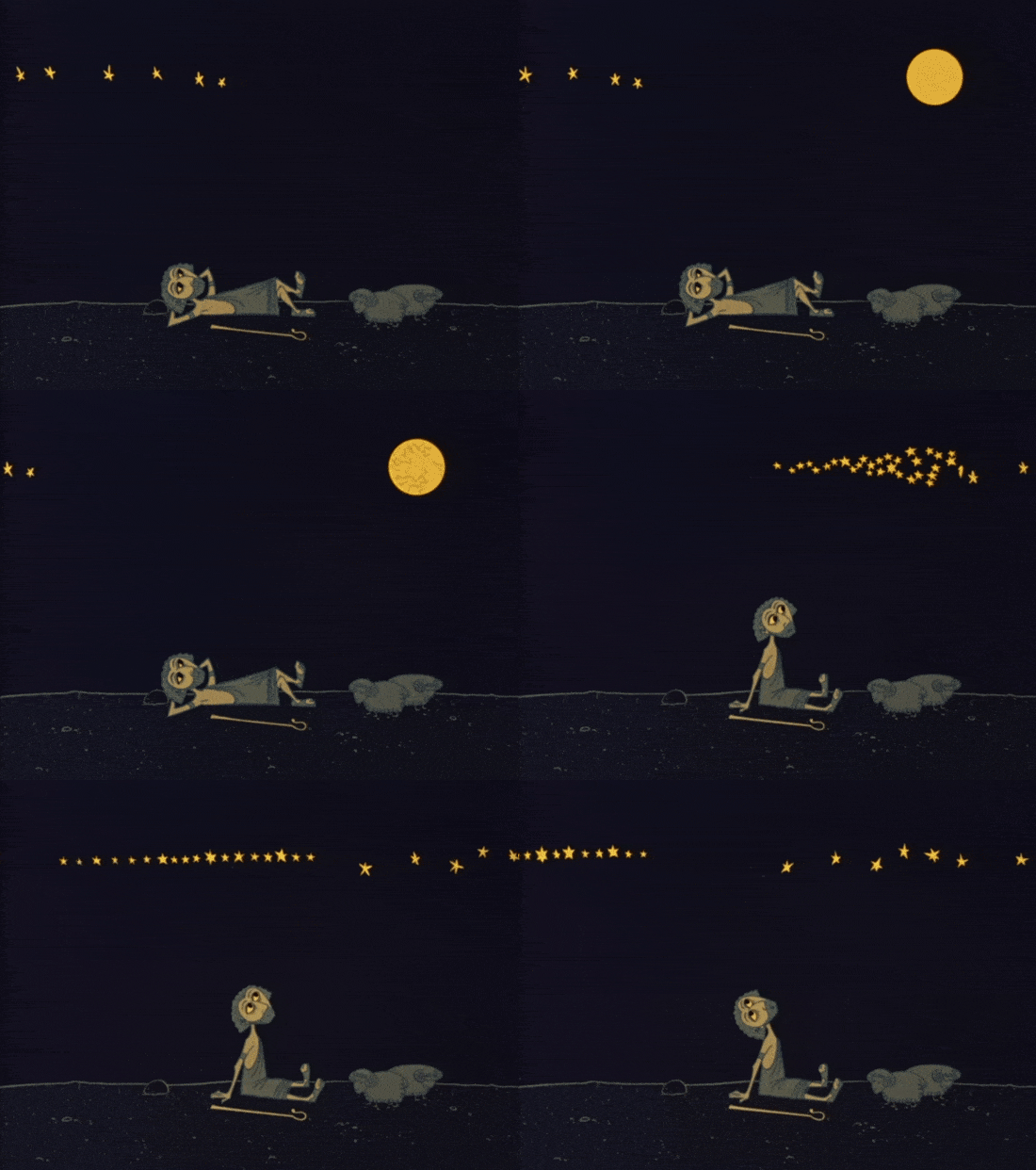
Still frames were also at work in The Last Unicorn (1982). The animation in this film was heavily criticized but I thought it was fantastic.
Another great piece!