'Simple, Clear and Appealing'
The trouble with (and magic of) cels.
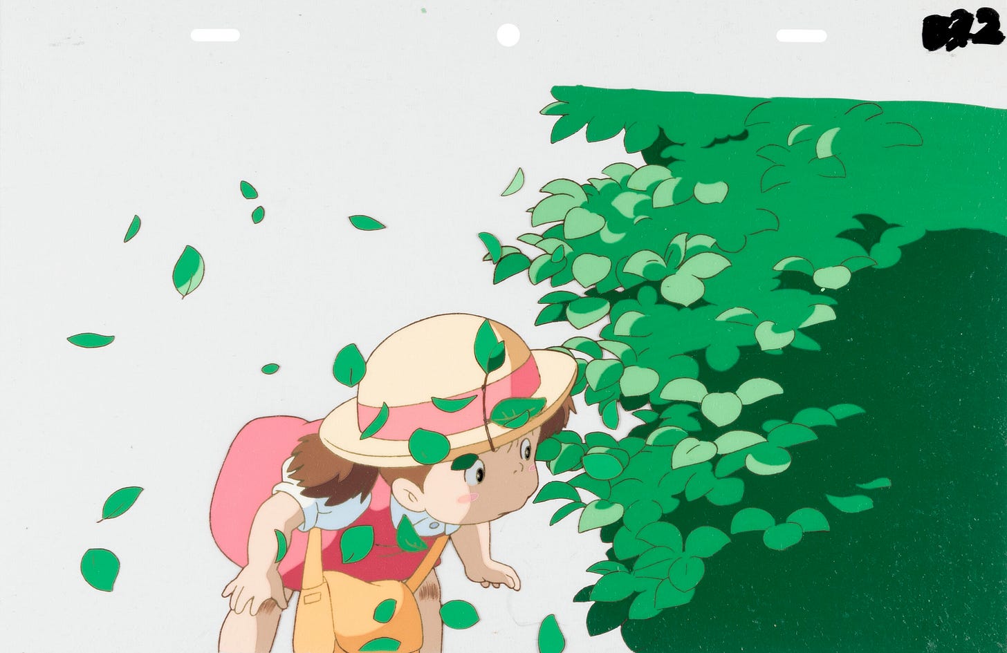
Welcome! Today’s issue of the Animation Obsessive newsletter is all about cel animation. It’s among the oldest and most admired techniques in the business, behind masterpieces from My Neighbor Totoro to Pinocchio.
These transparent plastic sheets were a powerful, almost magical invention. Before cels, animators in the early 20th century often drew movement frame by frame on paper, then cut out their drawings and laid them atop backgrounds to be filmed. When cels (short for “celluloid”) arrived on the scene, they created a new system.
“Working with paper drawings alone was much more restrictive than working with cels,” wrote historian Michael Barrier.
The new approach was more flexible and brought a greater division of labor. Whatever an animator drew on paper, other artists could trace onto cels and color. Background paintings (and other cel layers) showed through automatically. And characters like Mickey Mouse and Snow White could be born.
That said, it’s hard to find an animator who uses cels today — anywhere in the world. Computers have made cels obsolete. Even a stubbornly traditional piece of 2D animation, drawn on paper first, tends to be finished via computer. It’s faster, simpler and cheaper.
Looking back on the era of cel animation (The Secret of NIMH, Grave of the Fireflies), it’s easy to feel nostalgic. Some might argue that we let convenience end a golden age.
The computer era of animation does have drawbacks, as we’ve noted. But cels did, too. They powered some of the greatest films ever made — and yet they also favored certain styles, certain textures, certain ways of painting and drawing. During the late ‘80s, toward the end of cels’ dominance, Hayao Miyazaki was growing fed up with this problem.
“After working in cel animation so many years,” he wrote during the making of Totoro, “I’ve recently become more aware of the things I have been unable to do, rather than the things I have been able to do.”
As he put it:
Cel animation is distinguished by the facts that it is particularly suited to a collective form of work and that the images are extremely simple, clear and appealing. That cel animation images are simple and clear is another way of saying that they also lack much depth and sophistication. To state this using more current lingo, they are pictures with very little informational content. This fact becomes obvious if you look at picture books made with animation cels; at first glance, they seem both fancy and clear but you soon get tired of them. And if you work in an animation studio one thing you soon learn is that even poorly rendered drawings start to look fairly good as cels, but conversely, when something well-drawn is turned into a cel illustration it starts to look diluted and weak. In other words, when transferred to cels, both good and bad drawings tend to average out in the middle. Yet at the same time, it is this aspect of cel animation that makes it possible to implement mass production using a large number of people.1
The cel era was all about standardization. Miyazaki had come up in a world of divided labor: key animation, in-betweening, tracing, coloring, filming. Many people were involved in each frame, and the plastic cel itself was more resistant than paper to an artist’s individual touch.2
By the ‘80s, Miyazaki was focused on animation made outside this system.
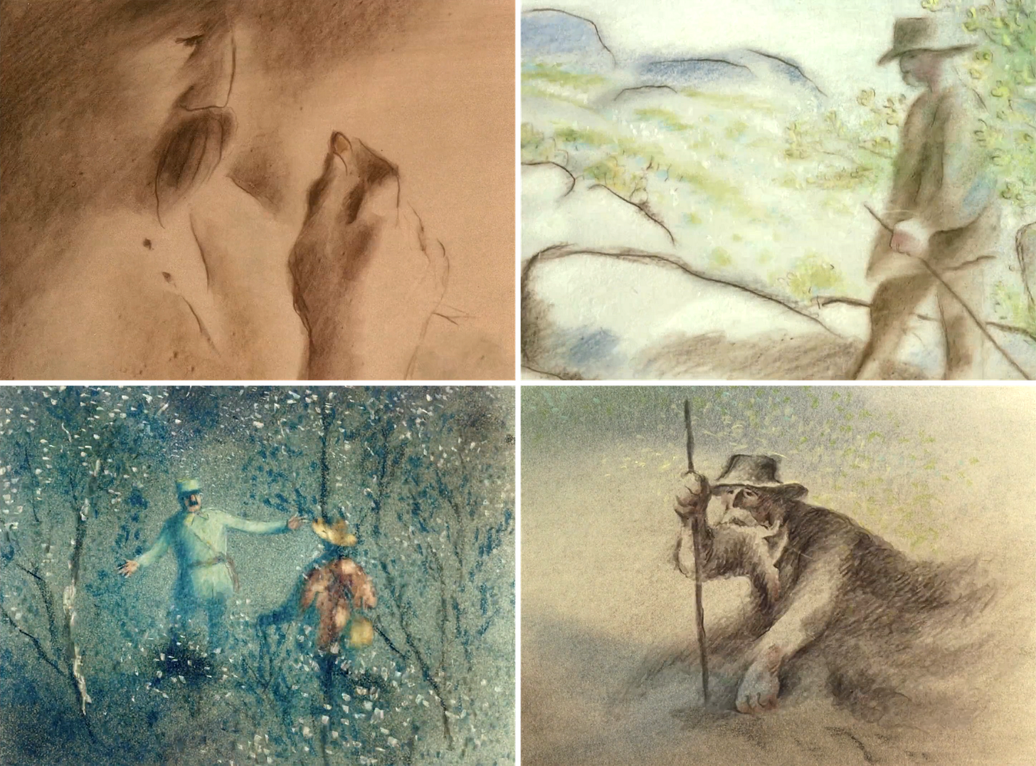
During Totoro, he came to believe that animating plants in the way he wanted, with the necessary light and atmosphere and movement, was impossible with “our usual techniques.” In this respect, he was impressed by the work of Frédéric Back (The Man Who Planted Trees), a Canadian animator who made films almost solo. His work was drawn and rendered in soft colored pencil, and it looks like a painting in motion.
Around this time, Miyazaki wrote about his exhaustion with the cel animation system, an exhaustion that he saw as a broad trend in the anime industry. He felt that they’d hit a dead end:
As we become more and more aware of what our cel animation technology can do, we will get a better idea of our own capabilities, which is to say that the scope of “what we cannot do” will gradually increase. Boredom will set in about the things we can do, and a kind of decadence may begin. If we go on from here, we must now live like Frédéric Back. We can’t move forward unless we abandon all of our old techniques.3
The trouble with transparent cels — the way that they both streamlined and limited art — had been known for decades before Miyazaki pointed it out.
Cels were the key to America’s assembly-line animation process in the ‘20s and ‘30s, which gave us Snow White. That process was exported around the world. In the mid-1930s, it reached the USSR. Because the Soviets were late adopters, they’d developed the old paper cutout system to new artistic heights. In fact, some were resistant to that setup being changed.
Cel art had to be simplified, and it had to be reproducible by many hands. An early Soviet paper animator argued that the new mass production system was only “suitable for one style, one artistic standard,” and that it crumbled when used for anything else.
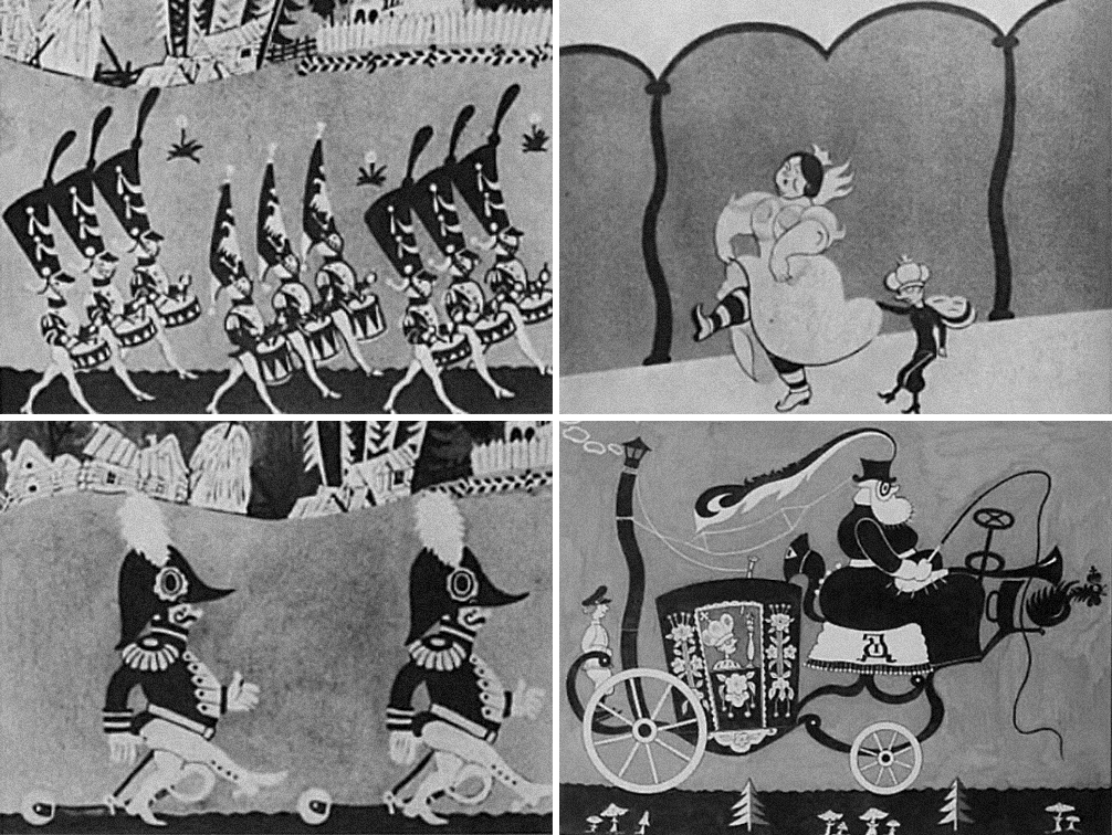
What the Soviets had created up to that point was compelling in its own way. In 1939, Disney happened to screen an old Soviet paper cartoon, and it amazed the studio’s younger artists. It was called Tsar Durandai (1934).
John Hubley, who later directed at UPA, attended those screenings. “It was so modern and fresh and violated so many of the totems,” Hubley recalled about the film. Its graphic design, its whole sensibility, was different from what he knew. Durandai had a “big influence on us guys who later became UPA,” he said.
Durandai’s co-director, Ivan Ivanov-Vano, remembered that foreign animators were blown away even in the ‘60s when he revealed that a paper cutout technique had powered the film. To them, it was almost futuristic. The Soviets had made it up out of necessity.4
Like the Americans, the Soviet animators went on to produce cel masterpieces (including The Snow Queen, Miyazaki’s favorite film). But many of them still felt stifled. When cels began to lose their sway in the USSR during the ‘60s, Ivanov-Vano quickly returned to paper cutouts for his stop-motion film Lefty (1964).
“The creation of a hand-drawn [cel] film with its mass-production method of work, the production of several thousand drawings by different artists,” he explained, “would not have allowed me to use rich folk patterns on the costumes of the characters, in the scenery and in the props.”5
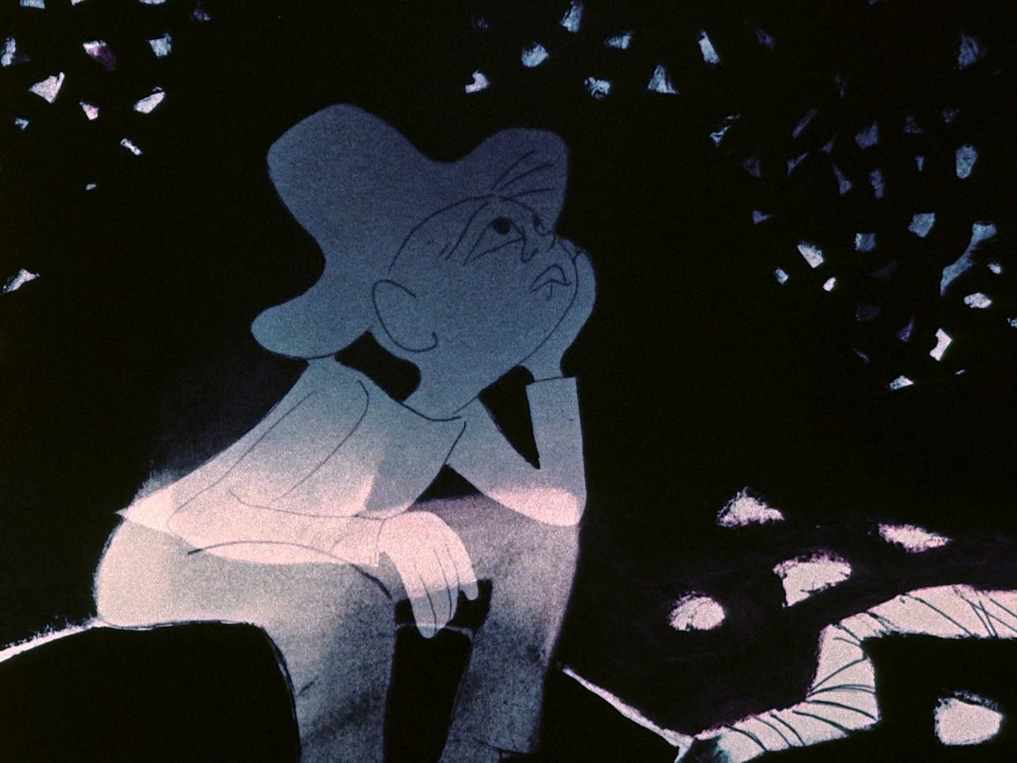
John Hubley himself moved away from cels after leaving UPA in the 1950s. He and Faith Hubley, his wife, went into business as independents. And they tended to work on paper, winning the first Oscar for an independent cartoon with Moonbird (1959). They quickly won again with The Hole (1962).
These Hubley films look like paintings — and that’s because they were. The team used an ingenious system to animate and paint the films on paper, and then (during filming) to double-expose the characters over the backgrounds. This trick was one of the many paper-animation experiments they developed over the years.
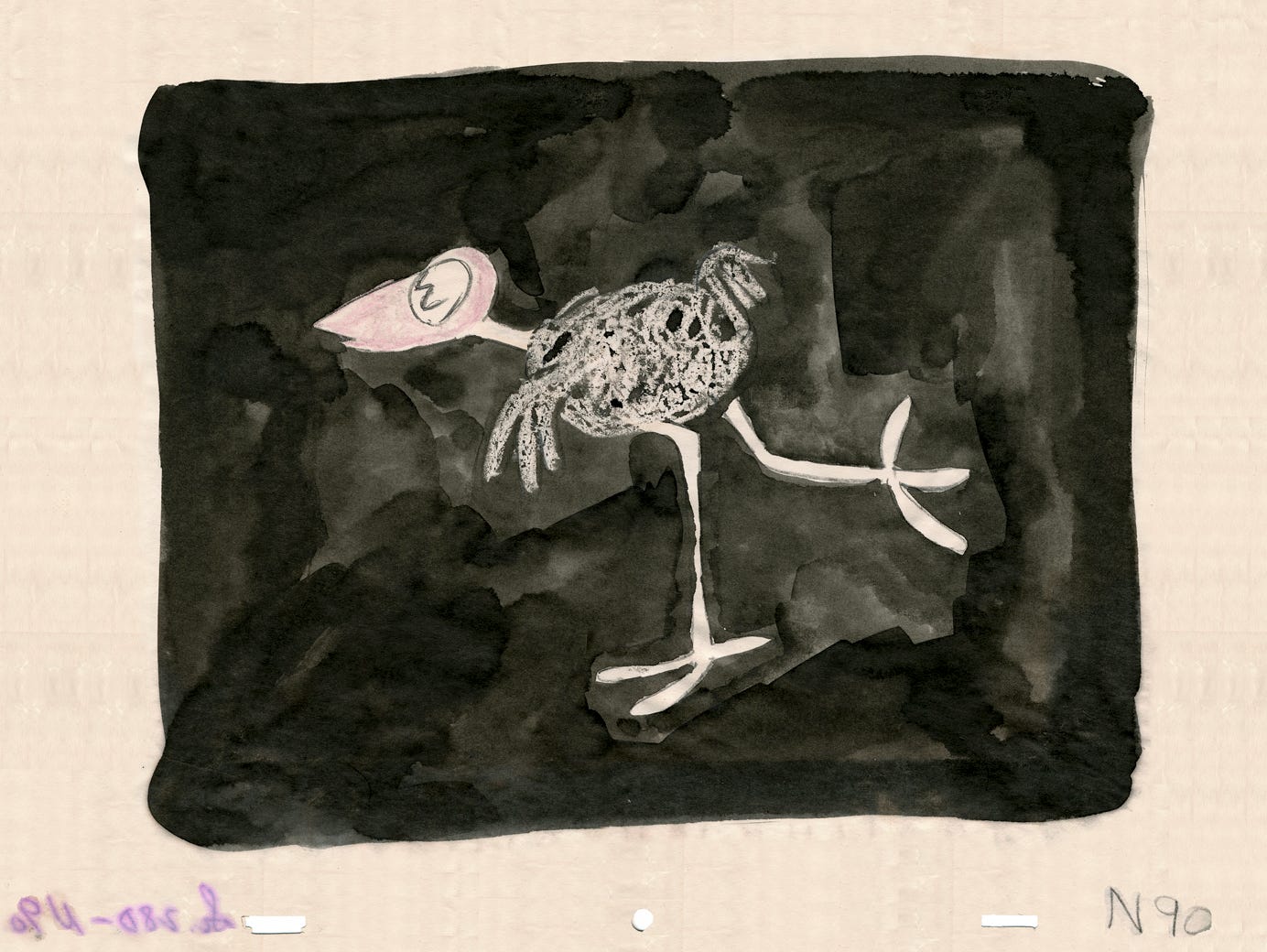
The Hubleys were artists’ artists who could be sharp in their criticisms of mainstream animation. Faith in particular was a maverick who deeply disliked cels (far more than John did). Here’s how she described their approach:
We explored reticulation and paper as a medium, and it was the beginning of eliminating the hard cel and the hard line that I’ve always felt was ugly.
And cel animation is, was, inhibiting. One would have to have a certain kind of skill to do it as handmade mass production. I’m not a specialist in it; I just know I hate it — I hate the way it looks and I don’t like the feel of it. I hate the hard edge and I don’t see why anyone should learn to be tidy. I am a bit of a slob and I like a free-flowing line and texture. That was our contribution … to liberate animation from itself, and to go to watercolors and to paint pastels. It was a big, big liberation and resisted by the industry.
Later in their careers, the Hubleys did make heavy use of cels again, but in a new way. They went back to that older form of cutout animation: animating and texturing on paper, then cutting out each frame. They pasted these cutouts onto cels — getting the best of both worlds.
Animator Michael Sporn, who came up at the Hubley Studio, was later nominated for an Oscar when he used this same trick for his film Doctor De Soto (1984).
Sporn was trying to capture the look of William Steig’s original children’s book, and only drawings on paper could do it. Cels lacked the complexity as a painting surface. And so he worked on paper, then attached the results to cels — giving him both the versatility of paper and the consistency of cels. Across his career, he returned to this hybrid method time and time again, from Abel’s Island (1988) to Champagne (1996).

During the cel era, creativity like Sporn’s was necessary for animators who wanted a different look than the old Disney one. They had to fight their technology — battling cels to achieve the results they wanted was a constant.
This fight took many forms. Like we wrote on Sunday, Chinese ink-wash animation was done through a painstaking process of cel-layering, photographic tricks and film printing. For The Snowman (1982), a British film inspired by Frédéric Back’s work, the artists drew on cels with children’s crayons and scratched their art with wooden skewers for texture.
Miyazaki himself strained hard to elevate the visuals of Totoro, which came out in 1988. It’s one of the best-looking animated films of all time — one of the heights of cel animation. But it was close to the end of an era. Animators were ready to move on.
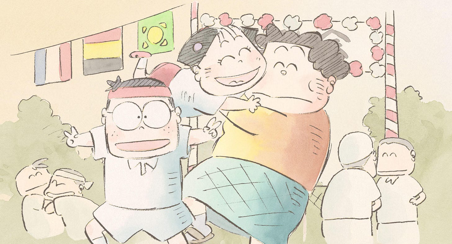
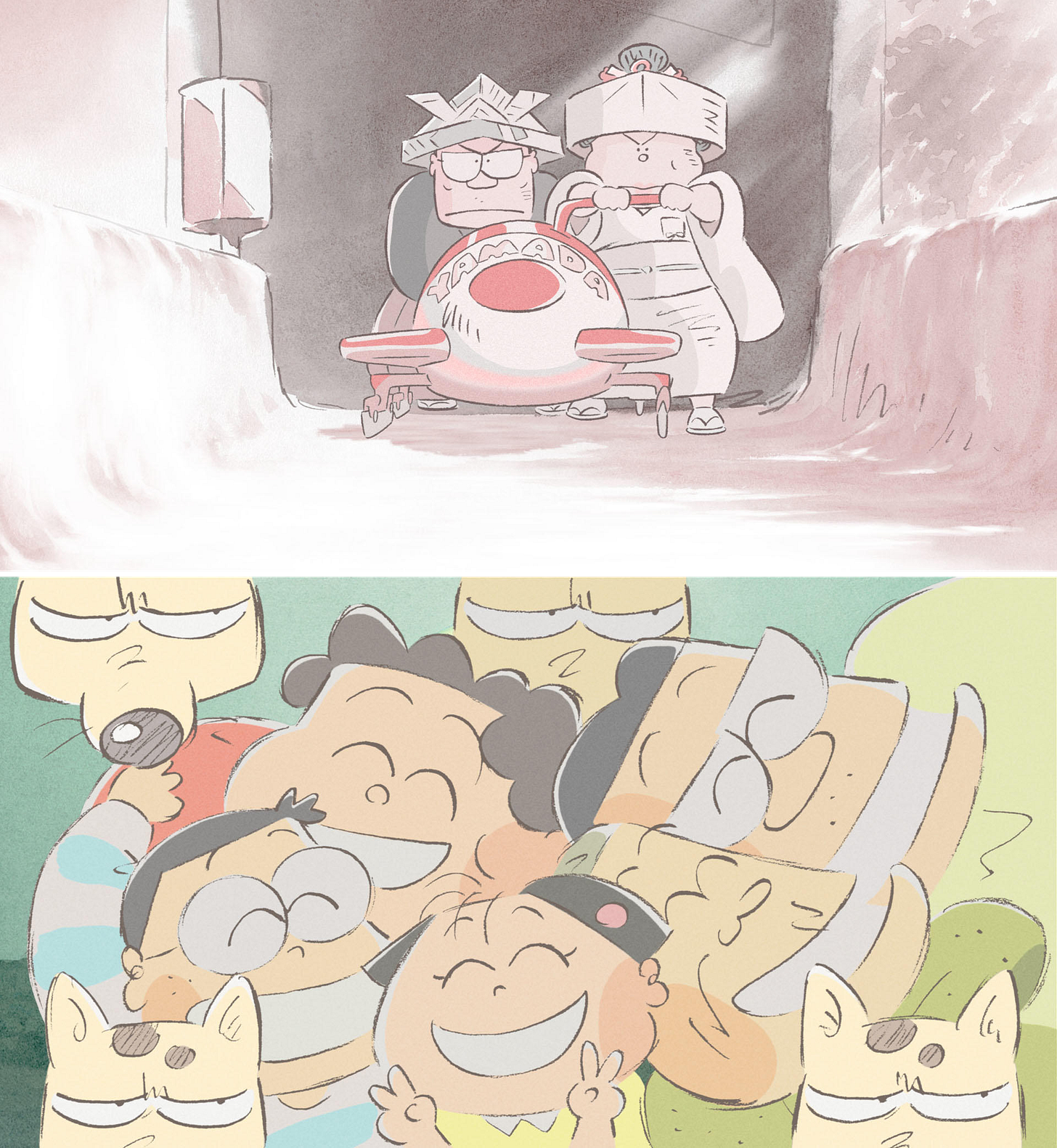
At Studio Ghibli, it wasn’t just Miyazaki who was questioning the old ways. He shared these concerns with Isao Takahata — a director even more enamored with Frédéric Back’s work. Takahata’s Grave of the Fireflies was intended, at first, to be done in a Back-like style.6 He finally achieved it with My Neighbors the Yamadas (1999).
As Takahata once explained, Frédéric Back:
… draws lines with crayon or colored pencil and lightly adds color, unlike our cel animation method that involves applying solid paint and creating clear shapes with lines. Seeing this gave me a very big hint about the possibilities of animation as a means of expression.
In the ‘90s, Studio Ghibli switched to a digital pipeline. Princess Mononoke was a hybrid — it used both cels and extensive computer effects. But Yamadas did away with cels and broke the rules of cel animation.
Taking from Back, Yamadas is all texture, all subtlety. Ghibli producer Toshio Suzuki wrote that Takahata “employed the same methods as someone creating works of art.” These techniques reappeared in quite a few later Ghibli projects — music videos, commercials and even The Tale of Princess Kaguya (2013), Takahata’s final film.
Although Miyazaki’s features kept using a cel-inspired look, even that is deceptive. Films like Spirited Away, Howl’s Moving Castle and The Boy and the Heron were digital productions, down to their enormous range of colors. Cels couldn’t have produced them. Throughout the 21st century, Miyazaki has leaned into the power of the computer.
Even as Ghibli was going digital, the same process was playing out around the world.
The “Disney renaissance” of the ‘90s was, as much as anything, a digital renaissance. From The Rescuers Down Under (1990) onward, cels were gone. The studio inked, colored and assembled its films on computers. Fancy camera movements that used to require the layering of cels on glass could now be done digitally. Expensive, time-consuming effects that Disney hadn’t used since Walt’s heyday were suddenly back.
The look of films like Beauty and the Beast and The Lion King became possible thanks to this transition. “In Little Mermaid there are three multiplane [camera] shots because that’s all we could afford and all we could really manipulate,” said Disney’s Peter Schneider in 1994. “In The Lion King there are hundreds.”7
Around that same time, a Disney color designer noted, “We used to have a limited number of palettes for a film — about nine … Now we can have one palette per scene.” The color gradation, soft shadows and special effects (like depth of field) typical of Disney renaissance movies were all computer-driven.
The limitations of cel layering were gone, too. At one time, it was only possible to stack maybe five cels before the camera picked up the plastic. During the Disney renaissance, that went out the window. A magazine report claimed that it wasn’t “unusual for a scene to have from 50 to 100 layers” by the time of The Lion King.
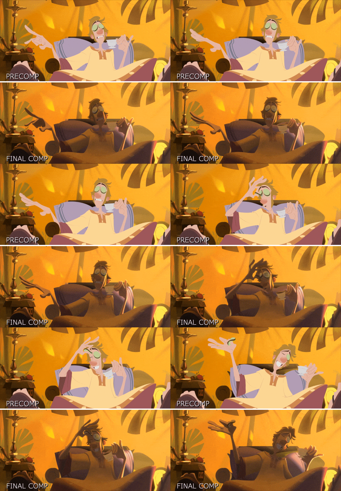
Today, 2D animation continues to break away from the limitations of cel tech. Klaus did it around the turn of the decade with its complex digital lighting — since emulated in films like The Imaginary (2023), directed by an ex-Ghibli artist.
Sergio Pablos, the director of Klaus, was trying to get away from anything cliche or unnecessary in the 2D animation process. He once said, “We’re used to seeing 2D characters looking like stickers put on painted backgrounds. I felt that we needed to feel like the same artists painted the whole world.” As he put it elsewhere:
If the traditional animation look of flat colors with colored lines was an artistic choice, then why would companies feel the need to airbrush DVD covers? Clearly, that was not a choice, that was a limitation.
When cels arrived on the scene, they were a groundbreaking technology. It’s safe to say that the entire history of animation would’ve looked different, and may never have happened at all, without them. Cel animation is what blew up around the world. There would be no Disney, no Toei Doga and no Studio Ghibli without cels — to name just a few.
At the same time, cels railroaded artists into specific ways of creating. It was possible to jump the tracks with enough effort, but it often meant working against your tools and their natural tendencies. This tension led to amazing creativity. But it was inevitable that a newer, more versatile technology would come along one day.
Today, computers railroad artists, too. There’s always a struggle against the too-perfect, too-crisp or too-textureless image that computers output by nature. But computers have also opened up styles that would’ve been unimaginable in the cel era. You see that in big ways with films like Across the Spider-Verse, and in little ones: the subtle, handcrafted look of Funny Birds was made possible by digital tools.
Cels ruled for 60 or 70 years before they were made obsolete. One day, a new default technology could replace drawing tablets and animation software, too. Until then, though, the fight for great, creative work continues — whether the tools favor it or not.
See you again soon!
From Starting Point (“Thoughts on Japanese Animation”). We also quoted “Having Seen The Man Who Planted Trees” from the same book.
The collective nature of cel animation is a main reason that Czech director Jiří Trnka abandoned it for stop-motion puppets in the 1940s. He argued that “the different techniques of the many draftsmen participating in the actual piecing together of the film obscures the character of the original drawing,” the original artist’s touch.
From Miyazaki’s essay in the book The World of Anime (アニメの世界, 1988).
Ivanov-Vano explained this in his book Frame by Frame (Кадр за кадром, 1980). We wrote about the creation and spread of Tsar Durandai last year.
From the short interview with Ivanov-Vano in My Puppet Friends (Мои друзья куклы, 1971).
As explained in Alex Dudok de Wit’s book about Grave of the Fireflies for the BFI Film Classics series.
Quotes and details about the digital pipeline at Disney all come from “Disney Lets CAPS Out of the Bag,” published in Computer Graphics World (July 1994).

You got an amazing blog, wish I found it sooner!
About to go watch Bill Plimptons new feature at the Am Doc and Animation festival! He’s doing a Q&A afterwards too!!!!